00

Website

Website Design & Development

Website Design & Development

italianvisa

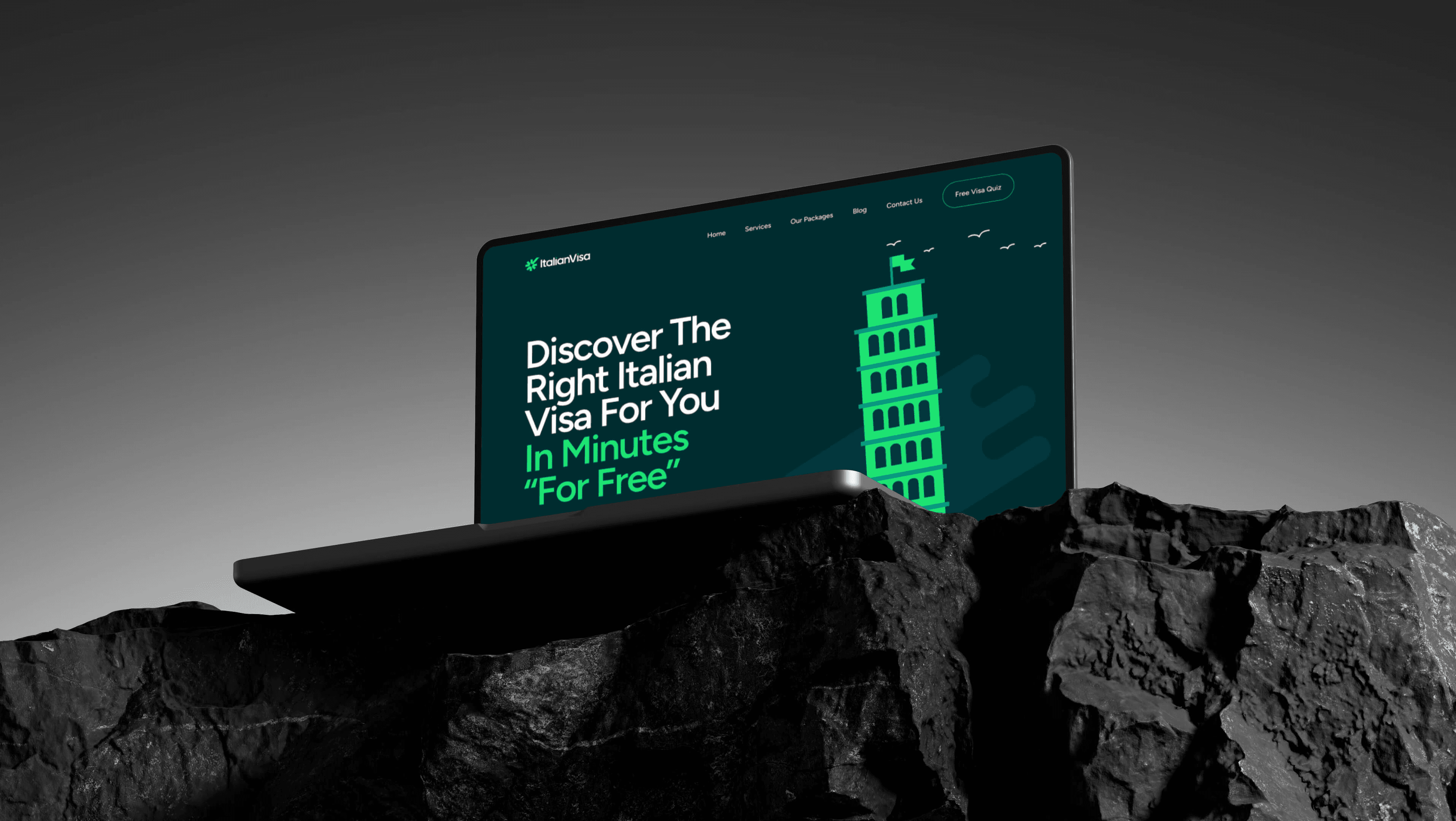
ItalianVisa is a modern immigration and relocation website designed to help users navigate the process of moving to Italy and obtaining the right visa. The platform presents complex legal and relocation services through a clean, approachable, and trustworthy interface that simplifies the user journey and makes the experience feel less overwhelming.

challange

I was involved in the creation of the ItalianVisa website, a platform in the immigration and relocation industry focused on helping people move to Italy and navigate the visa application process. The main goal of the project was to guide users who were searching for information about obtaining an Italian visa toward submitting an application. This required presenting complex immigration information in a clear and approachable way — explaining how the process works, what documents are required, and what users should expect during each stage of the journey. Another important objective was properly structuring and presenting the company’s services and different visa types while clearly communicating the company’s advantages and expertise. The company already had established brand guidelines, so an important part of the process was translating that visual identity into a cohesive digital experience that reflected the company’s personality, professionalism, and overall vibe.

I was involved in the creation of the ItalianVisa website, a platform in the immigration and relocation industry focused on helping people move to Italy and navigate the visa application process. The main goal of the project was to guide users who were searching for information about obtaining an Italian visa toward submitting an application. This required presenting complex immigration information in a clear and approachable way — explaining how the process works, what documents are required, and what users should expect during each stage of the journey. Another important objective was properly structuring and presenting the company’s services and different visa types while clearly communicating the company’s advantages and expertise. The company already had established brand guidelines, so an important part of the process was translating that visual identity into a cohesive digital experience that reflected the company’s personality, professionalism, and overall vibe.

I was involved in the creation of the ItalianVisa website, a platform in the immigration and relocation industry focused on helping people move to Italy and navigate the visa application process. The main goal of the project was to guide users who were searching for information about obtaining an Italian visa toward submitting an application. This required presenting complex immigration information in a clear and approachable way — explaining how the process works, what documents are required, and what users should expect during each stage of the journey. Another important objective was properly structuring and presenting the company’s services and different visa types while clearly communicating the company’s advantages and expertise. The company already had established brand guidelines, so an important part of the process was translating that visual identity into a cohesive digital experience that reflected the company’s personality, professionalism, and overall vibe.

solution

The solution focused on creating a clear and trustworthy user experience that could simplify complex immigration information and naturally guide users toward scheduling a consultation call. To achieve this, the website structure was built around user intent and information hierarchy. Different visa types, services, required documents, and application details were organized into clear and easy-to-understand sections, helping users quickly find relevant information and better understand the immigration process. Special attention was given to reducing the overwhelming feeling often associated with visa and relocation services. Complex topics were broken down into digestible content blocks, while strong visual hierarchy and clean layouts helped users navigate the platform comfortably and with confidence. Since the company already had established brand guidelines, the interface was carefully designed to reflect the premium and trustworthy feel of the brand while maintaining a warm and approachable atmosphere inspired by Italian aesthetics and lifestyle.

The solution focused on creating a clear and trustworthy user experience that could simplify complex immigration information and naturally guide users toward scheduling a consultation call. To achieve this, the website structure was built around user intent and information hierarchy. Different visa types, services, required documents, and application details were organized into clear and easy-to-understand sections, helping users quickly find relevant information and better understand the immigration process. Special attention was given to reducing the overwhelming feeling often associated with visa and relocation services. Complex topics were broken down into digestible content blocks, while strong visual hierarchy and clean layouts helped users navigate the platform comfortably and with confidence. Since the company already had established brand guidelines, the interface was carefully designed to reflect the premium and trustworthy feel of the brand while maintaining a warm and approachable atmosphere inspired by Italian aesthetics and lifestyle.

The solution focused on creating a clear and trustworthy user experience that could simplify complex immigration information and naturally guide users toward scheduling a consultation call. To achieve this, the website structure was built around user intent and information hierarchy. Different visa types, services, required documents, and application details were organized into clear and easy-to-understand sections, helping users quickly find relevant information and better understand the immigration process. Special attention was given to reducing the overwhelming feeling often associated with visa and relocation services. Complex topics were broken down into digestible content blocks, while strong visual hierarchy and clean layouts helped users navigate the platform comfortably and with confidence. Since the company already had established brand guidelines, the interface was carefully designed to reflect the premium and trustworthy feel of the brand while maintaining a warm and approachable atmosphere inspired by Italian aesthetics and lifestyle.

how was the process going

discovery & aligment

The project started with a discovery and alignment phase focused on understanding the company’s goals, target audience, services, and overall business direction. During this stage, we analyzed the existing structure, identified key user pain points, and defined the primary actions users should take throughout the website experience — with the main conversion goal being scheduling a consultation call.

competitors analysing

structure


visual direction

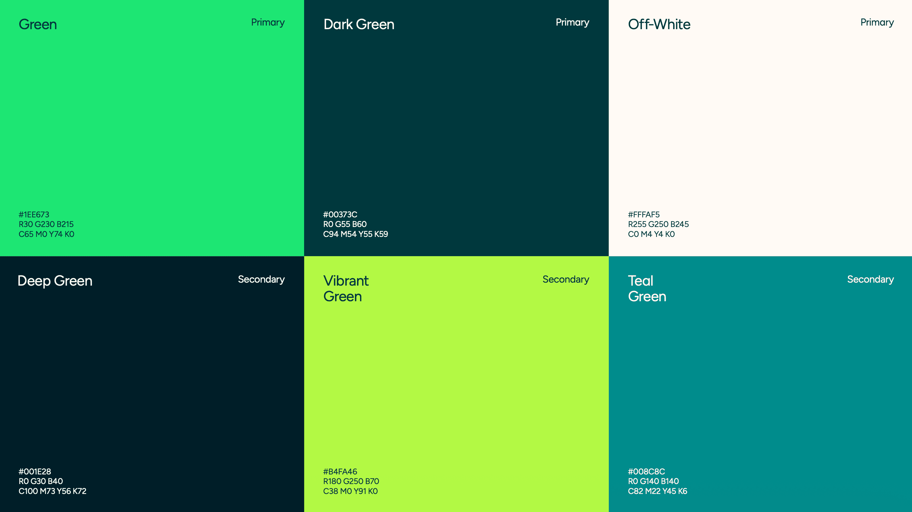
When the structure was defined and market analysis completed, I moved into the design phase. The brand already had an established visual identity, so the main challenge was to translate it into a functional and consistent digital experience, using the existing guidelines as a foundation.

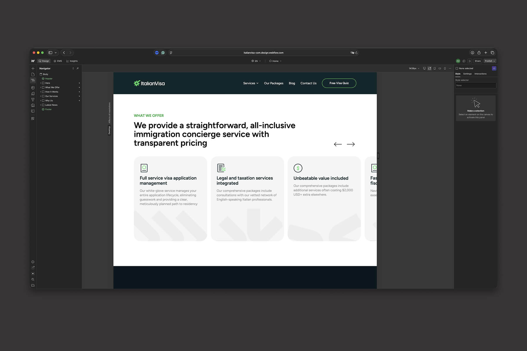
I focused on building a clear visual hierarchy that could support complex information without overwhelming the user. Typography, spacing, and layout were used to improve readability and guide attention toward key actions, especially the consultation booking CTA.

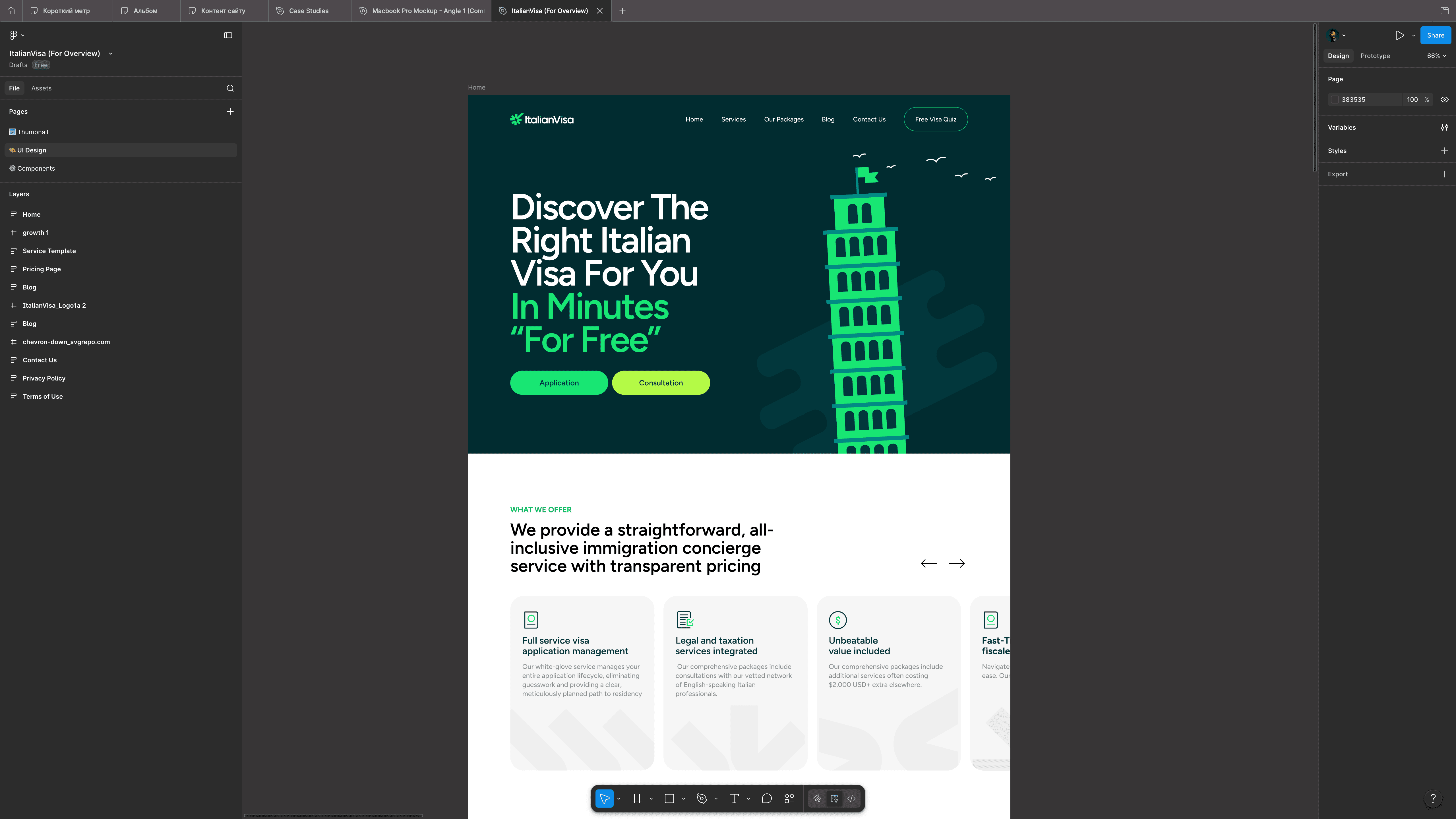
The visual language was extended through carefully applied graphic elements, icons, and subtle stylistic details from the brand guidelines. The goal was not to redesign the identity, but to reinforce it in a way that felt natural within a web experience.


implementation

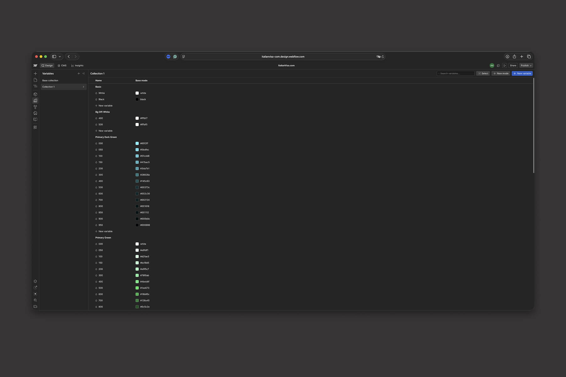
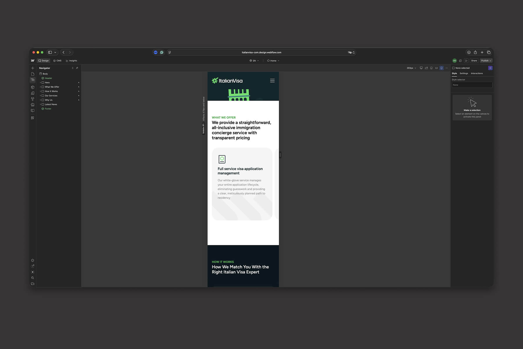
In the implementation phase, I translated the final design into a fully responsive Webflow build. The focus was on accurately recreating the visual system while ensuring the layout remained consistent across different breakpoints and screen sizes.

Since the Figma file was properly structured from the beginning — using variables, components, and a consistent naming system — this setup significantly sped up the development process. The same design logic was carried over into Webflow, where variables and reusable styles helped maintain visual consistency and reduced the need for manual adjustments during implementation.

At this stage, the main priority was to ensure pixel-perfect implementation of the design while maintaining performance, responsiveness, and layout stability across devices. The result was a consistent and reliable web experience that closely matched the original design vision.

I also worked on subtle motion and micro-interactions to make the website feel more alive and engaging. This included text reveal animations, smooth section transitions, and light interactive feedback across key elements.

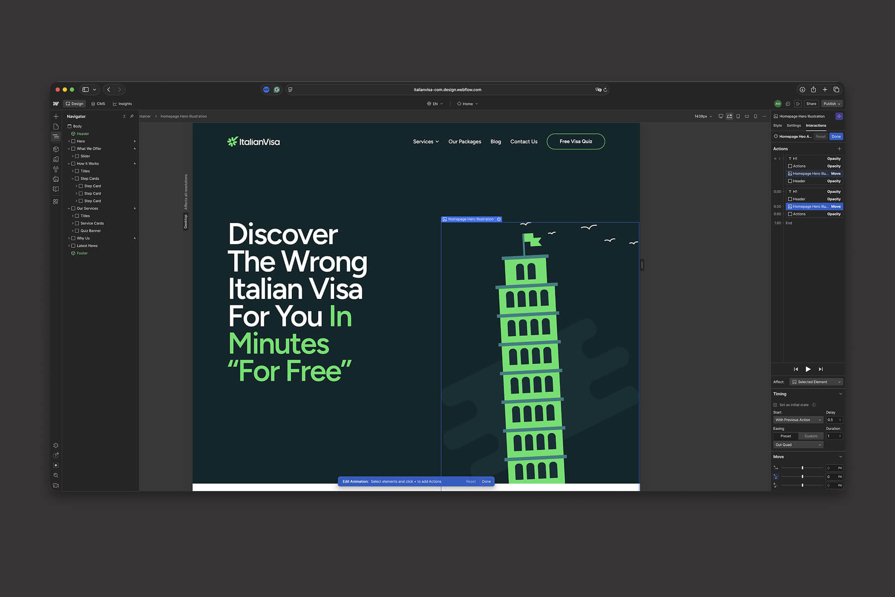
The goal was not to overload the experience with motion, but to add just enough dynamism to support the content and guide user attention naturally. These small details helped the interface feel more modern, responsive, and polished, while still maintaining clarity and readability throughout the experience.


CMS setup

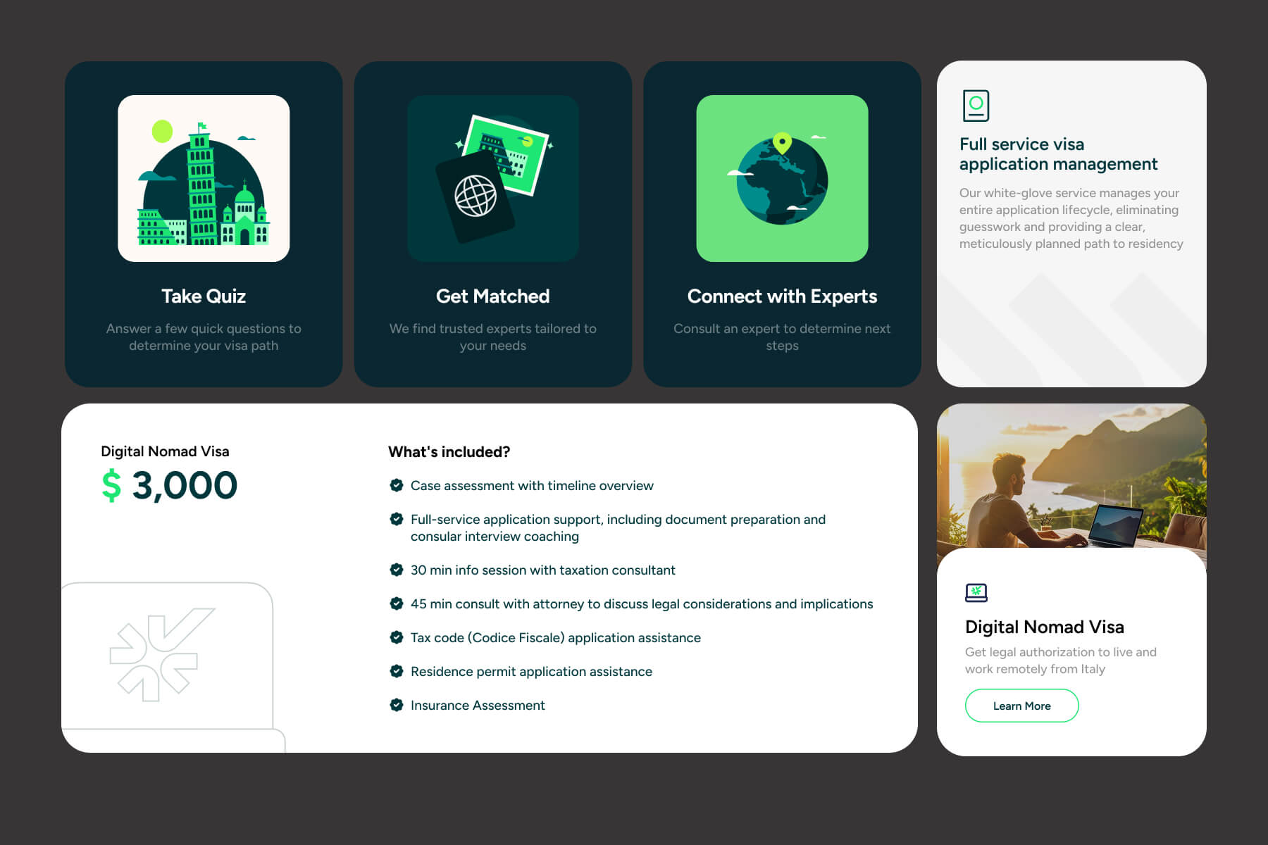
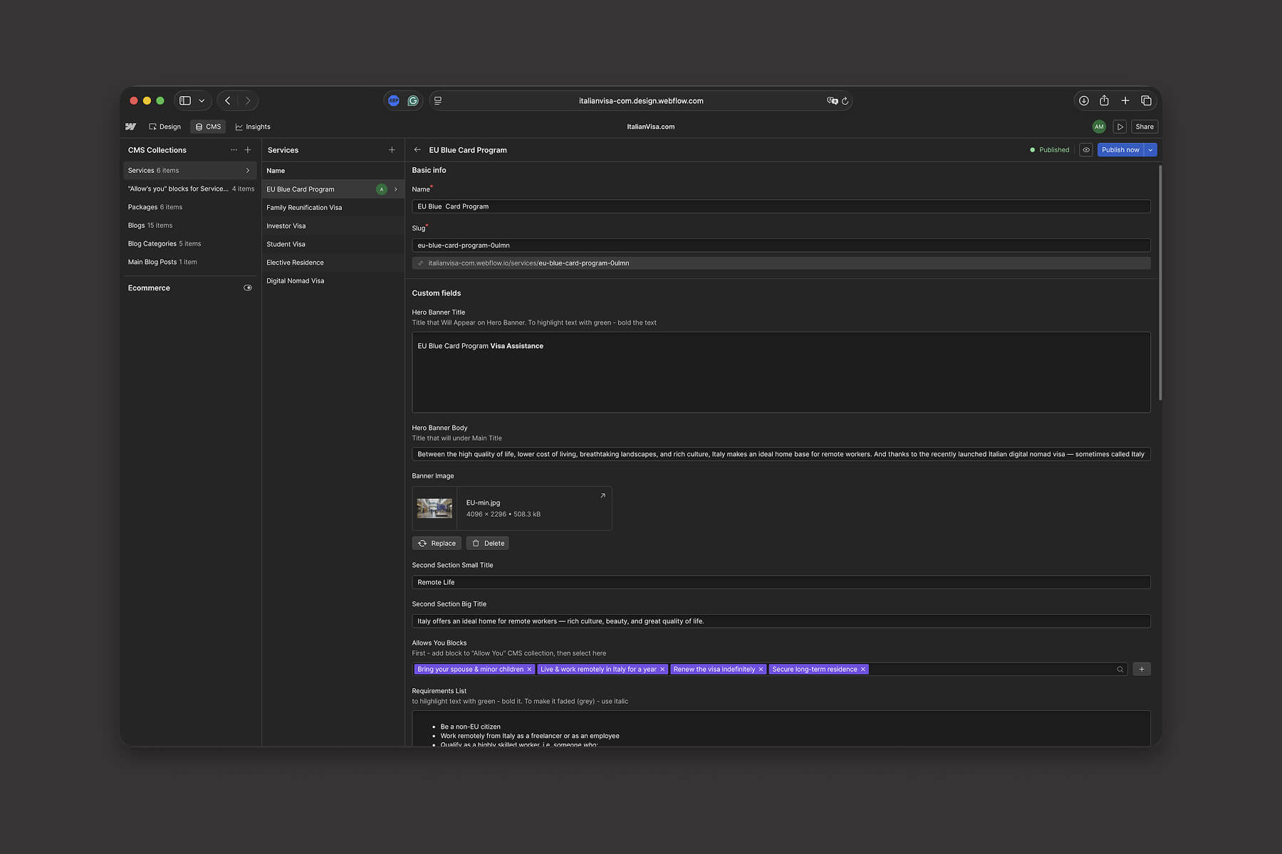
In the CMS implementation phase, I structured dynamic collections for both services and the blog, as well as additional relational collections that could be used as multi-references within individual service pages. This allowed for a flexible content system where different types of information could be connected and reused across the platform without duplication.

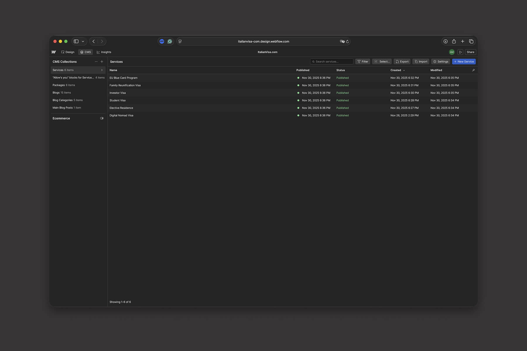
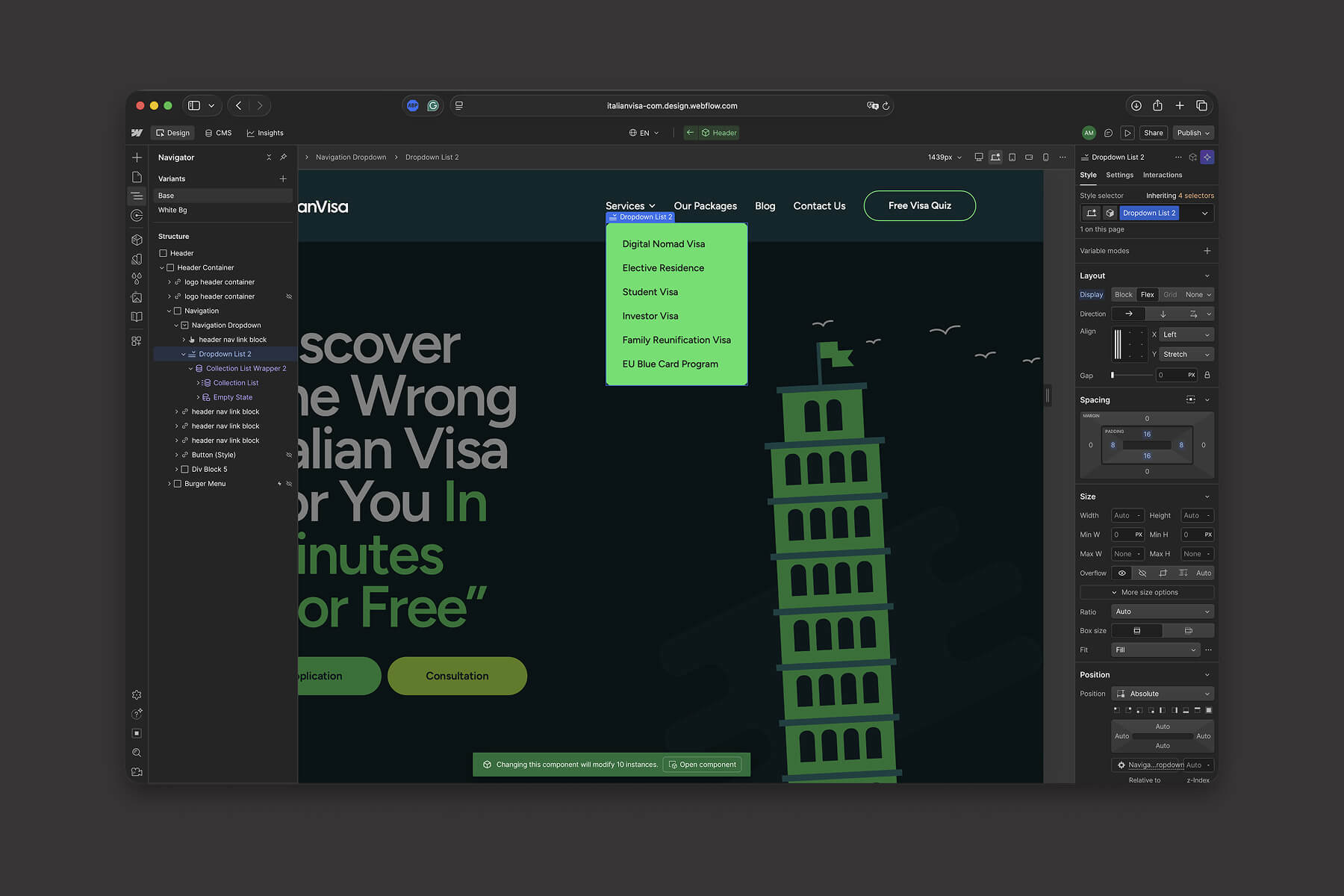
The services dropdown in the navigation was also fully connected to the services collection. This ensures that any future additions or changes to services will automatically be reflected in the navigation, eliminating the need for manual code updates and reducing maintenance overhead for the client.

The CMS was designed to be as user-friendly and scalable as possible, allowing the client to manage content independently without any technical knowledge. Even more complex page structures were accounted for, enabling the addition of modular content blocks such as benefits, pricing packages, required documents, and other service-specific sections in a structured and intuitive way.

Overall, the CMS setup transformed the website into a flexible system that can easily evolve over time while remaining easy to manage on the client side.


refinement & launch

In the refinement and launch phase, I focused on polishing the overall experience and ensuring everything was consistent across design, development, and CMS logic. This included reviewing layouts across breakpoints, refining spacing and typography details, and fixing small UX inconsistencies that appeared during implementation.


Special attention was given to improving clarity in key conversion areas, such as service pages and consultation booking flows, ensuring that users could reach the main CTA without friction and fully understand the value proposition.

I also performed final QA across the CMS structure, testing how dynamic content behaves in real scenarios — especially for services, blog posts, and interconnected page elements — to make sure everything scales correctly without breaking layout or logic.


overcomes

After launch, the main focus was on stability and user experience consistency. The system proved to be flexible and easy to maintain, allowing the client to update content independently while keeping the design intact. Overall, the final result is a clean, scalable platform that successfully combines clarity, conversion focus, and long-term maintainability.

role

Web Developer & Designer

industry

Immigration services

duration

2,5 weeks

tools

Webflow, Figma

project gallery

contact me

let’s discuss your project, product or opportunity

Whether you’re building a product, redesigning an existing experience, or looking for a long-term collaboration, feel free to get in touch

contact me

let’s discuss your project, product or opportunity

Whether you’re building a product, redesigning an existing experience, or looking for a long-term collaboration, feel free to get in touch