00
Website
remojii site
concise, conversion-focused landing page that communicates the platform’s core value — AI-driven remote job matching and simplified hiring. It translates a complex product into a clear narrative and guides users toward sign-up through structured messaging and strong visual hierarchy
challange
solution
how was the process going
discovery & aligment
Since the marketing website was developed as an extension of an already defined product, the discovery phase was significantly more focused and structured compared to the initial platform work. The core product logic, user flows, and competitive positioning had already been validated during the platform phase, meaning the strategic foundation, target audiences, and key messaging directions were clearly established from the beginning.
Competitor analysis, information architecture, and core content structure were already in place, which allowed the process to move quickly from research into execution. Instead of exploring different product directions, the main goal of this phase was alignment — translating existing product strategy into a clear marketing narrative and defining how it should be visually and emotionally communicated through the landing experience.
With these foundations already validated, the project could shift directly into defining visual direction, layout principles, and interaction patterns. This created a more execution-driven workflow, where design decisions were guided by established product logic rather than early-stage exploration, allowing for faster iteration and a more focused creative process.
visual direction
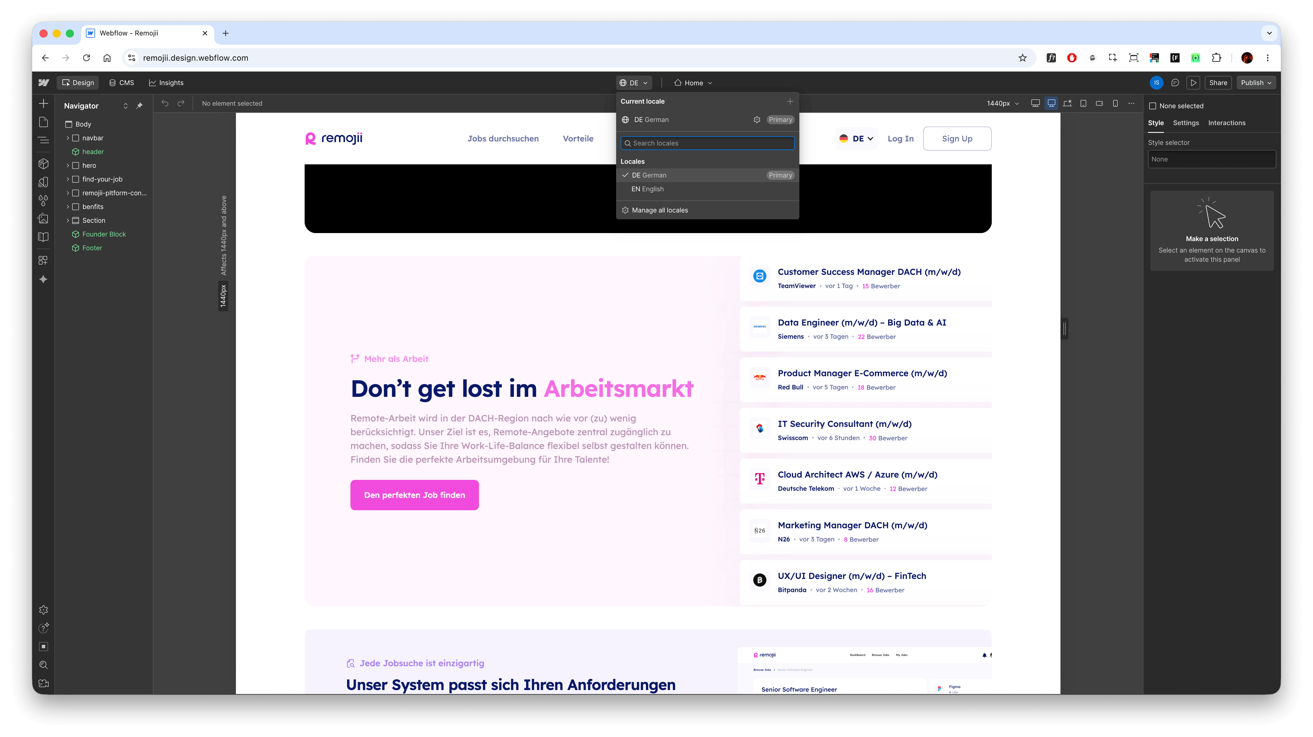
The visual direction for the marketing website was built to reflect clarity, trust, and a modern product-led identity rather than a decorative or overly expressive brand approach. Since the core product already had a defined system and tone, the goal was to extend that language into a more emotionally engaging and conversion-oriented interface.
The design relied on a clean grid system, strong typographic hierarchy, and generous spacing to maintain readability and focus across sections. Emphasis was placed on structured storytelling — guiding users through problem, solution, and product value without visual noise or unnecessary complexity. Subtle motion and micro-interactions were used sparingly to support attention flow rather than dominate it.
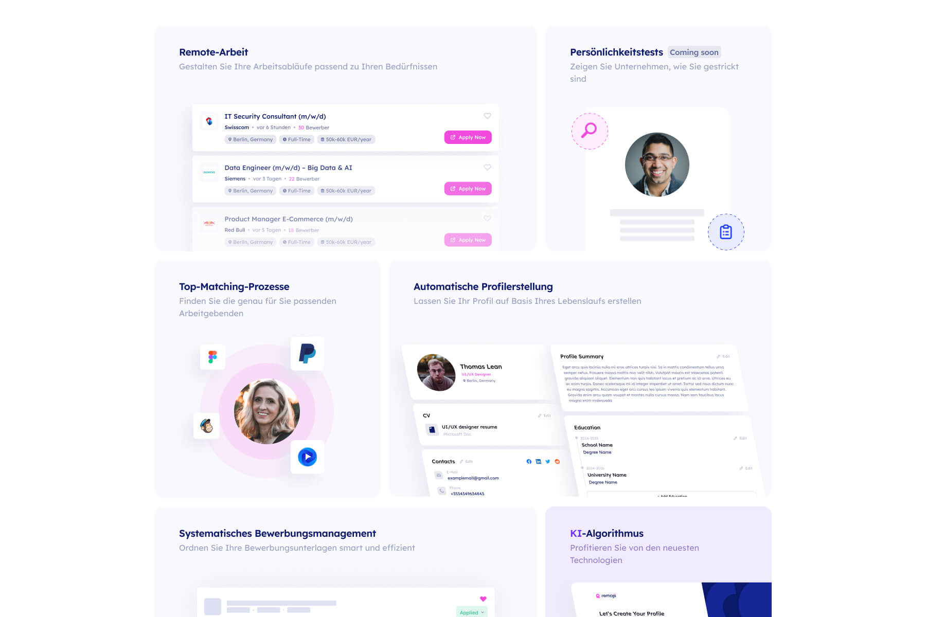
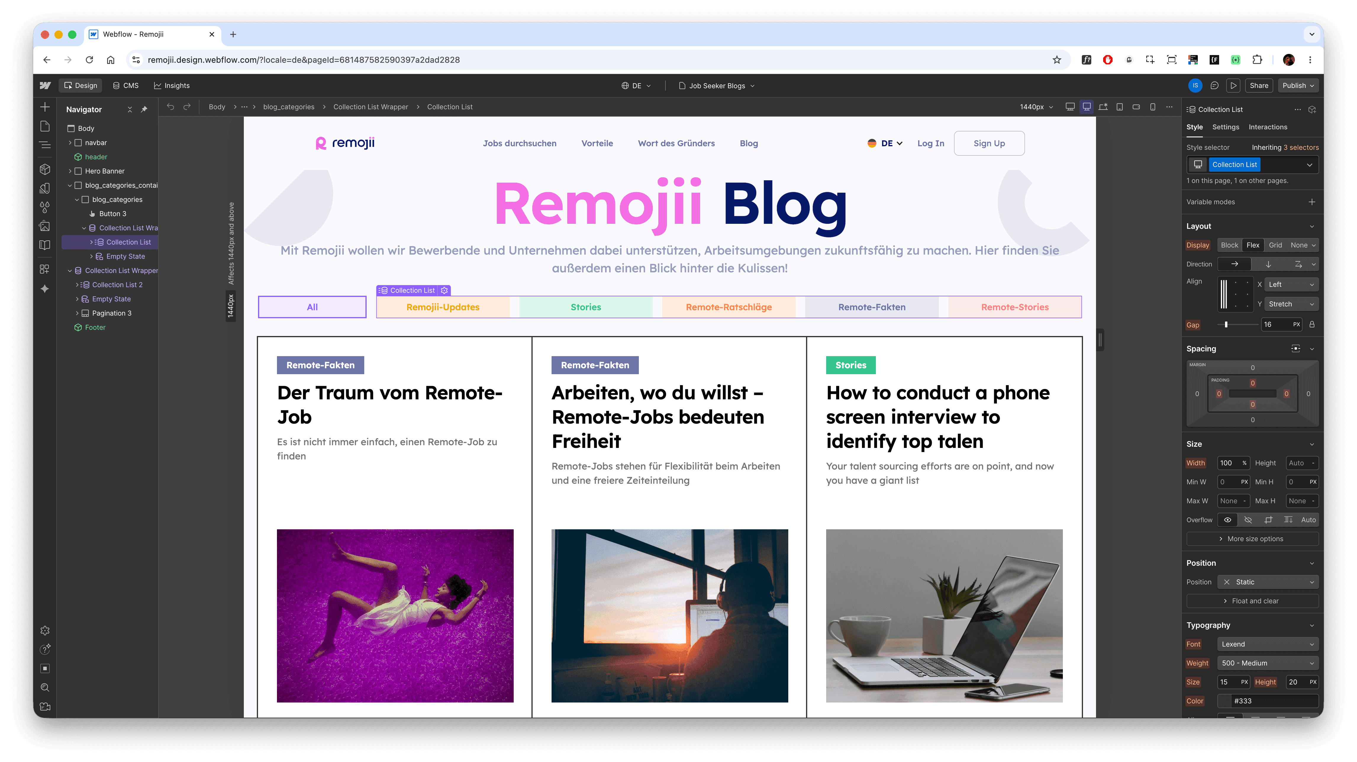
Certain sections were structured using a bento grid approach, allowing content to be broken into modular, digestible blocks that improve scannability and create a more dynamic rhythm across the page. This helped especially in feature and benefit sections, where hierarchy and comparison needed to be communicated quickly without overwhelming the user.
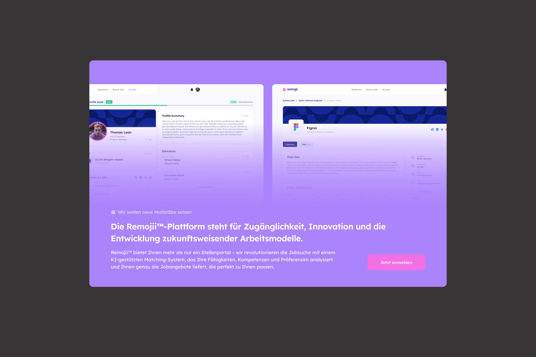
Visually, the interface also reused and adapted elements directly from the main platform, ensuring consistency between product and marketing experience. This included UI components, styling patterns, and visual tokens, which helped reinforce brand continuity and made the landing page feel like a natural extension of the product rather than a separate system.
Overall, the direction aimed to make the platform feel credible, intelligent, and easy to understand at a glance — reinforcing the idea of a structured, AI-driven system rather than a traditional job board.
blogs design
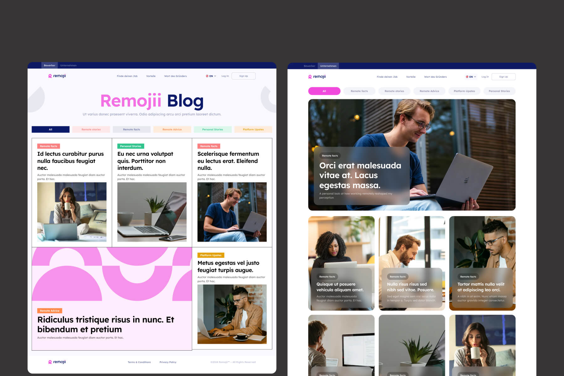
Blog design was also differentiated based on the target audience of each landing experience. Content for job seekers was presented in a more modern, expressive visual style, with softer hierarchy, more dynamic layouts, and a lighter editorial tone to make it feel engaging and approachable. In contrast, the recruiter-focused blog followed a more strict and structured design approach, with clearer grids, reduced visual noise, and a stronger emphasis on readability and professionalism. This separation helped reinforce the different mindsets of each audience while keeping the overall system consistent within the same design language.
implementation
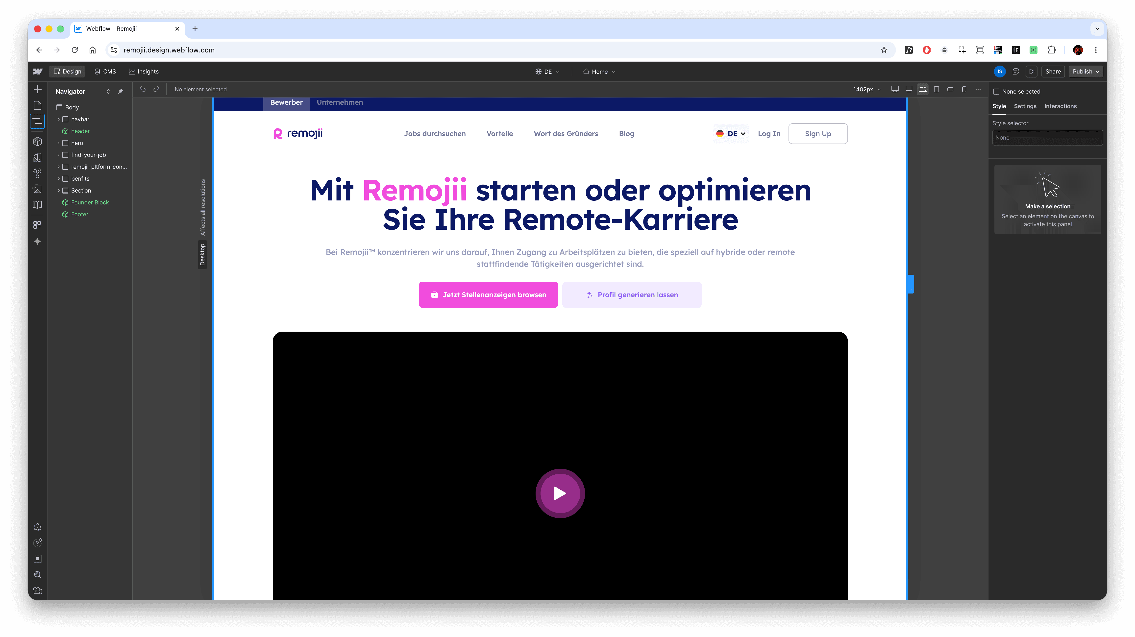
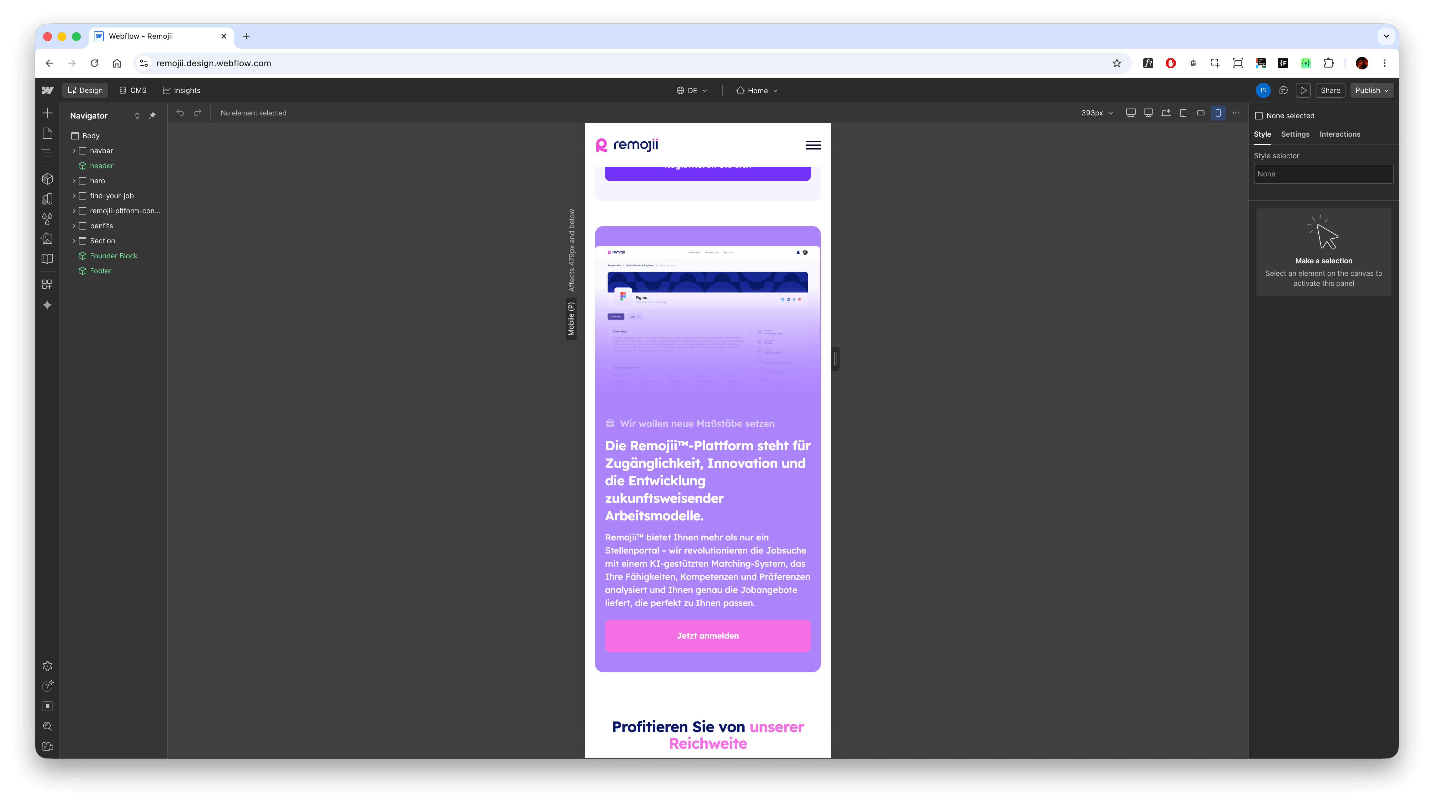
In the implementation phase, I translated the final design into a fully responsive Webflow build. The focus was on accurately recreating the visual system while ensuring the layout remained consistent across different breakpoints and screen sizes.
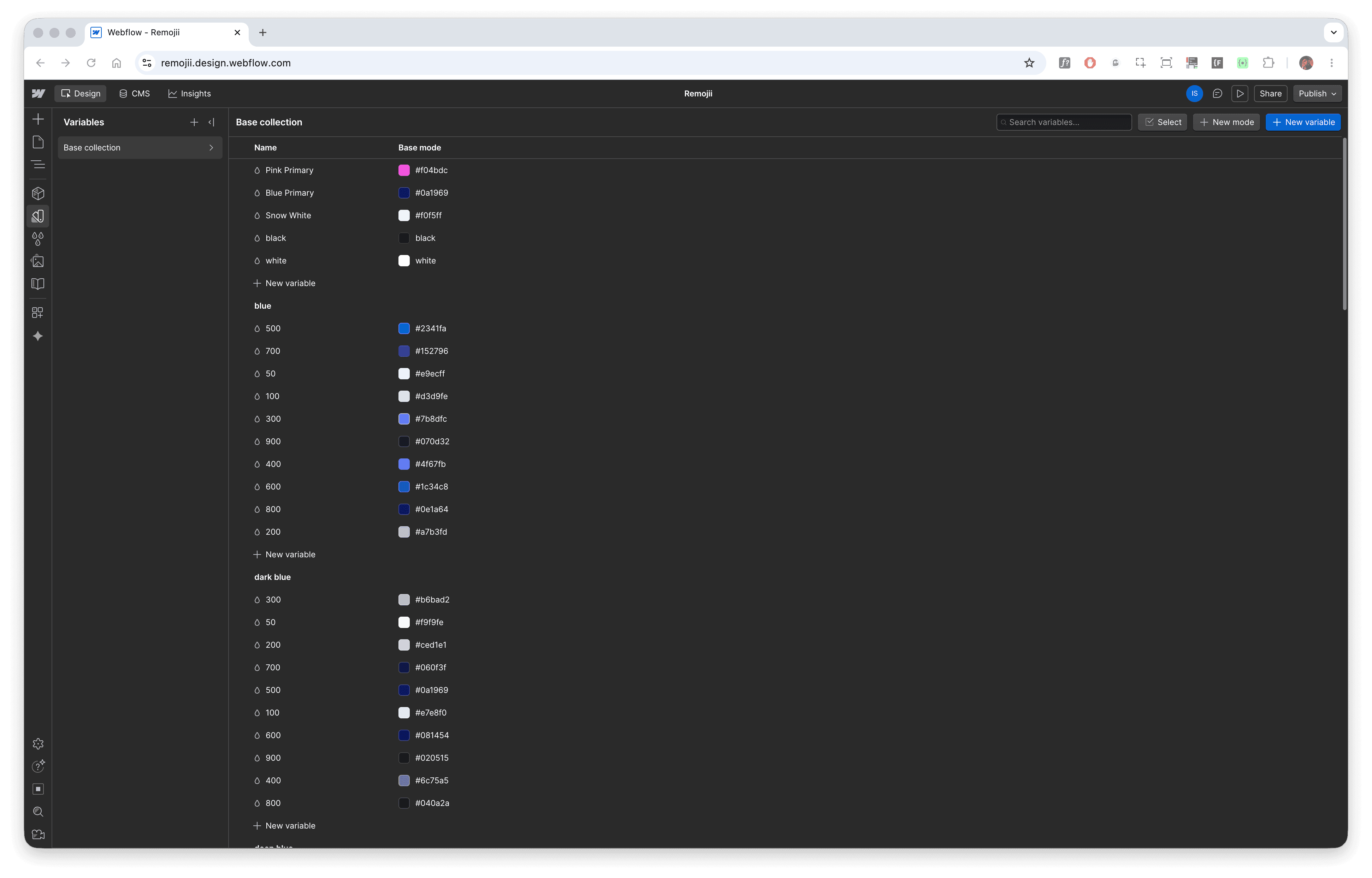
Since the Figma file was properly structured from the beginning — using variables, components, and a consistent naming system — this setup significantly sped up the development process. The same design logic was carried over into Webflow, where variables and reusable styles helped maintain visual consistency and reduced the need for manual adjustments during implementation.
At this stage, the main priority was to ensure pixel-perfect implementation of the design while maintaining performance, responsiveness, and layout stability across devices. The result was a consistent and reliable web experience that closely matched the original design vision.
A localization system was set up to support seamless switching between English and German versions, ensuring consistent layout behavior across both languages.
CMS setup
The CMS structure was designed with scalability and content separation in mind, ensuring the marketing website could grow without requiring layout or structural changes. Two distinct CMS collections were created for blog content — one tailored for job seekers and another for recruiters — allowing each audience to have a dedicated content stream with its own tone, topics, and presentation style.
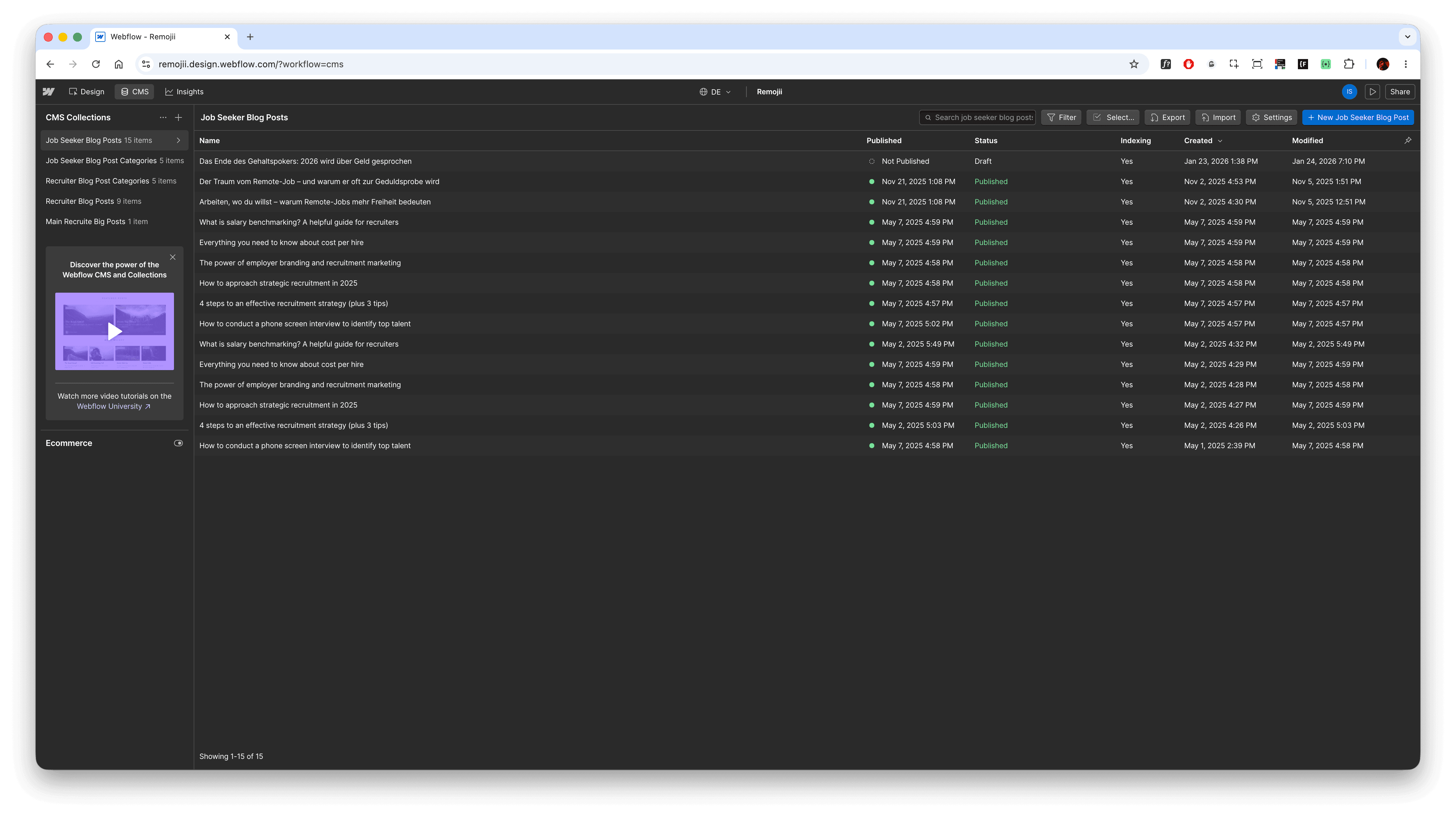
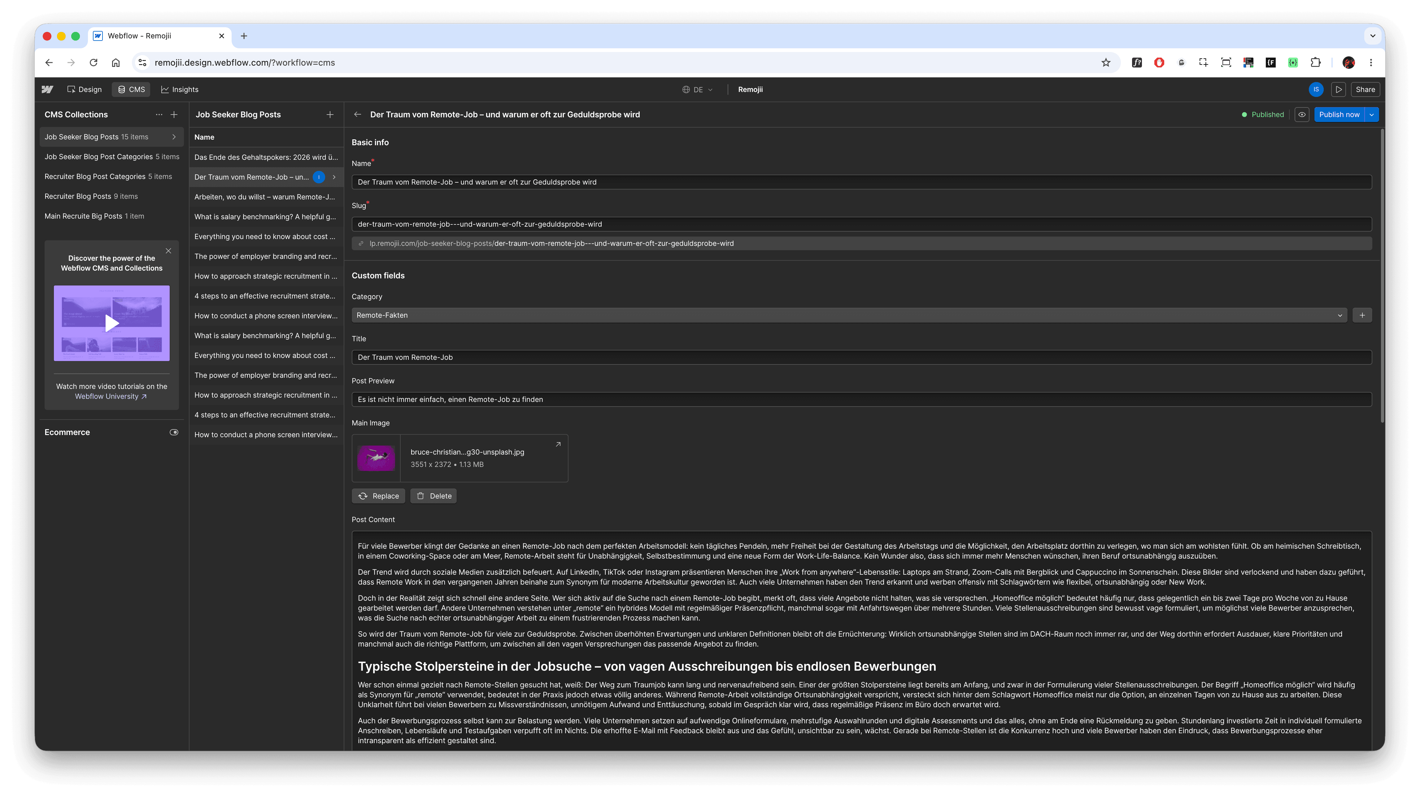
In addition to this separation, a shared category system was implemented to organize articles across both collections. This made it possible to maintain a consistent content taxonomy while still preserving clear differentiation between user groups. Each new post automatically inherits its structure, styling, and placement rules, meaning that once content is added to the CMS, it is instantly reflected across the website without manual intervention.
The setup was built to ensure long-term flexibility, allowing the team to easily expand content, introduce new categories, and scale both blog sections independently while keeping the overall system clean and manageable.
refinement & launch
The final phase focused on polishing the experience and ensuring consistency across all pages, states, and responsive breakpoints before launch. Special attention was given to layout stability, typography balance, and interaction behavior to make sure the site felt cohesive across both language versions and audience modes. This included fine-tuning spacing systems, improving visual hierarchy in key conversion sections, and ensuring that the transition between job seeker and recruiter views remained smooth and predictable.
A significant part of the refinement process was also dedicated to performance and usability checks within Webflow. CMS-driven sections, localization switching, and dynamic blog structures were tested to ensure reliability and prevent edge-case layout issues when scaling content. Final adjustments were made to improve readability, reduce visual friction, and strengthen the overall narrative flow from hero sections to conversion points.
The launch delivered a fully functional, scalable marketing system that supports multiple audiences, languages, and content types while remaining easy to maintain. The result is a structured and conversion-oriented landing experience that extends the core product ecosystem and provides a clear entry point for both job seekers and recruiters.
I also performed final QA across the CMS structure, testing how dynamic content behaves in real scenarios — especially for services, blog posts, and interconnected page elements — to make sure everything scales correctly without breaking layout or logic.
overcomes
The final result is a scalable, multi-layered marketing website that successfully translates a complex product into a clear and accessible narrative. It supports two distinct audience journeys — job seekers and recruiters — while maintaining a unified design system and consistent brand expression across all pages and languages.
The implementation in Webflow ensured that the system is not only visually consistent but also operationally efficient. With built-in localization, dynamic audience switching, and a structured CMS architecture, the website can evolve independently from design and development constraints. New content, blog posts, and categories can be added without breaking layout logic or requiring manual updates.
Beyond functionality, the key outcome was the creation of a flexible communication layer for the product ecosystem. The website improves clarity around value proposition, strengthens user understanding of the platform, and provides a direct, conversion-focused entry point into the product for both target audiences.
link
role
Web Developer & Designer
industry
HR & Recruiting
duration
2 weeks
tools
Webflow, Figma
project gallery


see also