00
Mobile App
chamber+
This project was an internal podcast learning platform designed for company employees to consume educational audio content and support professional growth. The app featured a library of curated podcasts — primarily focused on finance, business, and self-development — allowing employees to learn and stay informed in a more flexible and engaging format. The platform was created as part of the company’s internal learning ecosystem, helping teams access knowledge and continuous education through a clean and easy-to-use mobile experience.
challange
solution
how was the process going
discovery & analysis
After discussing the main goals and overall direction with the client, I immersed myself in the research phase.
problem analysis
audience analysis
competitor research
final direction
ux structure
A basic user flow was created to map the core journey — from opening the app, browsing podcast categories, selecting an episode, and engaging with playback. This helped clarify the main interaction patterns and ensured that the experience remained lightweight and focused on listening rather than complex navigation.
wireframes
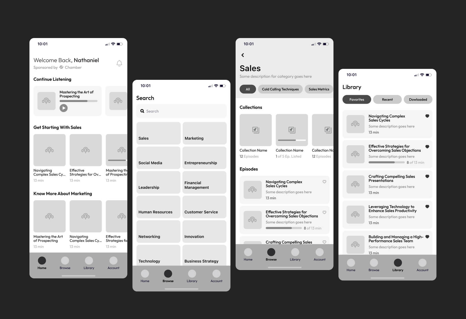
Based on the flow, wireframes were developed to establish the hierarchy of screens, layout structure, and key interface components. The emphasis was on clarity and ease of use, making sure that content discovery, categories, and playback were easy to access without unnecessary friction.
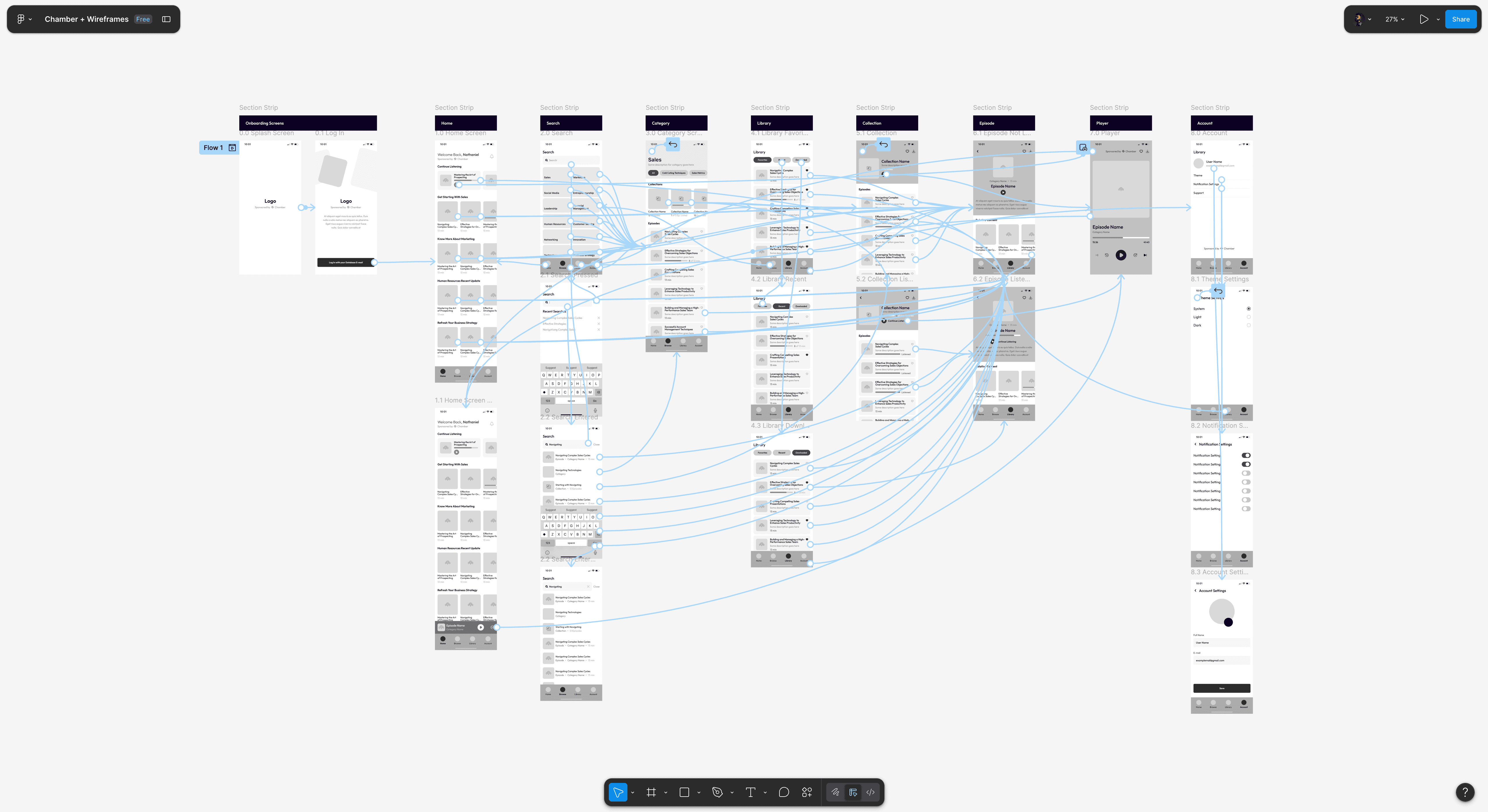
To better evaluate the experience, the wireframes were assembled into a clickable prototype. This allowed testing of real usage scenarios and helped validate navigation logic, transitions between screens, and overall usability before moving into visual design
interface design
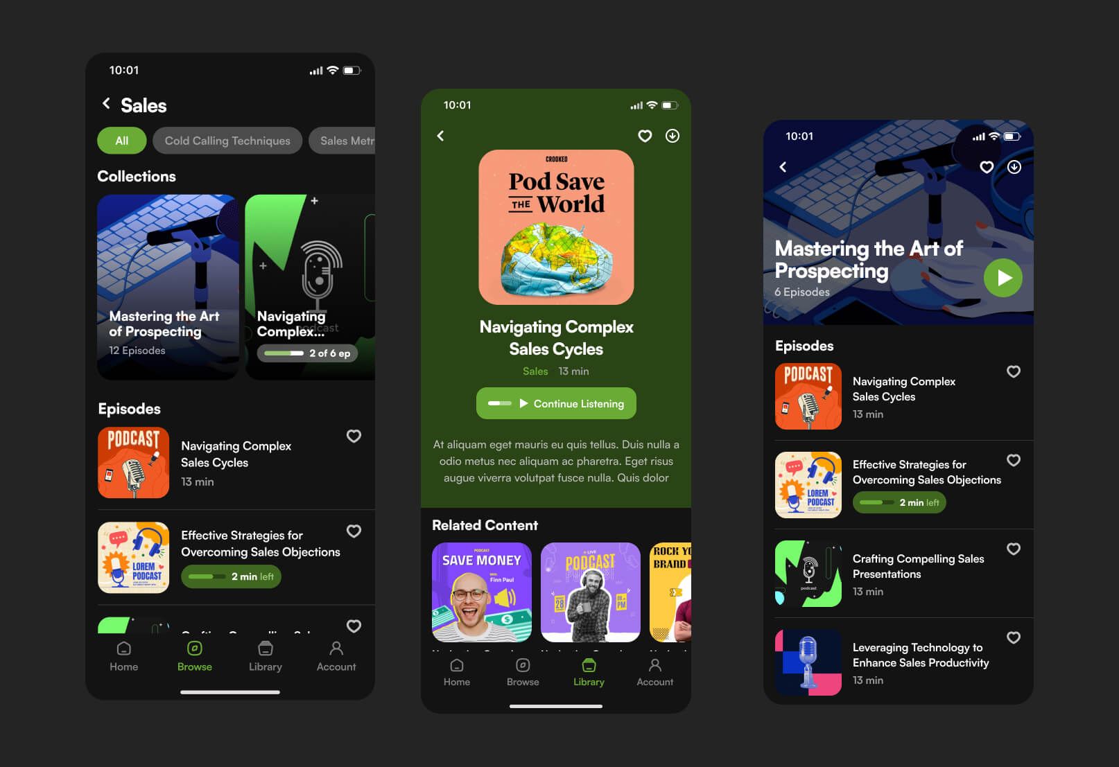
The interface design focused on creating a clean, modern, and distraction-free listening experience tailored specifically for long-form podcast consumption. The goal was to make the app feel intuitive and lightweight, while still visually engaging enough to support regular daily use by employees.
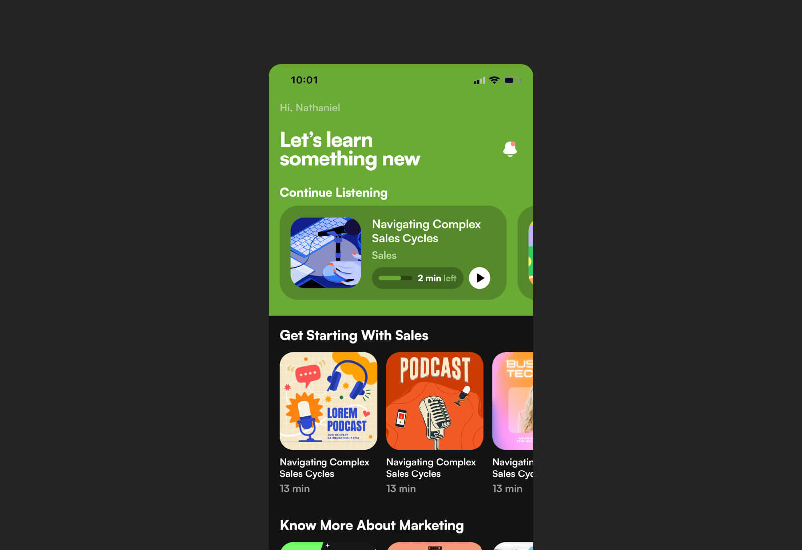
The visual language followed a modern, corporate-friendly aesthetic with subtle stylistic details to avoid a rigid “enterprise tool” feeling. This helped strike a balance between professionalism and approachability, making the app feel more like a contemporary media platform rather than traditional internal software.
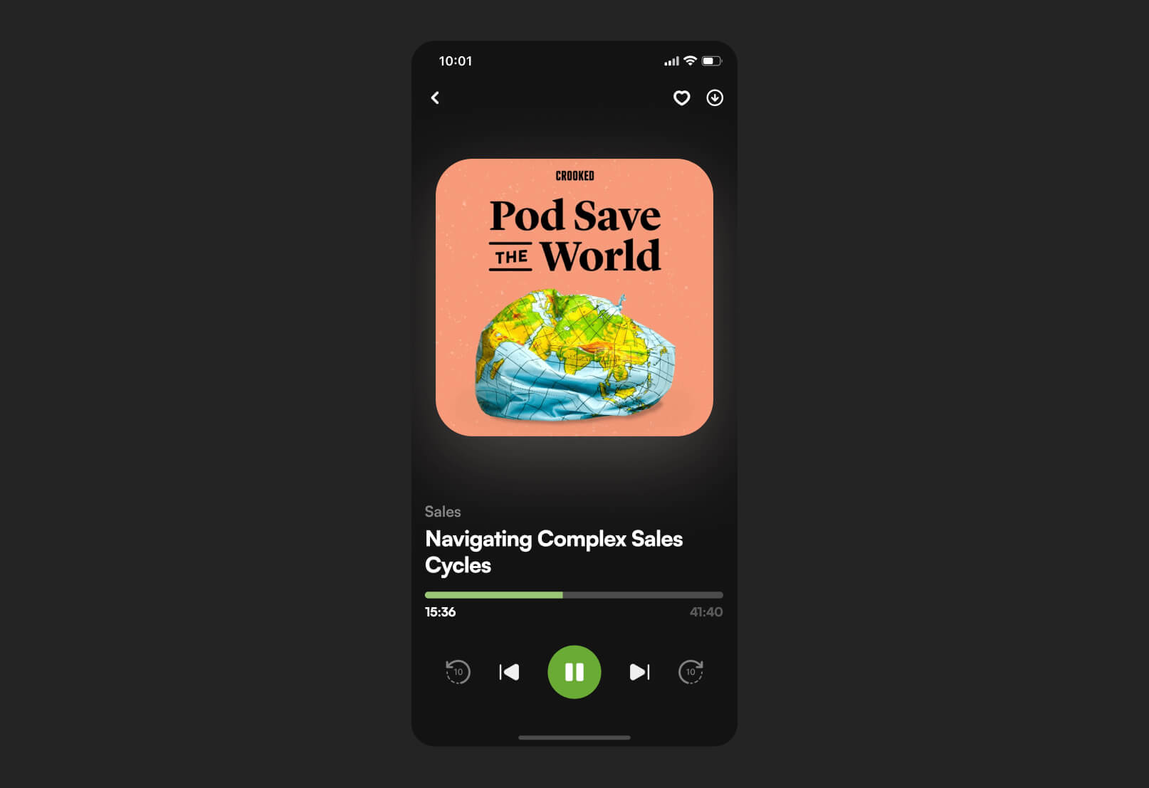
Special attention was given to the podcast player experience. The playback interface was designed to be simple and functional, with clear controls and easy access to essential actions such as pause, skip, and episode navigation, ensuring a smooth listening flow without unnecessary distractions
outcomes
The final result is a modern internal podcast platform that transforms corporate learning content into an accessible and engaging listening experience. Employees are able to easily browse topics, discover relevant episodes, and continue playback seamlessly across their daily routines.
The redesigned experience significantly improves content discoverability and usability compared to typical internal learning tools. Instead of feeling like a static corporate system, the platform now behaves more like a contemporary media application, encouraging consistent engagement and passive learning throughout the day.
The structured interface and simplified navigation reduce friction in accessing educational content, while the clean visual system ensures that the focus remains on listening rather than interacting with complex UI elements.
role
Product Designer
industry
Finance Analytics
duration
1,5 month
tools
Figma
project gallery