00
EdTech
e-matura
e-matura is an online learning system designed to help high school students prepare for their final exams through structured video lessons, quizzes, and study materials across multiple subjects. It combines guided learning paths with interactive content to centralize and simplify the entire exam preparation process in one place.
challange
solution
how was the process going
discovery & analysis
The discovery phase focused on understanding how students prepare for final exams in a high-pressure environment and where existing educational platforms fail to provide structure, clarity, and motivation. The goal was to translate a fragmented learning process into a single, coherent system that guides students step by step while still remaining flexible enough to adapt to individual learning styles
problem analysis
audience analysis
competitor research
final direction
ux structure
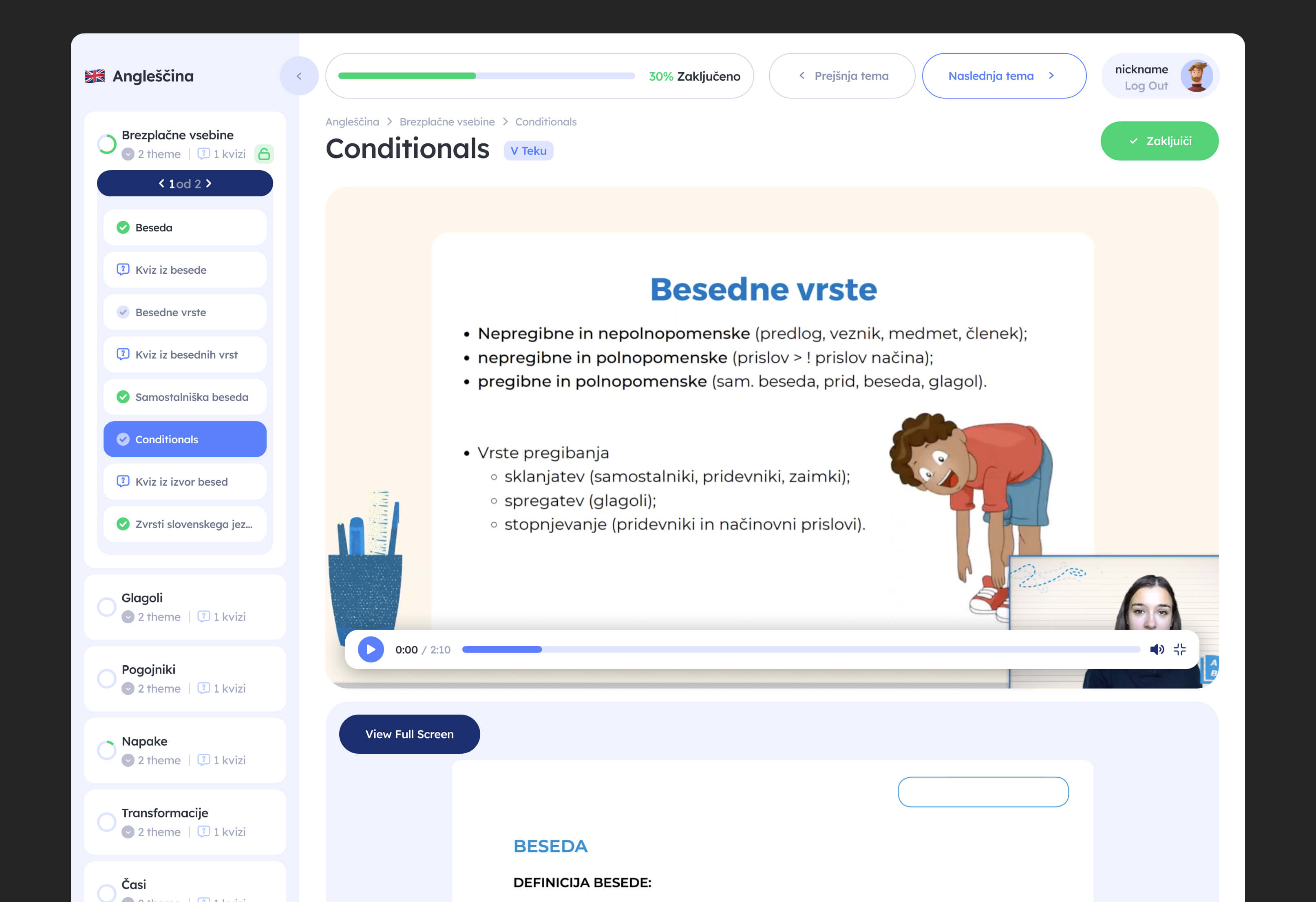
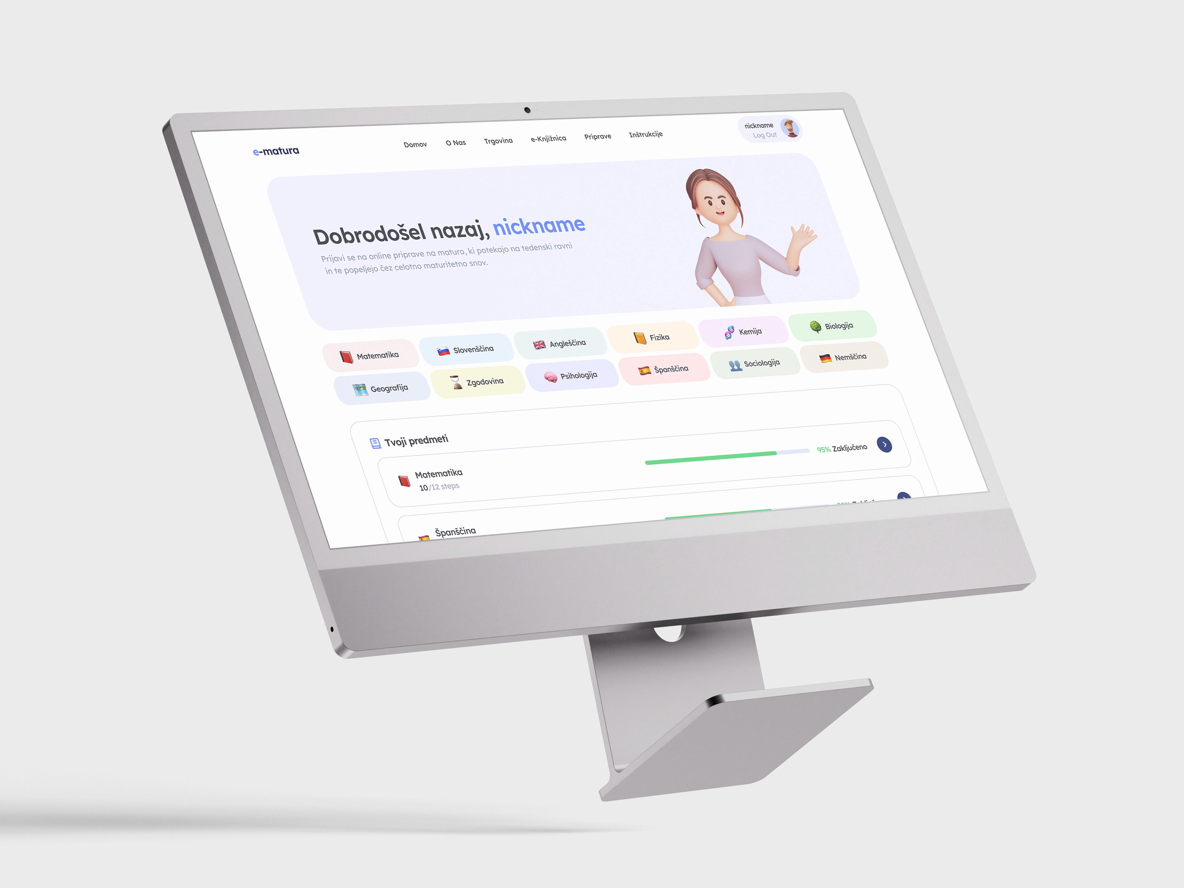
The UX structure was designed around reducing cognitive overload and helping students stay oriented throughout long-term exam preparation. Since users interact with large amounts of educational content across multiple subjects, the experience needed to feel structured, predictable, and easy to navigate even during high-stress periods.
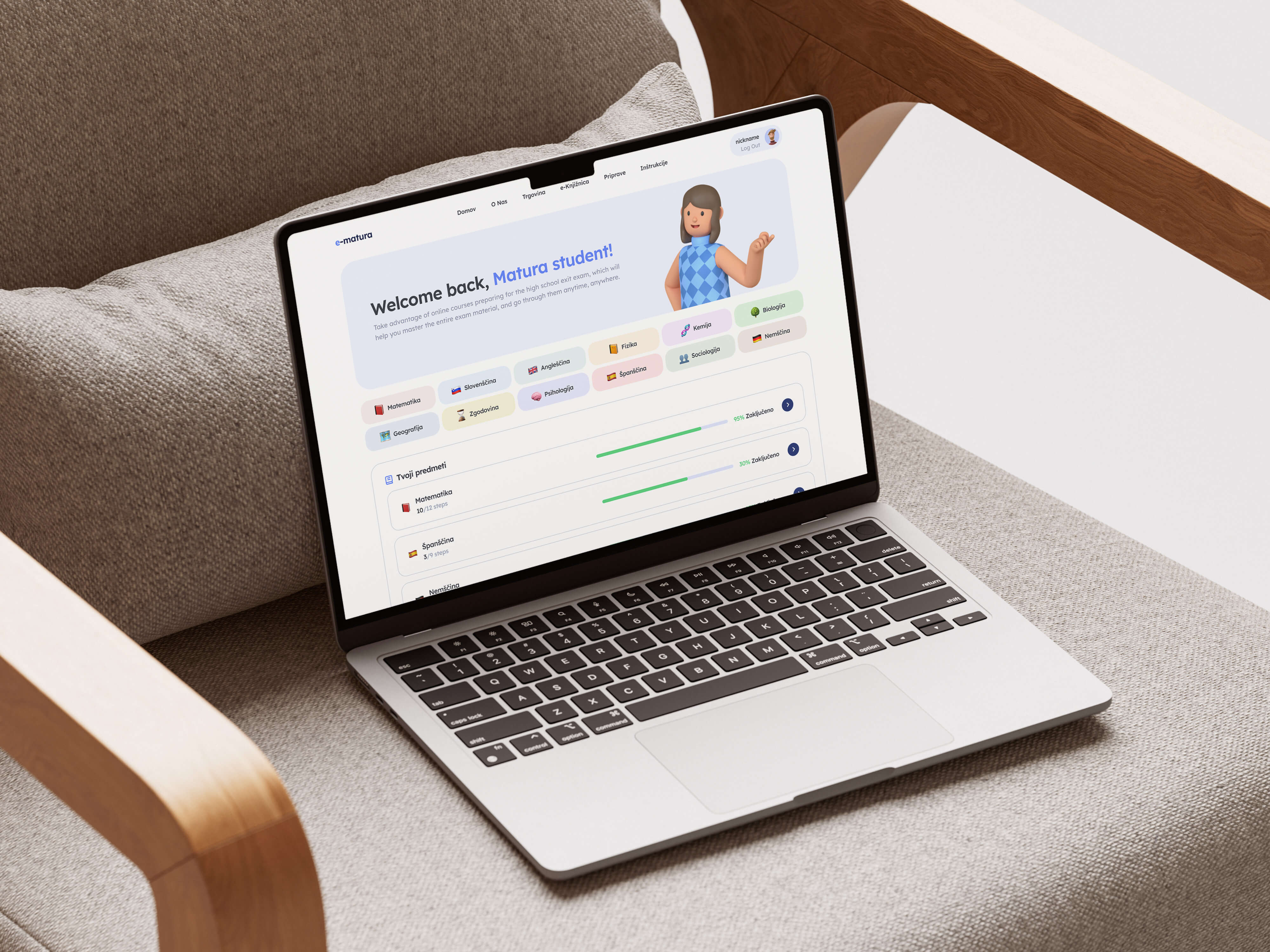
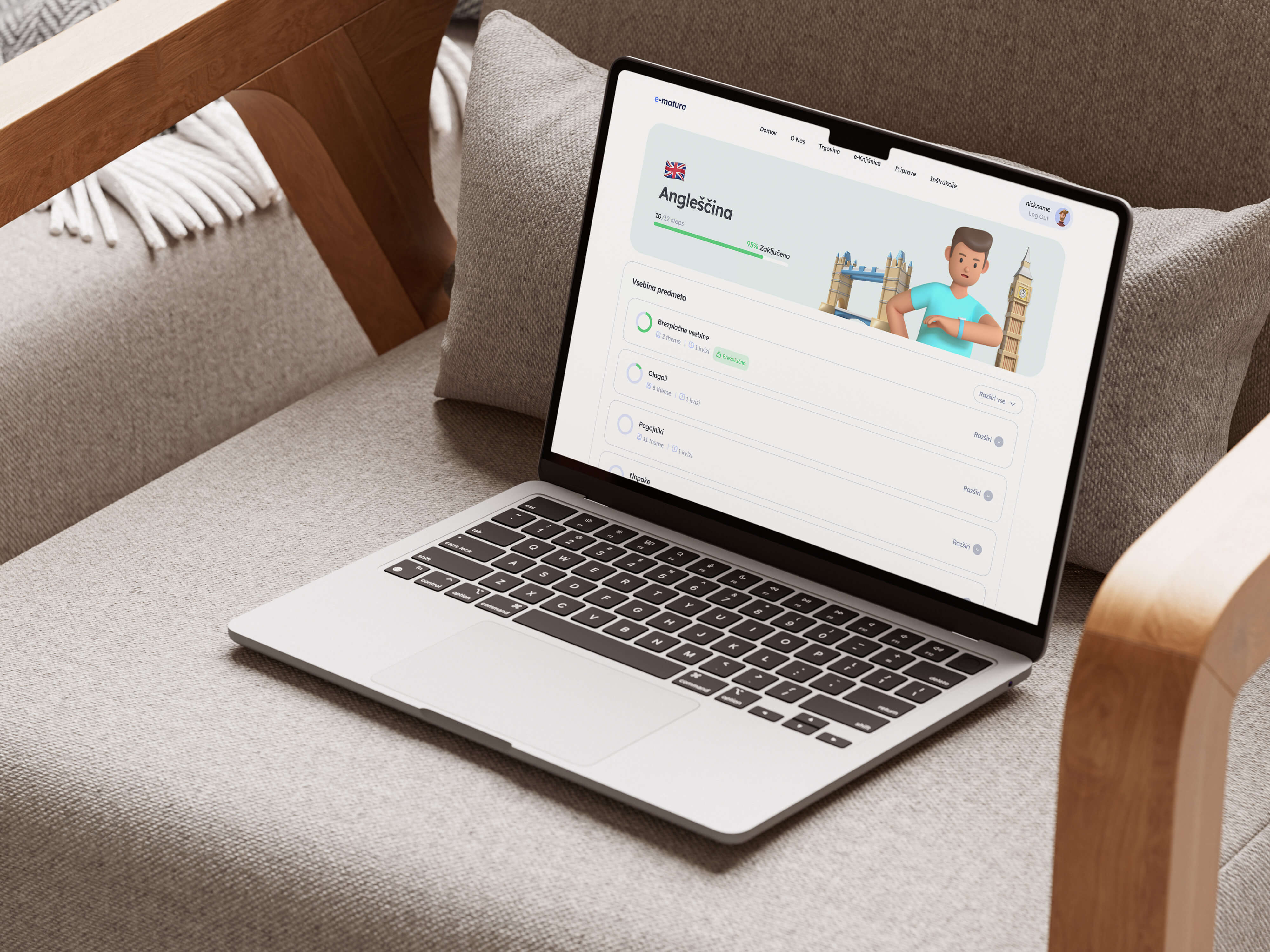
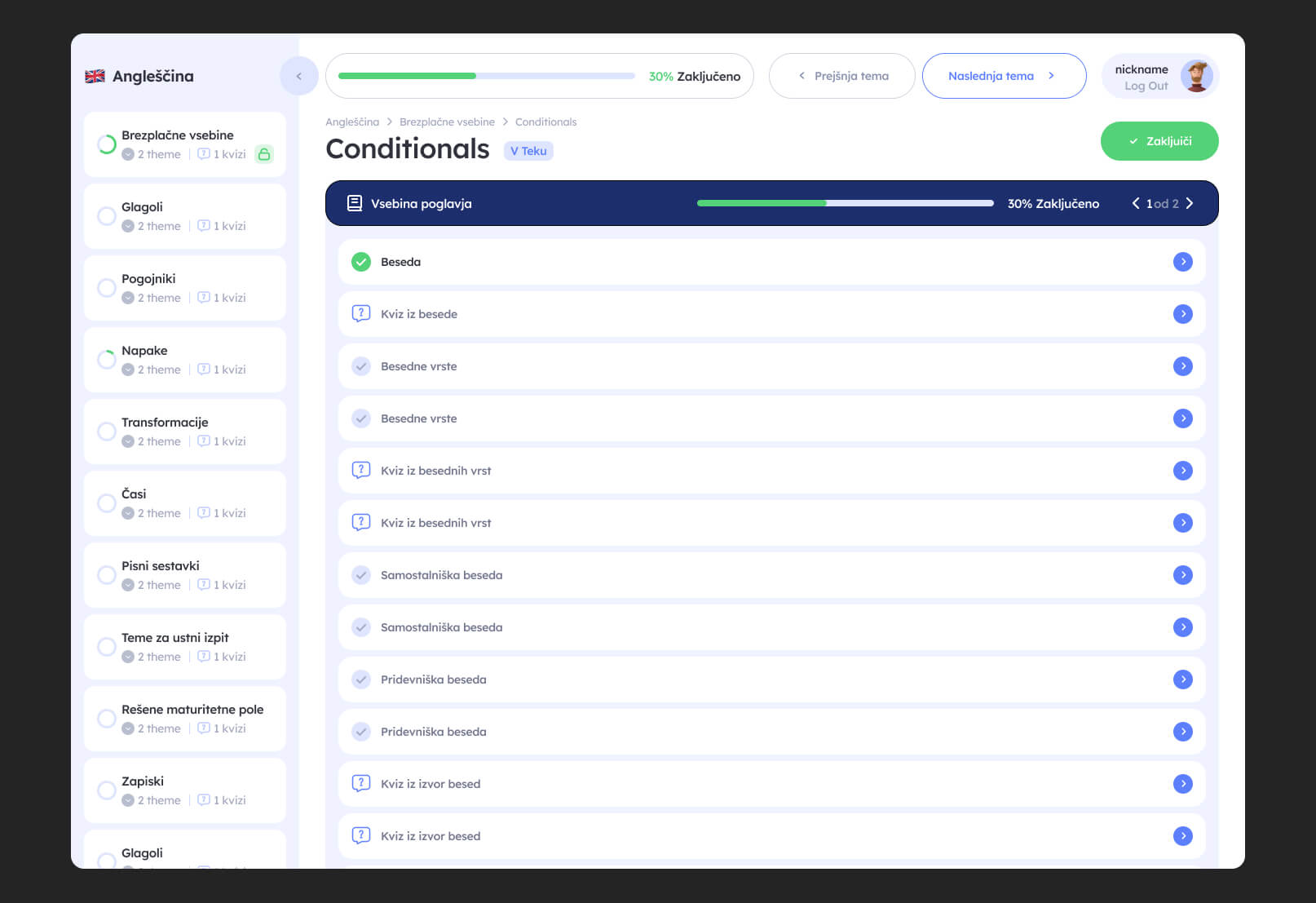
The platform architecture was built around clear progression logic, allowing students to quickly understand where they are in the learning journey, what topics are completed, and what should be studied next. Instead of presenting content as a large unorganized library, lessons and materials were grouped into structured modules with clear hierarchy and pacing.
Special attention was given to balancing guidance with flexibility. Students can follow predefined learning paths or revisit subjects independently depending on their preferred study style. Navigation patterns and layouts were intentionally simplified to minimize distractions and keep focus on learning tasks rather than interface complexity.
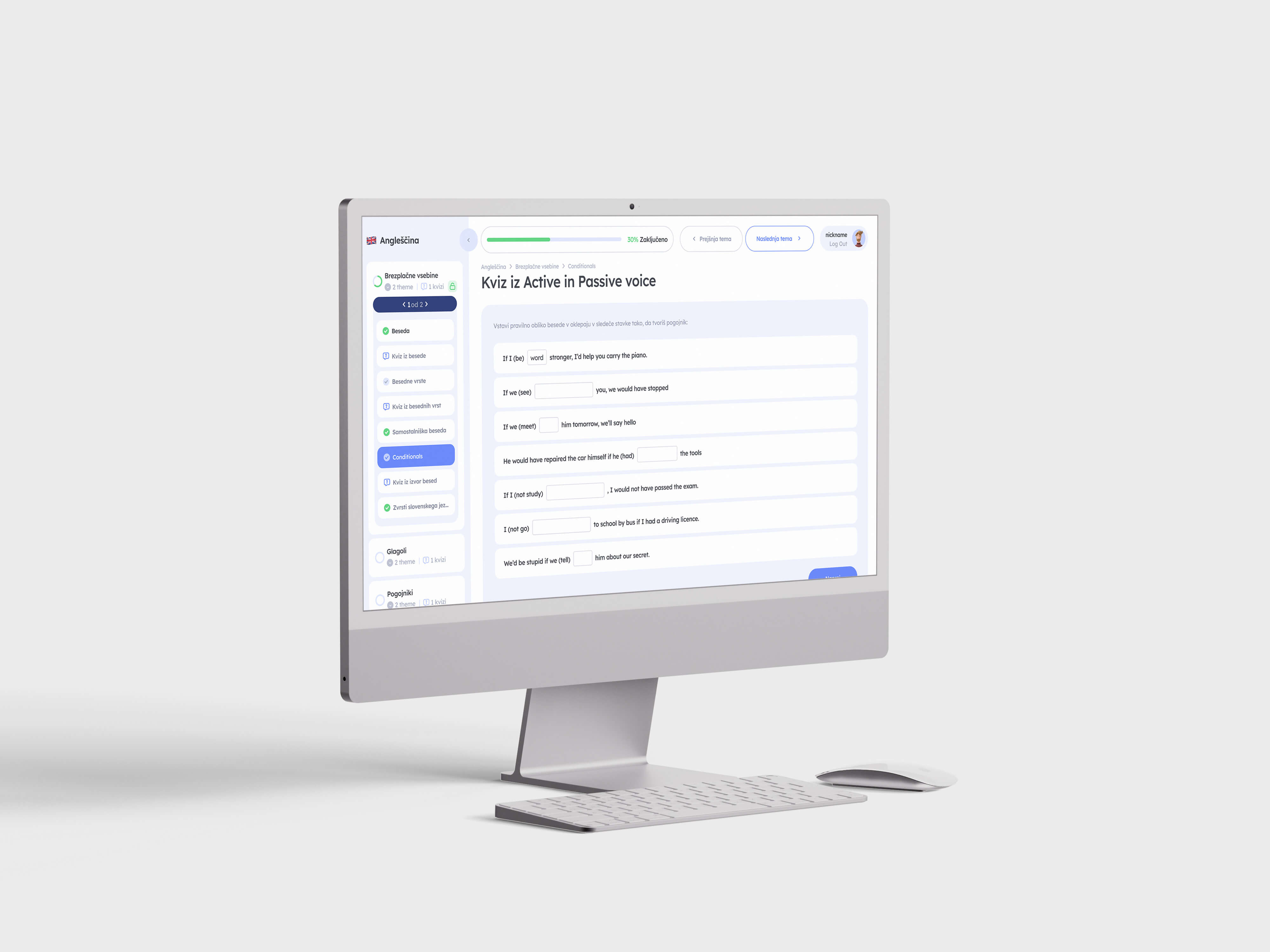
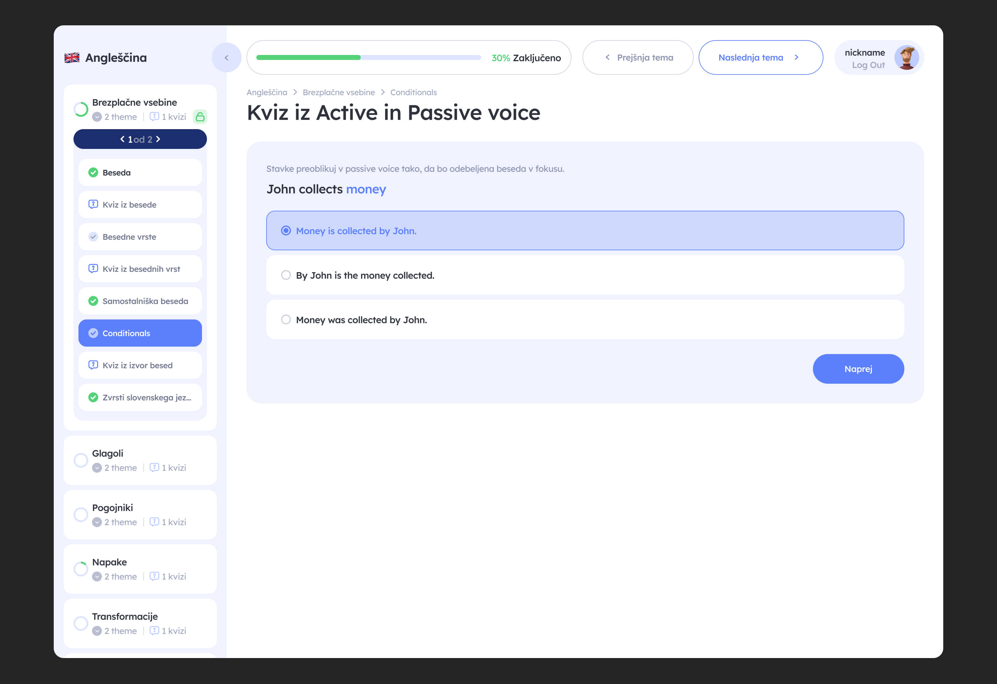
Interactive elements such as quizzes, lesson completion states, and progress tracking were integrated directly into the flow to reinforce motivation and provide continuous feedback. The overall UX direction focused on creating a calm, supportive learning environment that encourages consistency and reduces the feeling of being overwhelmed during exam preparation.
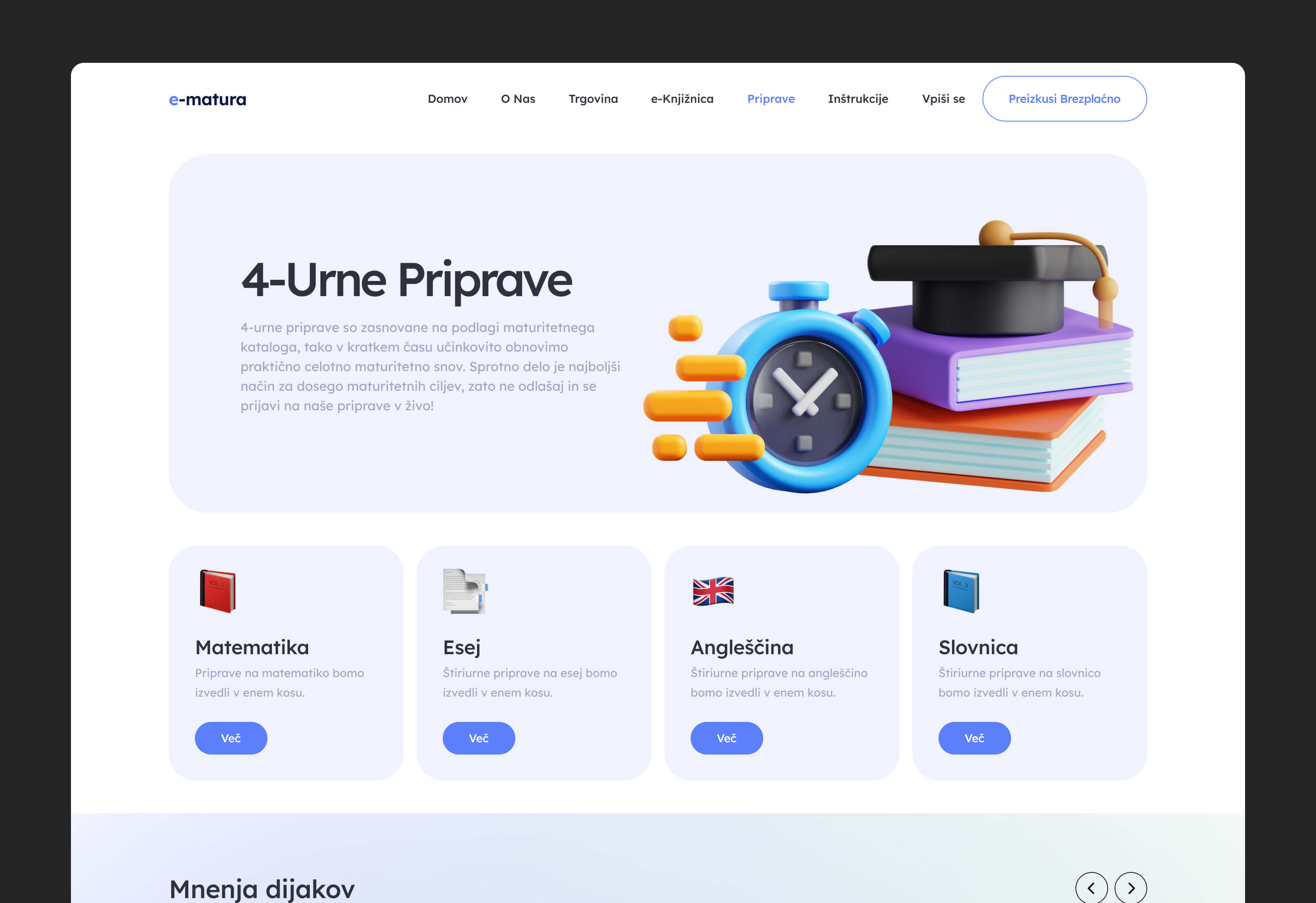
interface design
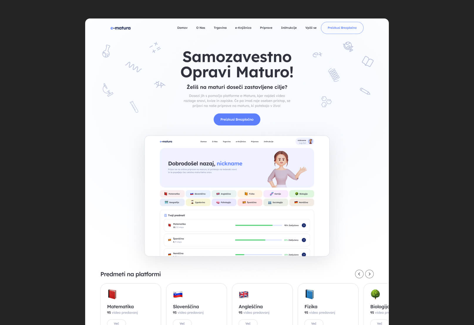
The interface design was built around clarity, focus, and reducing stress during the learning process. Since students spend long periods interacting with educational content, the visual system needed to feel approachable and motivating without becoming distracting or visually overwhelming. The design direction combines structured layouts with softer visual elements to create a balance between discipline and accessibility.
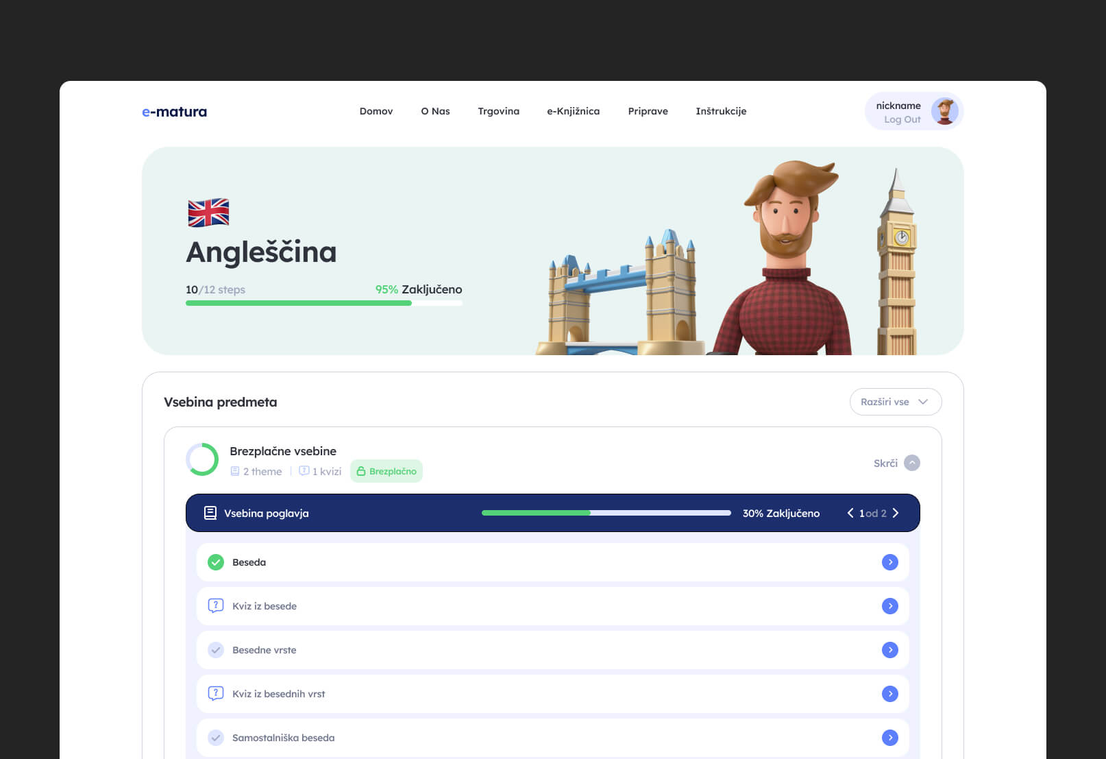
A strong emphasis was placed on hierarchy and progression visibility. Lessons, modules, quizzes, and subject categories were organized through clear spacing, typography scales, and color coding to help students quickly orient themselves within the platform. The UI intentionally avoids unnecessary complexity, allowing educational content to remain the primary focus of the experience.
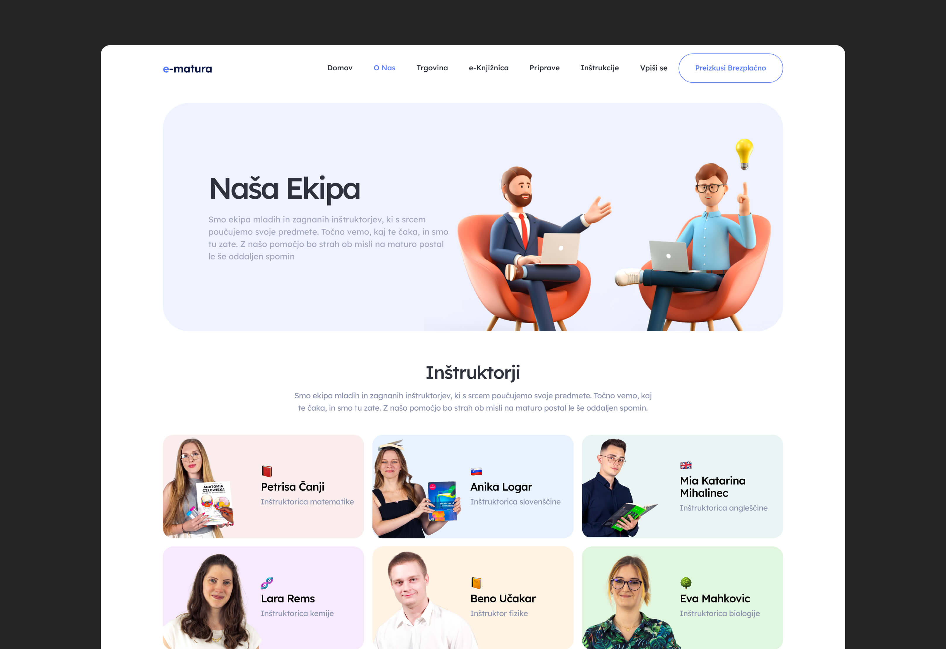
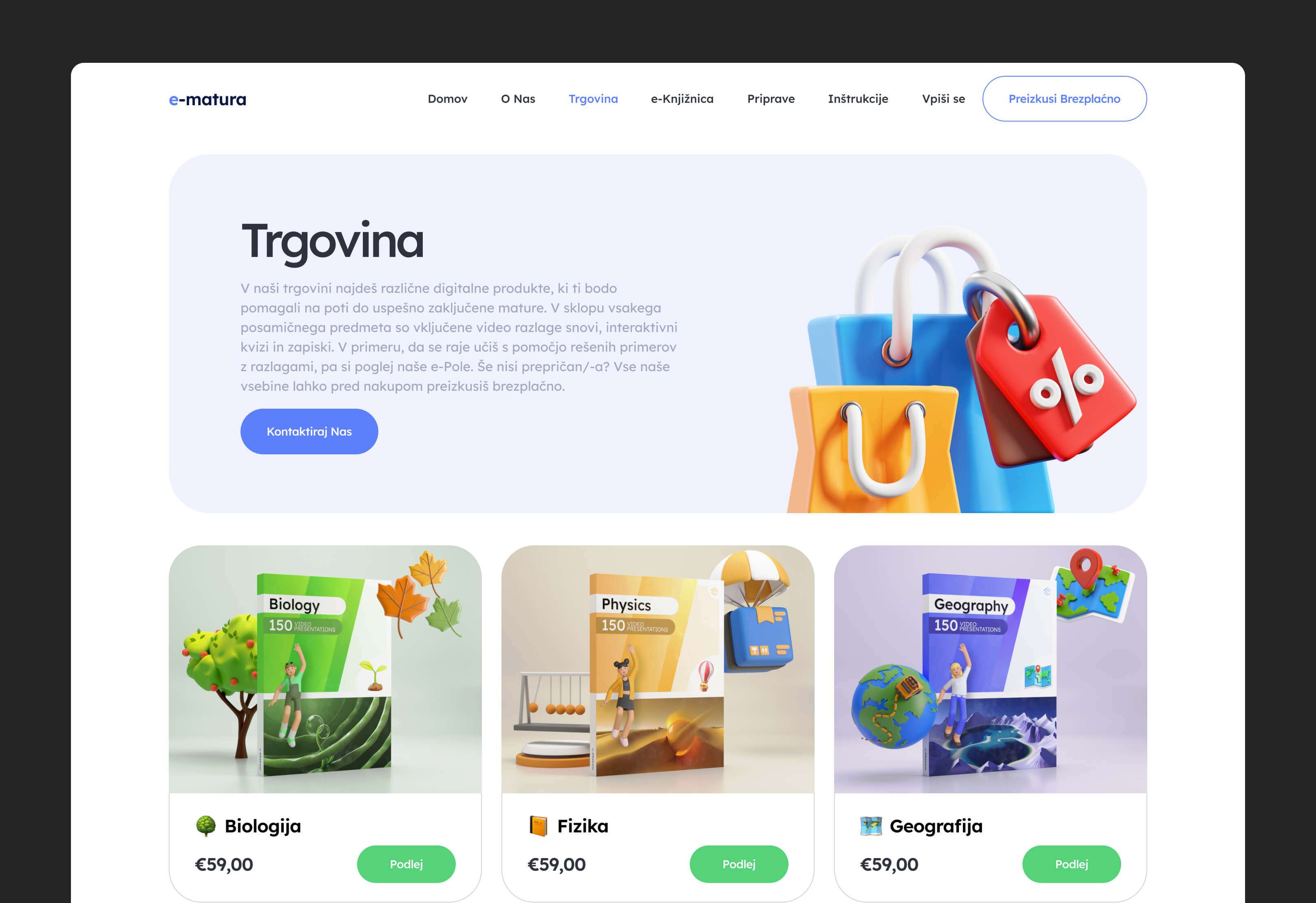
To give each subject a stronger identity and make navigation more memorable, custom 3D characters and objects were created for every learning category. Each figure visually represented its corresponding subject, turning abstract educational sections into more recognizable and emotionally engaging experiences. These 3D elements became a core part of the platform’s visual language, appearing throughout dashboards, course sections, and promotional areas to create consistency and personality across the system
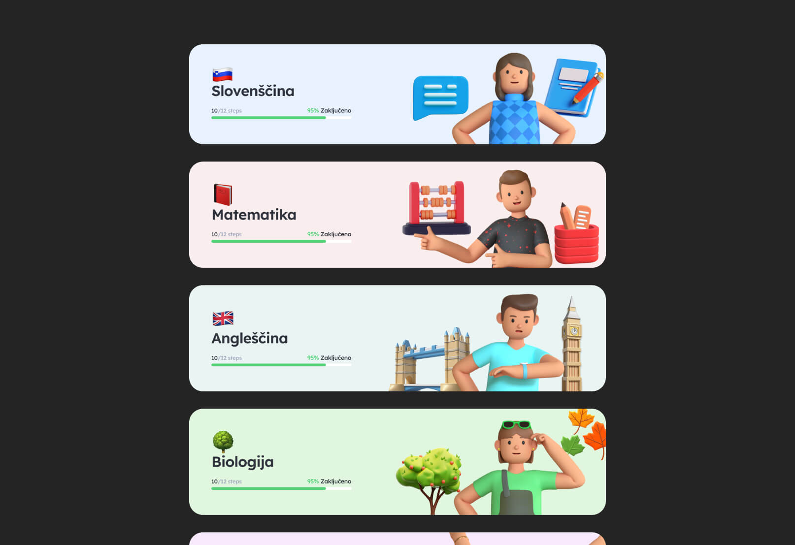
The visual direction also incorporated 3D educational objects and symbolic elements as part of the broader interface aesthetic. Rather than functioning as decorative assets only, these visuals helped reinforce subject differentiation, improve content recognition, and make the overall learning environment feel more dynamic and interactive for students
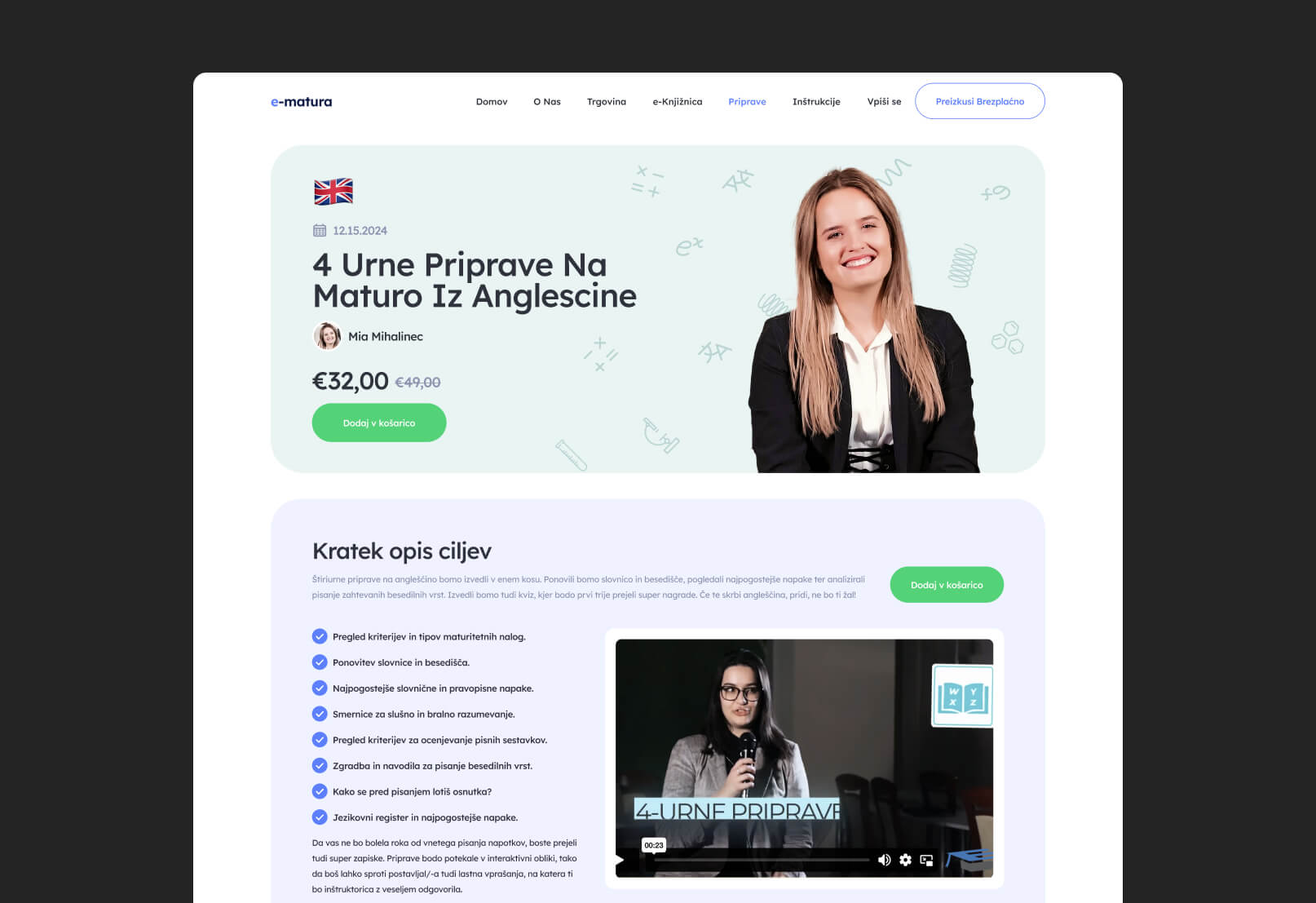
marketing site
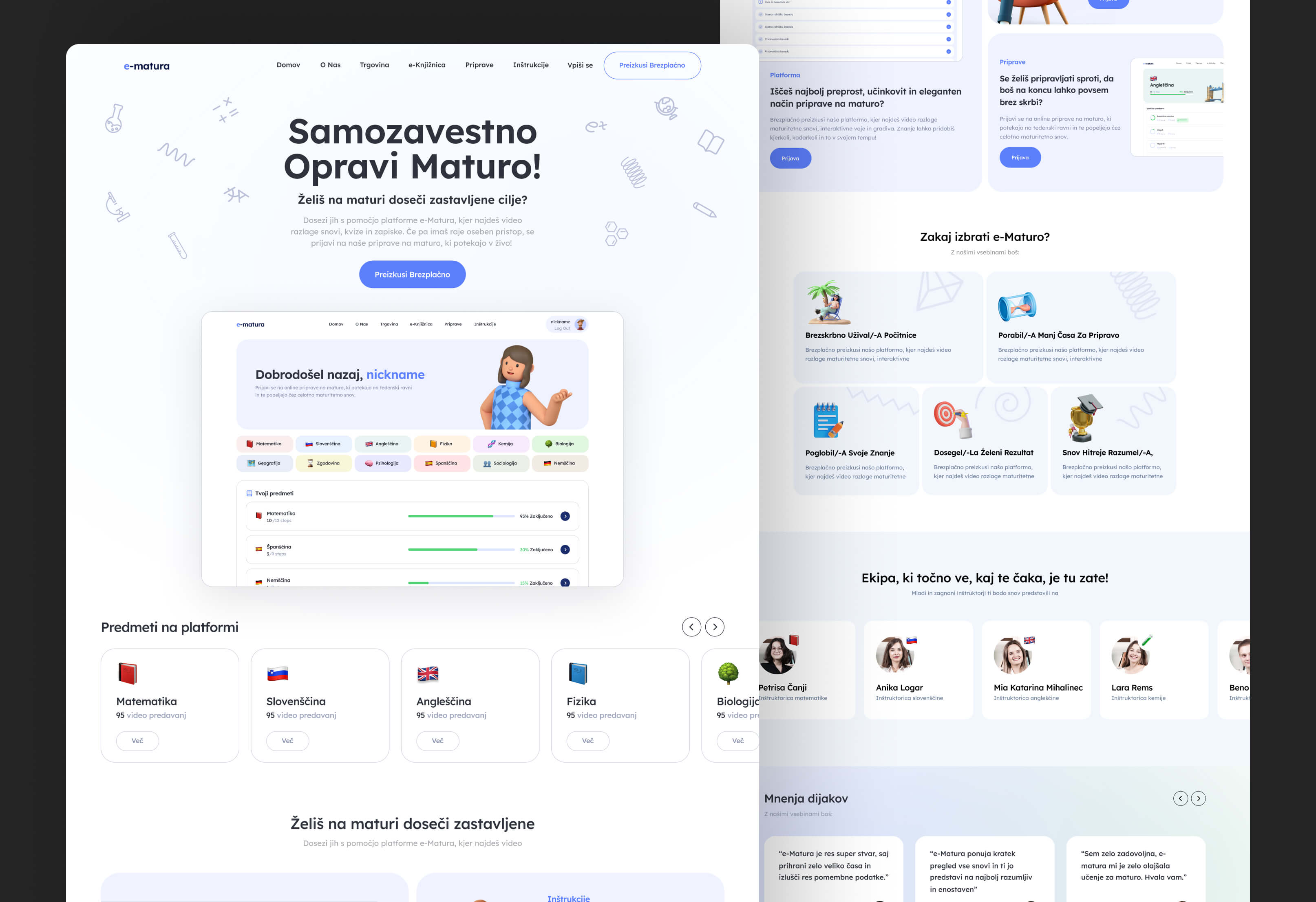
The marketing website was designed to make the educational platform feel approachable, motivating, and easy to understand for both students and parents. Since the product itself contains a large amount of structured educational content, the landing experience focused on simplifying communication and presenting the platform as a clear, guided learning system rather than a traditional online course library.
The visual direction combines clean layouts with more expressive and energetic elements to create a balance between trust and engagement. Bright accents, strong typography hierarchy, and modular content sections were used to break down information into digestible blocks and maintain attention throughout the page. The structure was intentionally designed to support fast scanning while still allowing deeper exploration of features and benefits.
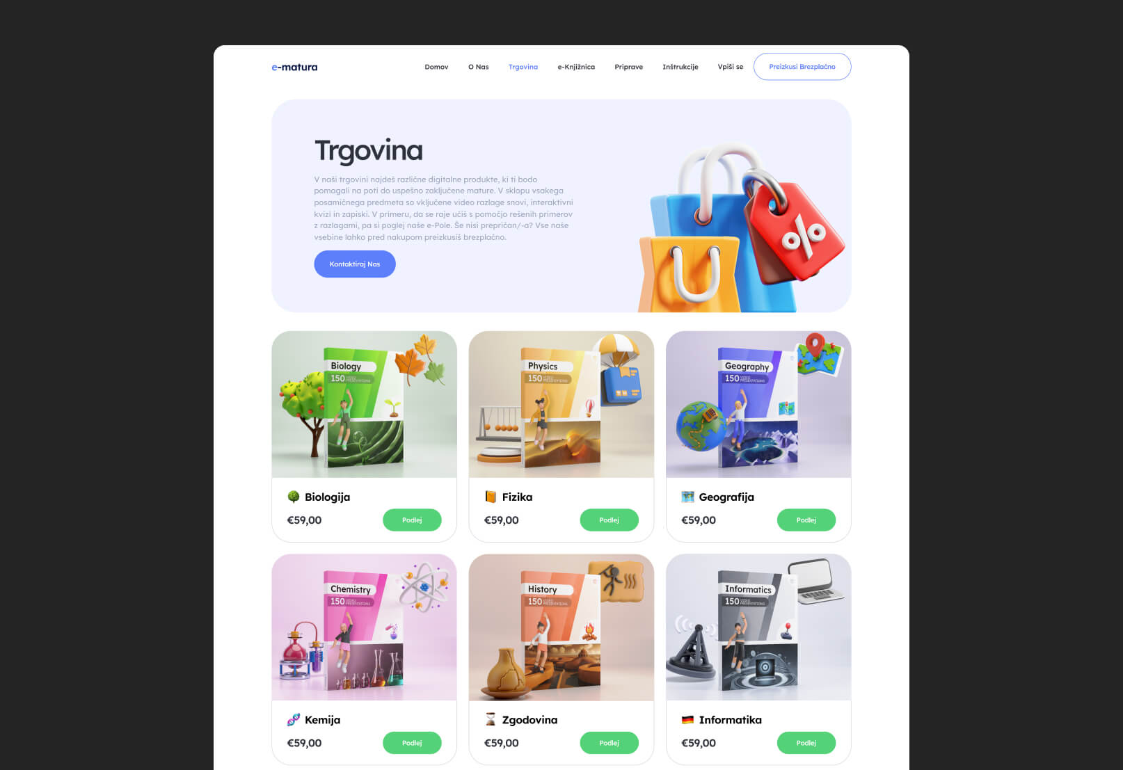
A key part of the visual identity was the integration of custom 3D characters and educational objects connected to different school subjects. These elements helped create a recognizable and playful visual system that differentiates the platform from more generic educational products. The 3D assets were used throughout hero sections, feature blocks, and promotional areas to reinforce subject identity and make the experience feel more interactive and memorable.
The overall interface direction aimed to communicate clarity, progress, and accessibility while still maintaining a modern, product-oriented aesthetic that feels engaging for younger audiences.
outcomes
The final result is a cohesive educational ecosystem that combines a structured learning platform with a visually engaging marketing experience. The product successfully transforms fragmented exam preparation into a guided and easy-to-follow system, helping students navigate complex subjects with more clarity and confidence.
The platform’s interface and UX structure create a more approachable learning environment by balancing educational discipline with motivational visual elements. The integration of custom 3D characters and subject-based visuals helped establish a distinct brand identity while also improving navigation and subject recognition across the system.
On the marketing side, the website effectively communicates the platform’s value proposition through a clear, engaging, and student-friendly experience. Together, the platform and marketing site form a scalable digital product that supports both user acquisition and long-term educational engagement.
project gallery