00
SaaS
dewey
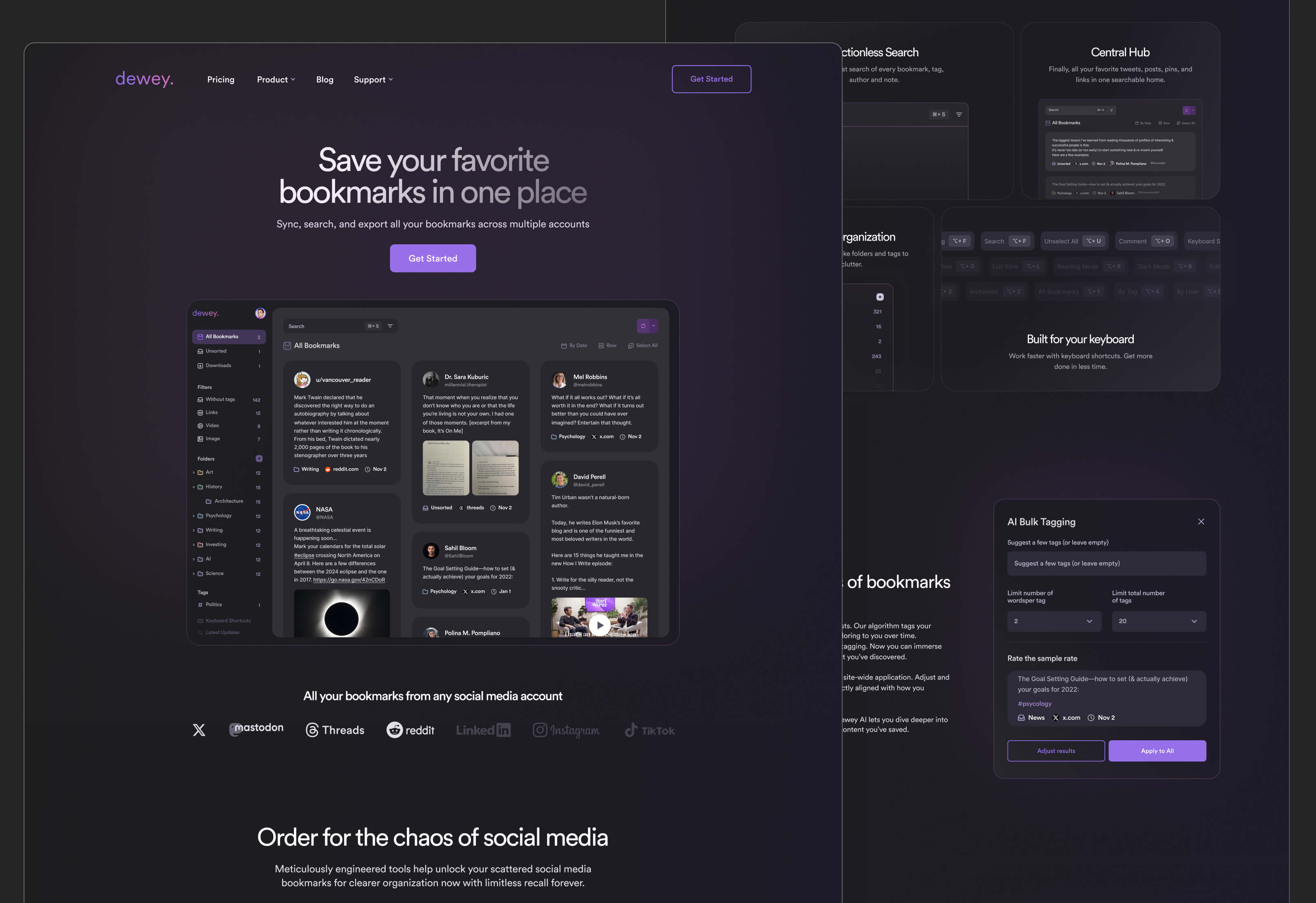
Dewey is a modern AI-powered platform designed to help users capture, organize, and rediscover content from across the web in one unified workspace. It focuses on turning scattered bookmarks and saved information into a structured, searchable knowledge system with smart tagging and filtering. The platform acts as a personal content hub where users can quickly save, categorize, and retrieve information, making it especially useful for research, content consumption, and knowledge management workflows.
challange
solution
how was the process going
discovery & analysis
After discussing the main goals and overall direction with the client, I immersed myself in the research phase.
problem analysis
audience analysis
competitor research
final direction
ux structure
The UX structure was built around simplifying the process of saving, organizing, and rediscovering content. One of the key goals was reducing friction between discovering information and storing it in a meaningful way.
user flow
wireframes
interface design
The color system was derived from the existing brand logo, which became the foundation for the overall visual direction of the product. Its palette helped define the tone of the interface and ensured that the final design remained aligned with the established brand identity while still feeling modern and functional in a digital environment.
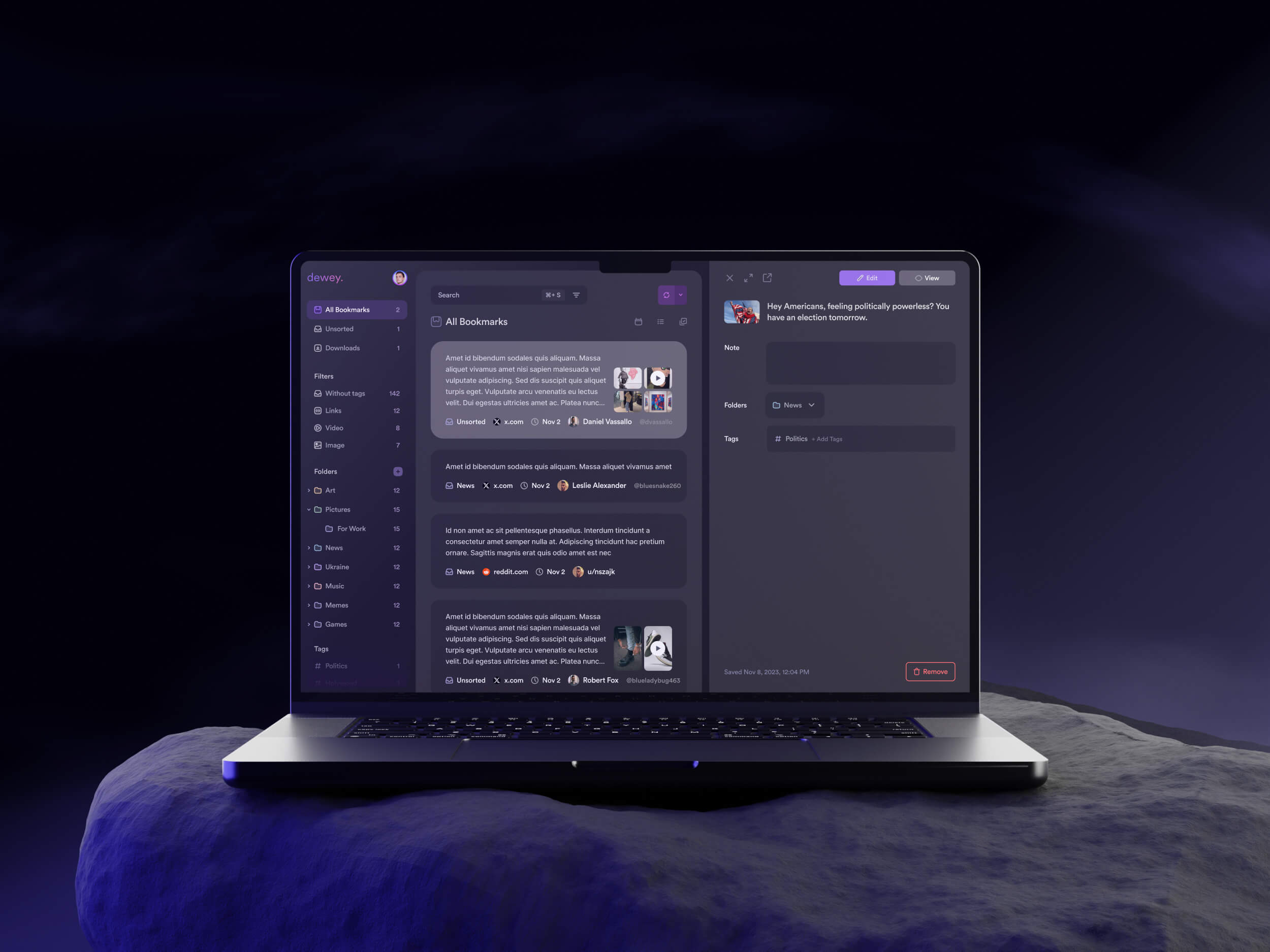
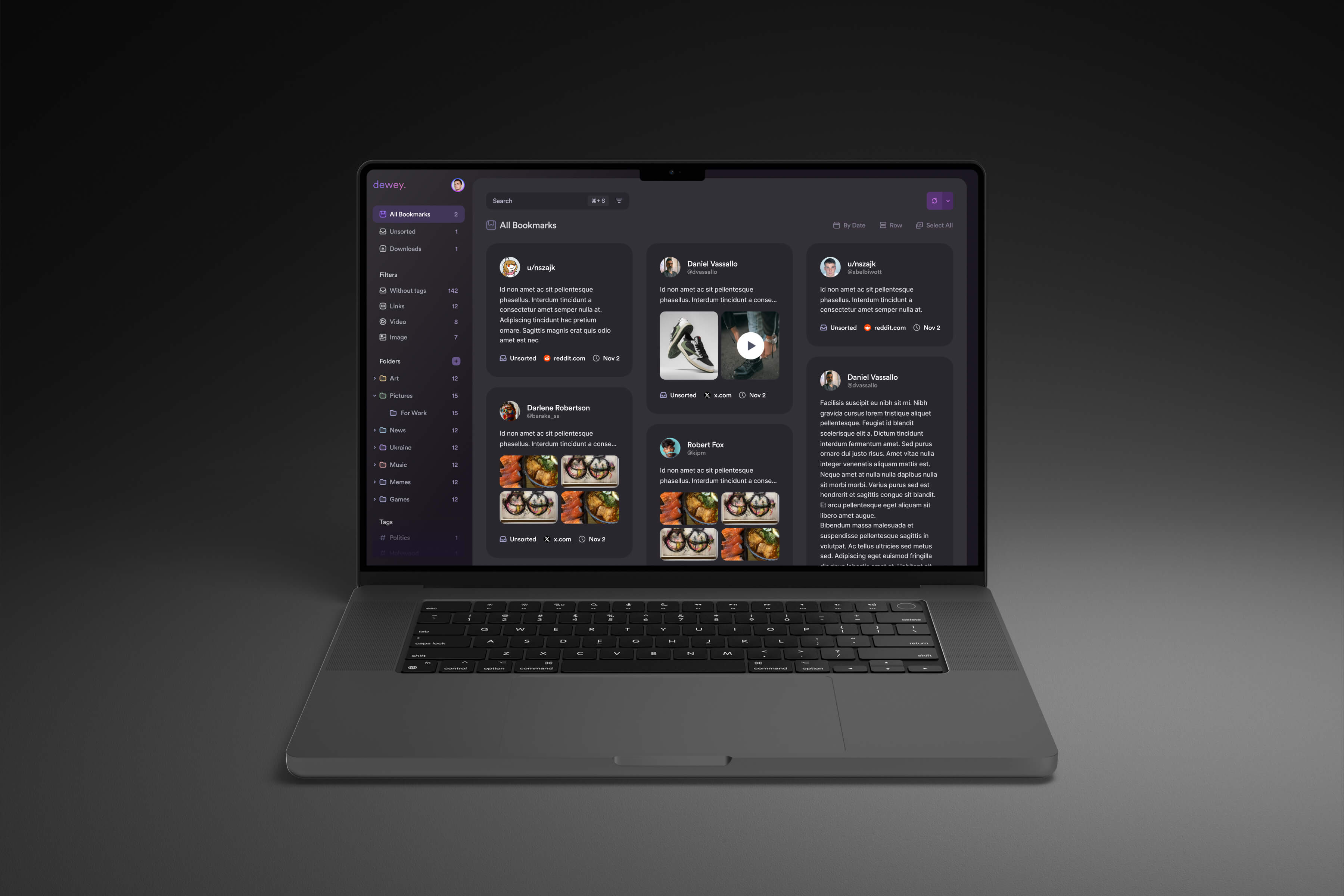
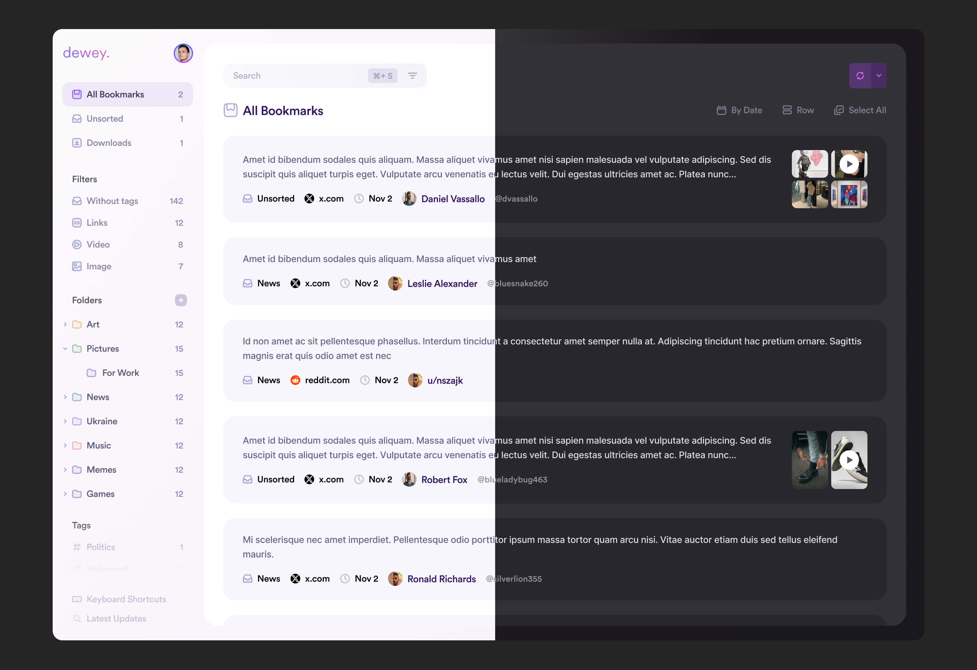
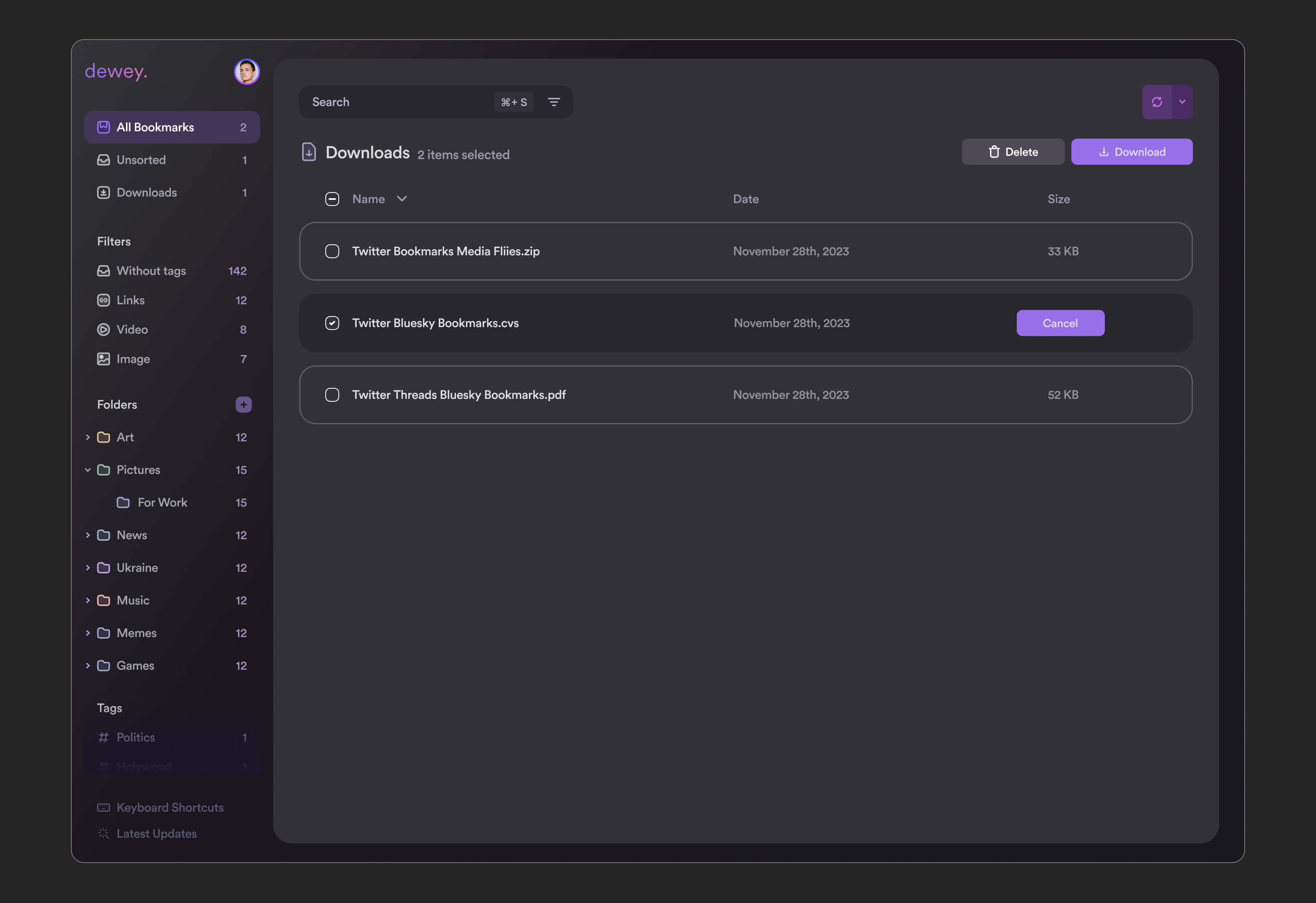
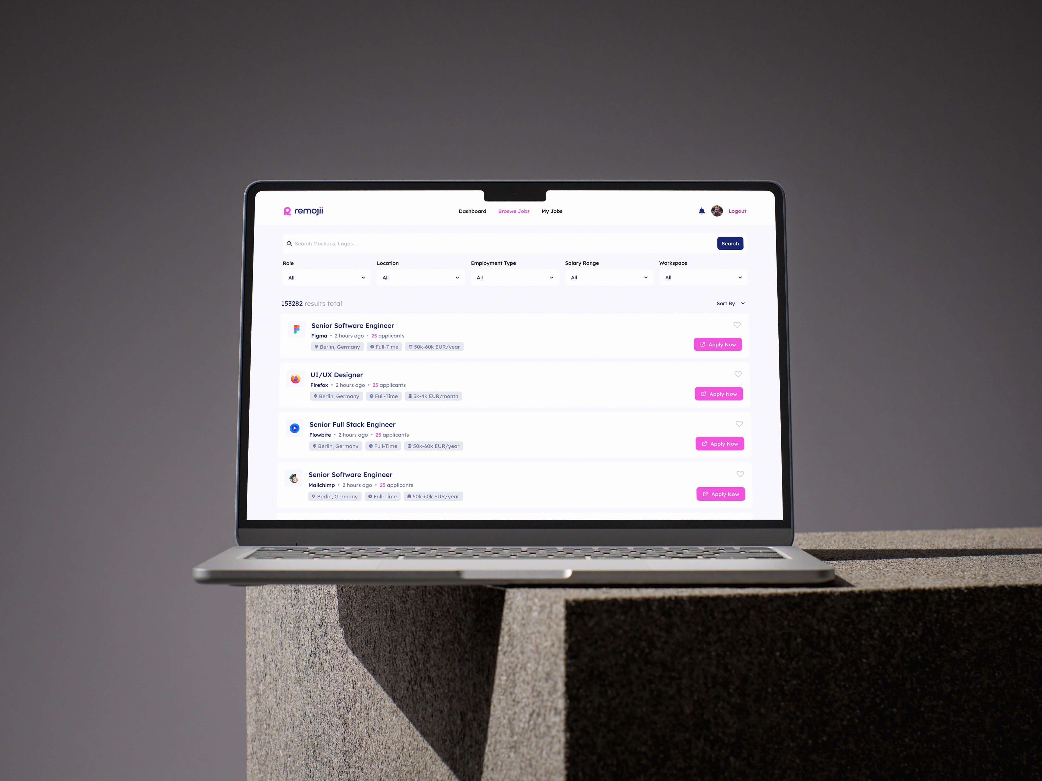
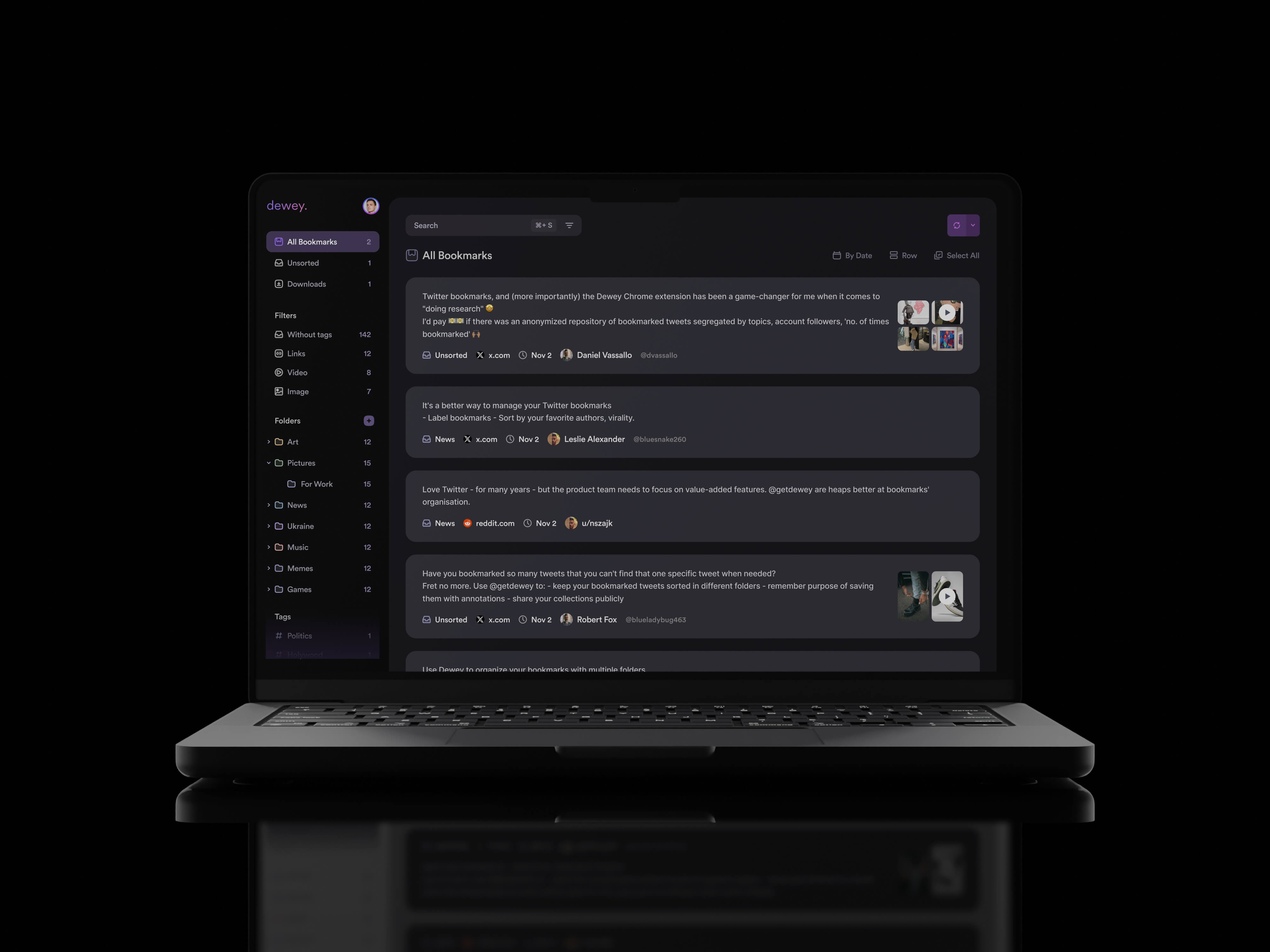
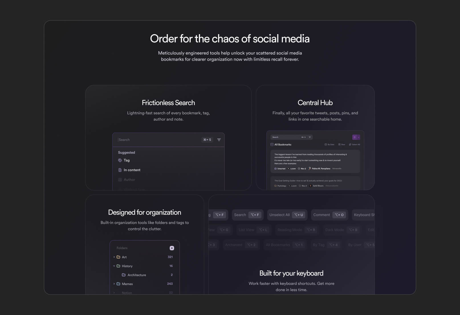
The interface design phase focused on creating a clean, modern, and distraction-free experience that could support large amounts of information without feeling overwhelming. Since the product revolves around content consumption and organization, readability and clarity became key priorities throughout the design process.
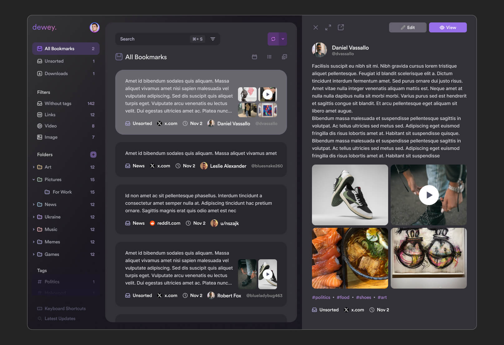
A minimal visual language was used to reduce cognitive load and help users focus on the content itself rather than the interface. Careful attention was given to spacing, typography, hierarchy, and component consistency to ensure the platform remained intuitive even as the amount of saved information grew over time
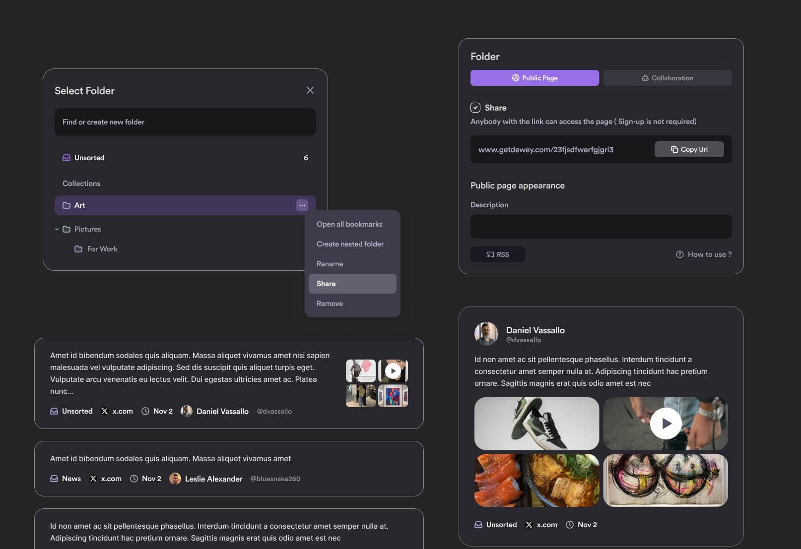
Special emphasis was placed on designing both light and dark themes. The goal was not simply to invert colors, but to create two fully balanced experiences optimized for different environments and user preferences. The light theme focused on clarity and cleanliness, while the dark theme was designed to feel comfortable during long reading or research sessions without sacrificing contrast or usability
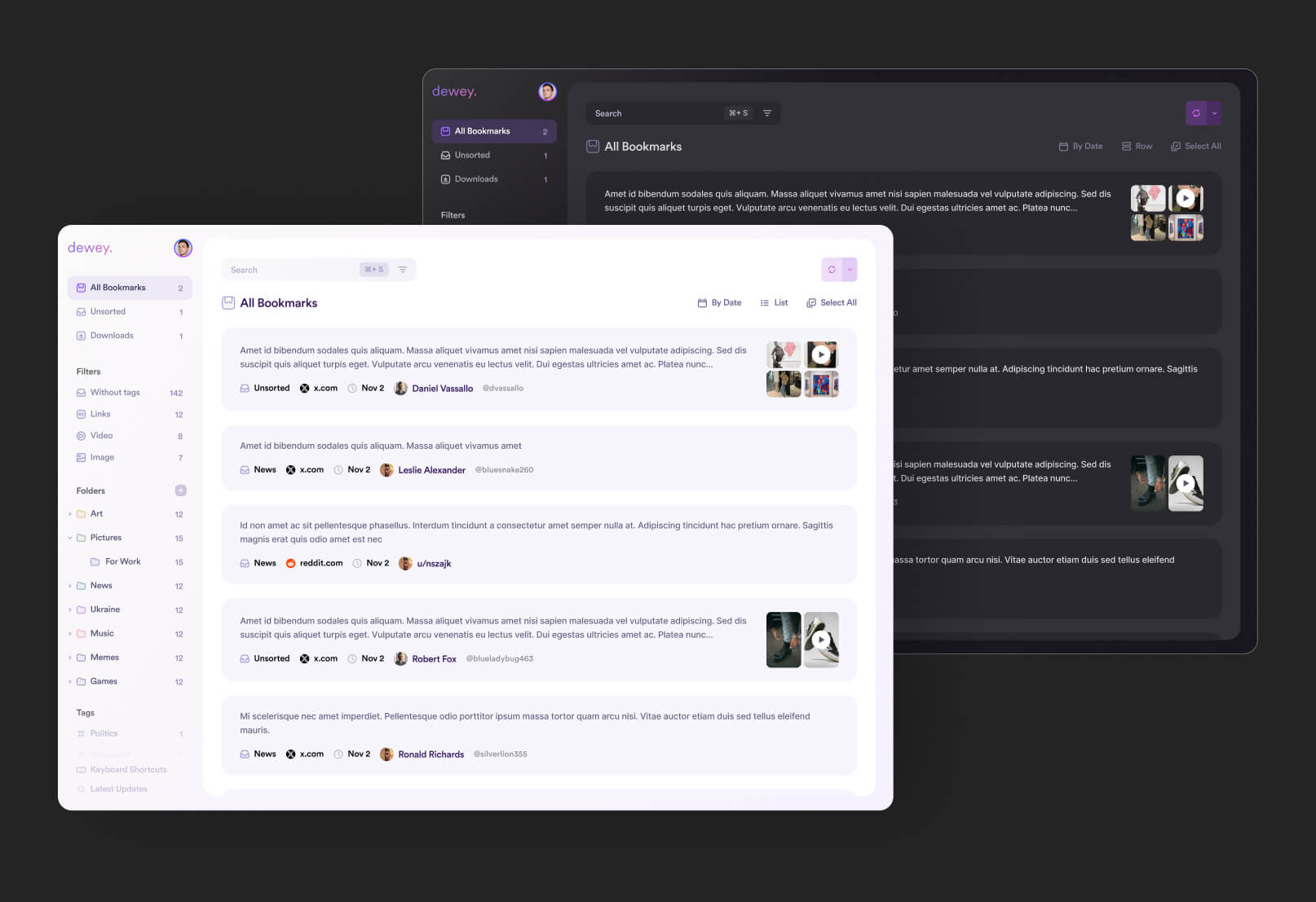
Interactive states, subtle transitions, and consistent UI patterns were also introduced to make navigation feel smoother and more responsive. Together, these decisions helped create a polished and scalable interface system that supports both productivity and long-term usability
marketing website design
Alongside the product interface, a marketing website was also designed to clearly communicate the platform’s value and positioning. The main goal was to introduce the product in a simple and engaging way while explaining how the platform helps users organize and rediscover information more effectively
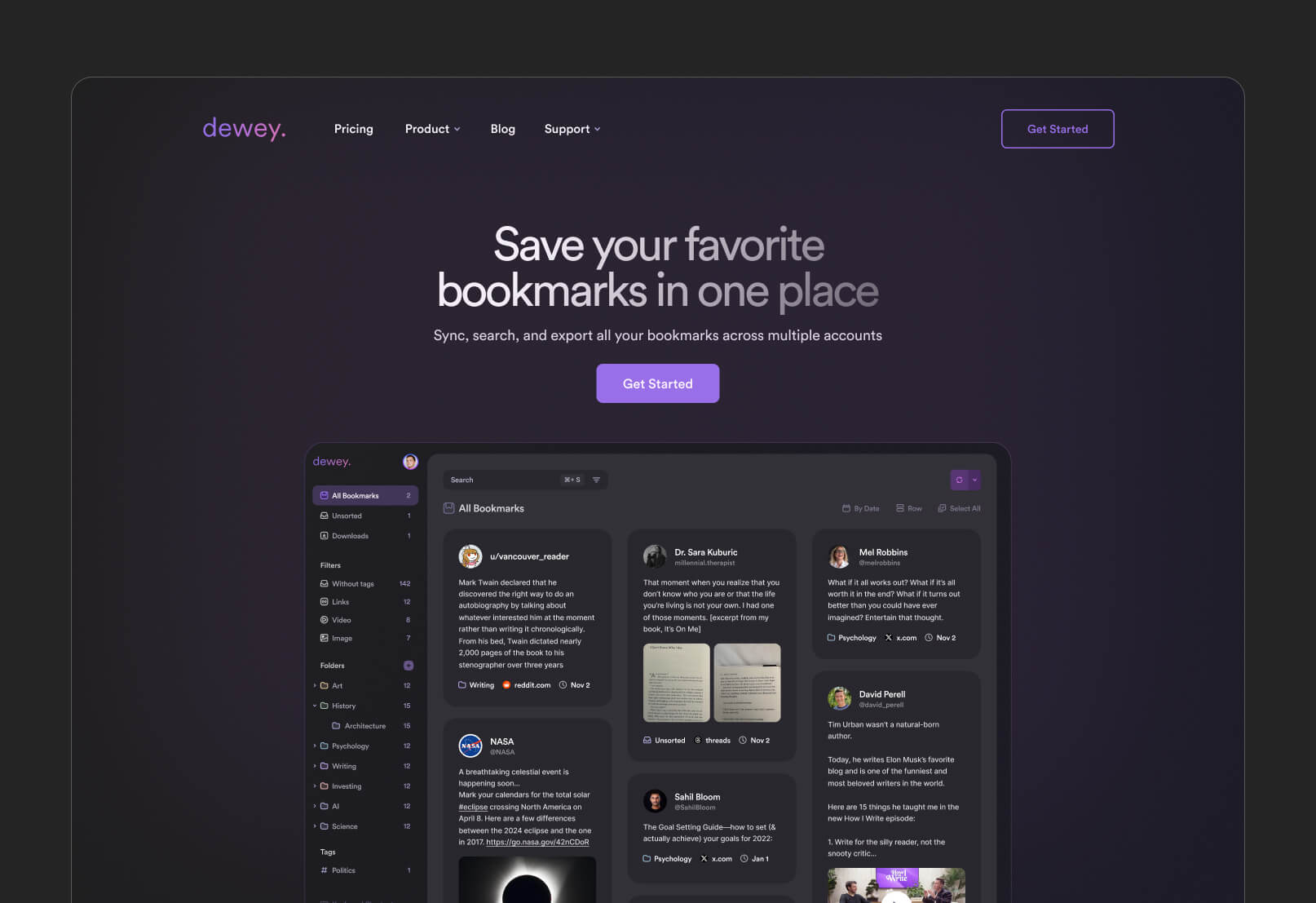
The website was structured around clarity and storytelling, gradually guiding users through the product’s core features, use cases, and benefits without overwhelming them with technical details. Strong emphasis was placed on visual hierarchy, concise messaging, and conversion-focused layouts to keep the experience intuitive and easy to follow.
The final result was a cohesive marketing experience that aligned with the product interface and helped establish a stronger, more recognizable brand presence
outcomes and results
The final result was a cohesive ecosystem consisting of both the product interface and marketing website, unified through a consistent visual language and user experience. The platform successfully transformed a potentially overwhelming content-management workflow into a cleaner and more structured experience focused on simplicity and usability.
The redesigned interface made saving, organizing, and rediscovering information feel significantly more intuitive, while the introduction of light and dark themes improved comfort and accessibility across different usage environments.
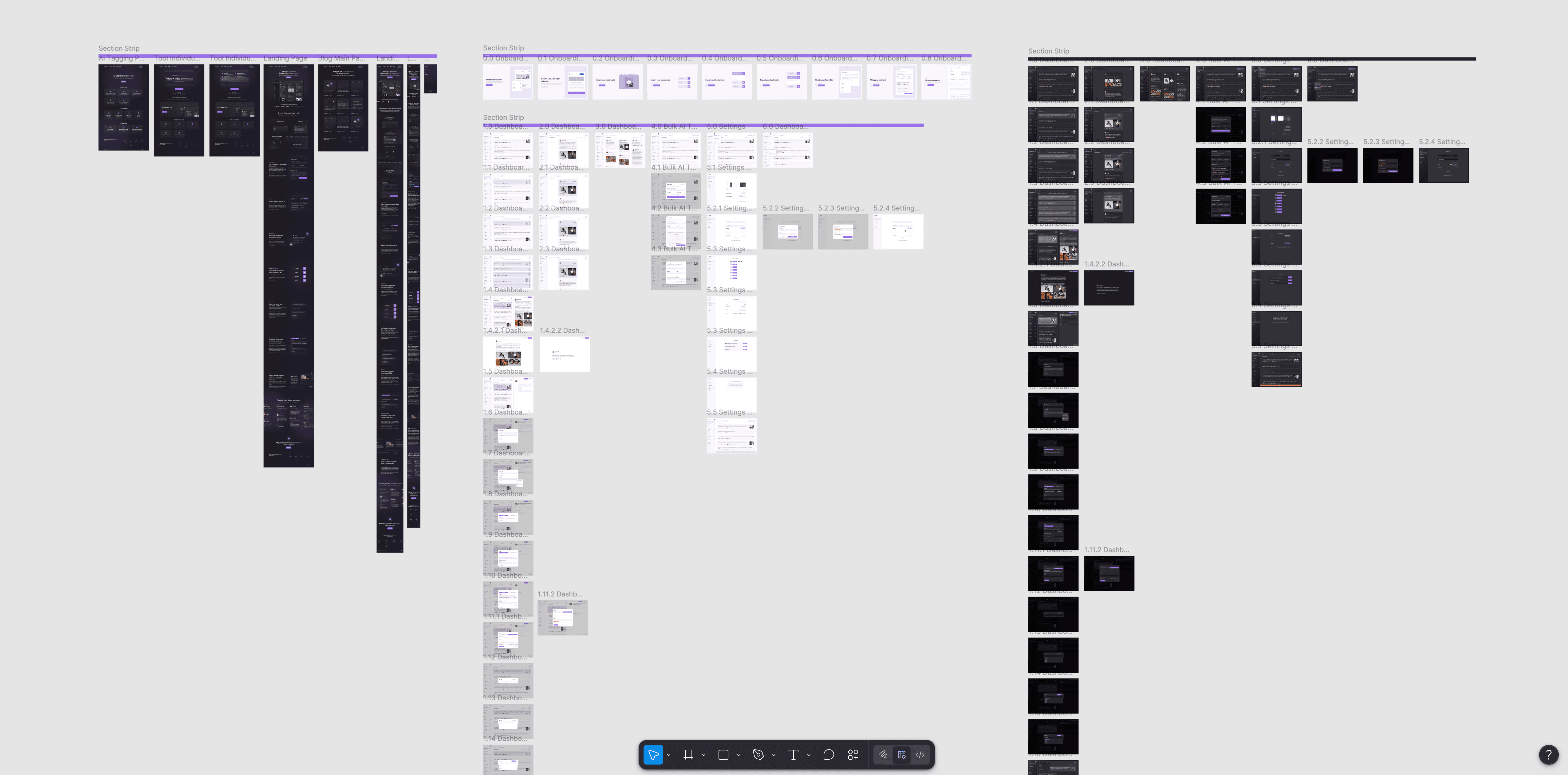
From a product perspective, the system became more scalable and easier to maintain thanks to the structured component-based design approach. The project files were organized using reusable components, variables, variants, and consistent naming conventions, simplifying both future iterations and developer handoff.
The marketing website also strengthened the platform’s positioning by communicating the product’s value more clearly and creating a stronger connection between the brand identity and the actual product experience.
Overall, the project resulted in a cleaner, more modern, and user-focused platform that balances simplicity, functionality, and long-term scalability.
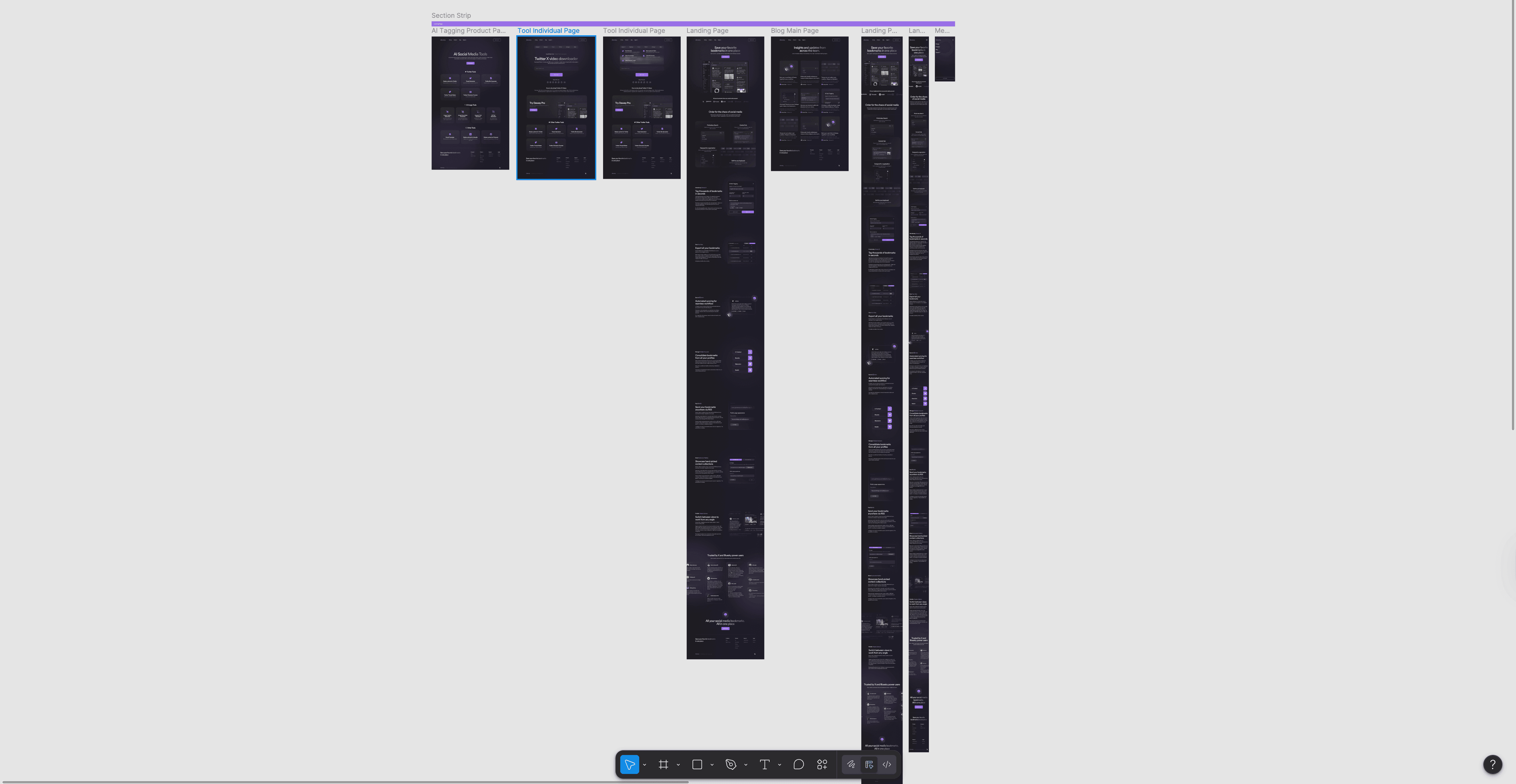
project gallery