00
EdTech
mextalki
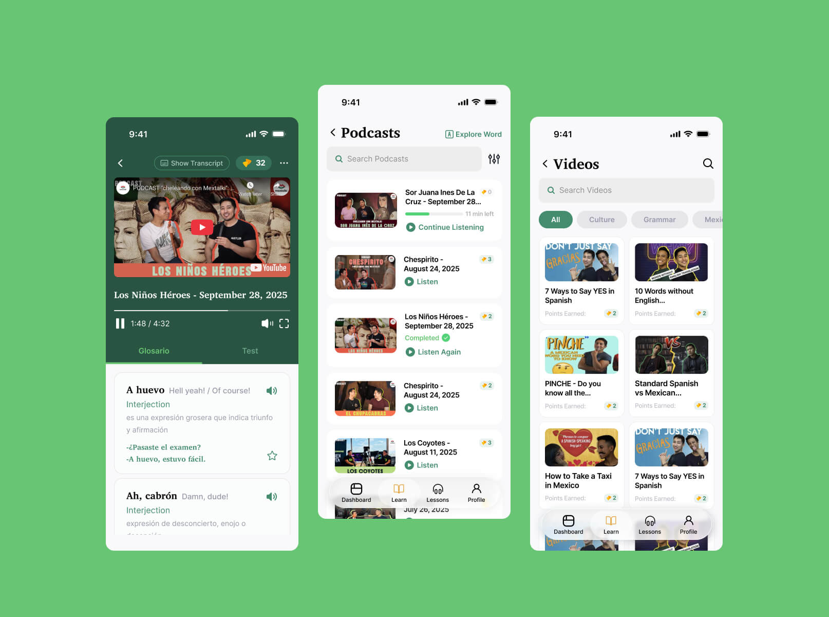
mextalki is an online platform for learning authentic Mexican Spanish through real conversations, live classes, podcasts, and cultural immersion. It focuses on helping students speak naturally and confidently by practicing with native speakers instead of relying only on traditional grammar-based learning
challange
solution
how was the process going
discovery & analysis
After discussing the main goals and overall direction with the client, I immersed myself in the research phase.
problem analysis
audience analysis
competitor research
final direction
ux structure
Once the research phase was completed and the overall direction was defined, I moved into the UX stage of the project. I started by creating a user map to properly structure the platform experience and understand how users would navigate between different parts of the ecosystem. On this stage I also created prototype before creating UI, but unfortunately didn't saved screenshots of the process. I will showcase it later with the U
user flow
wireframes
interface design
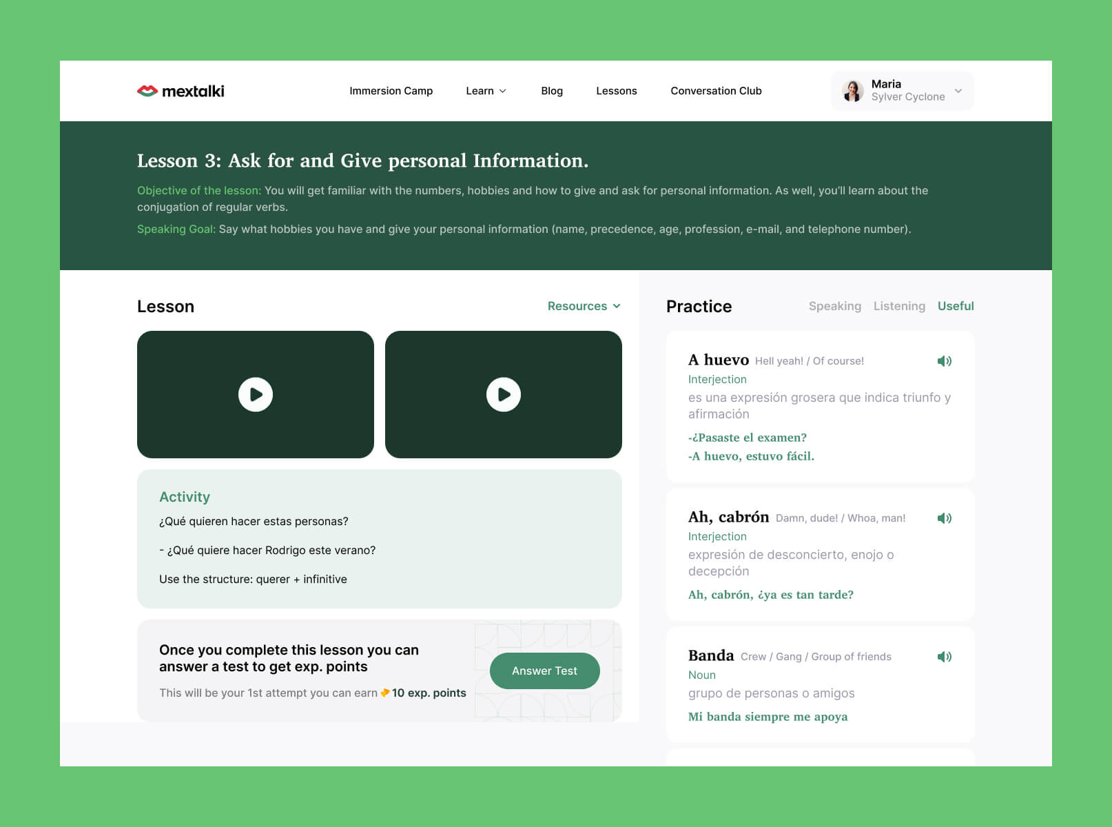
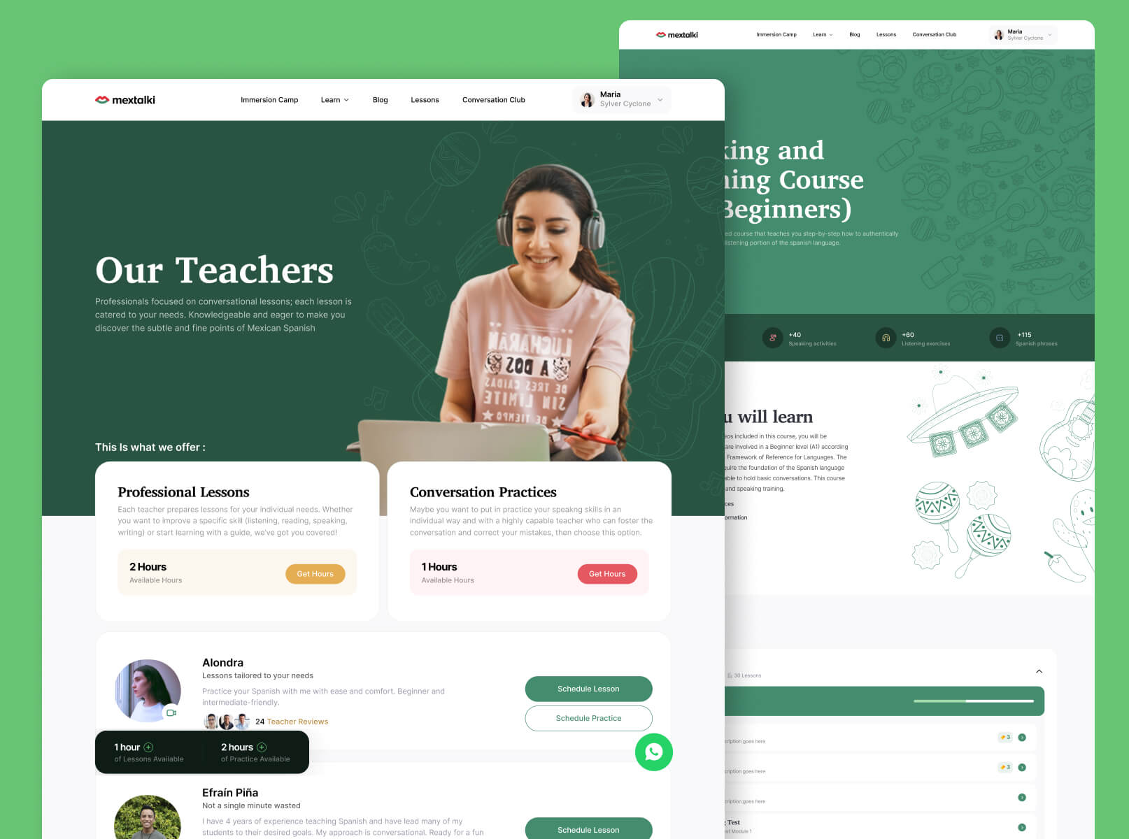
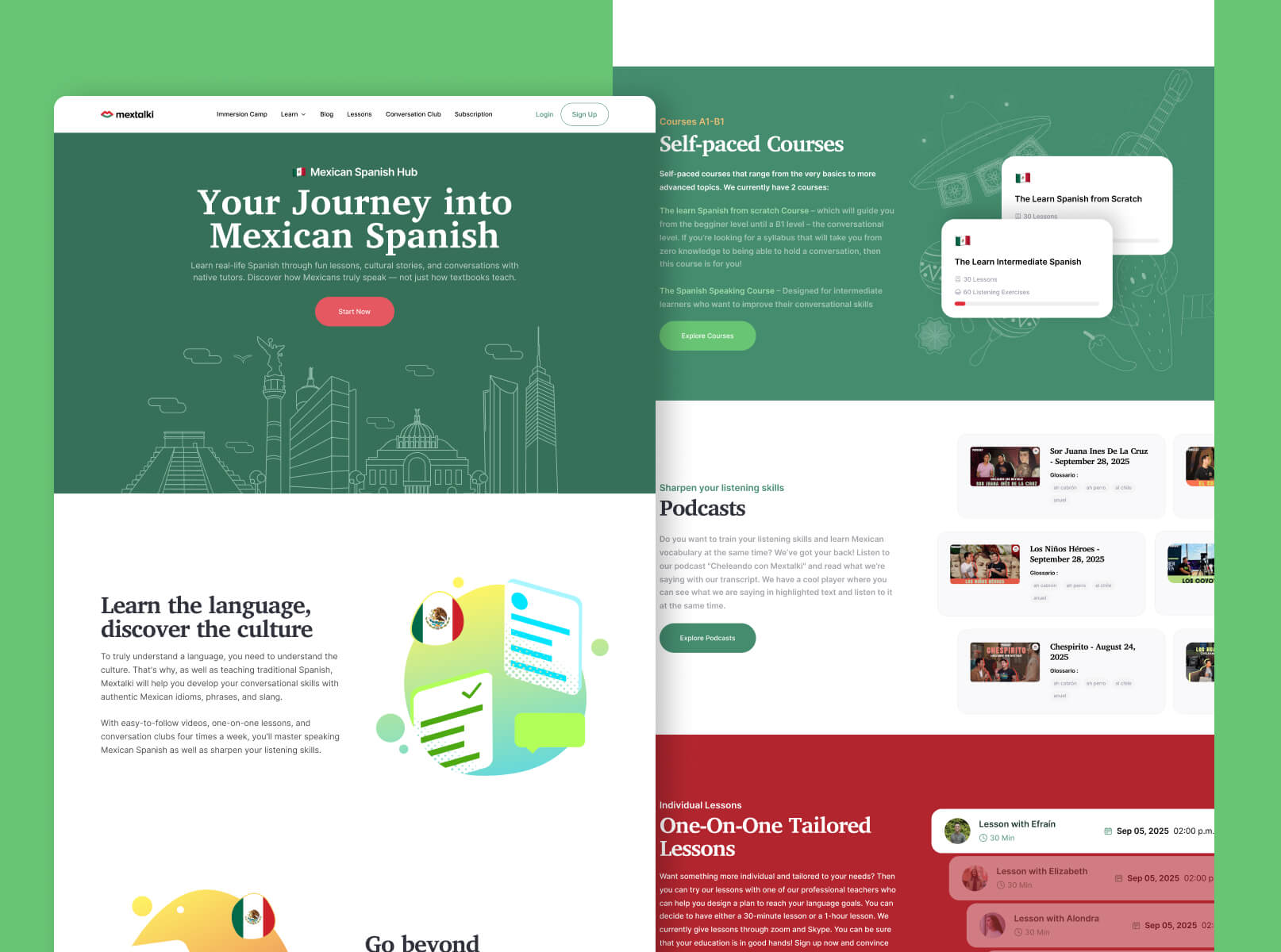
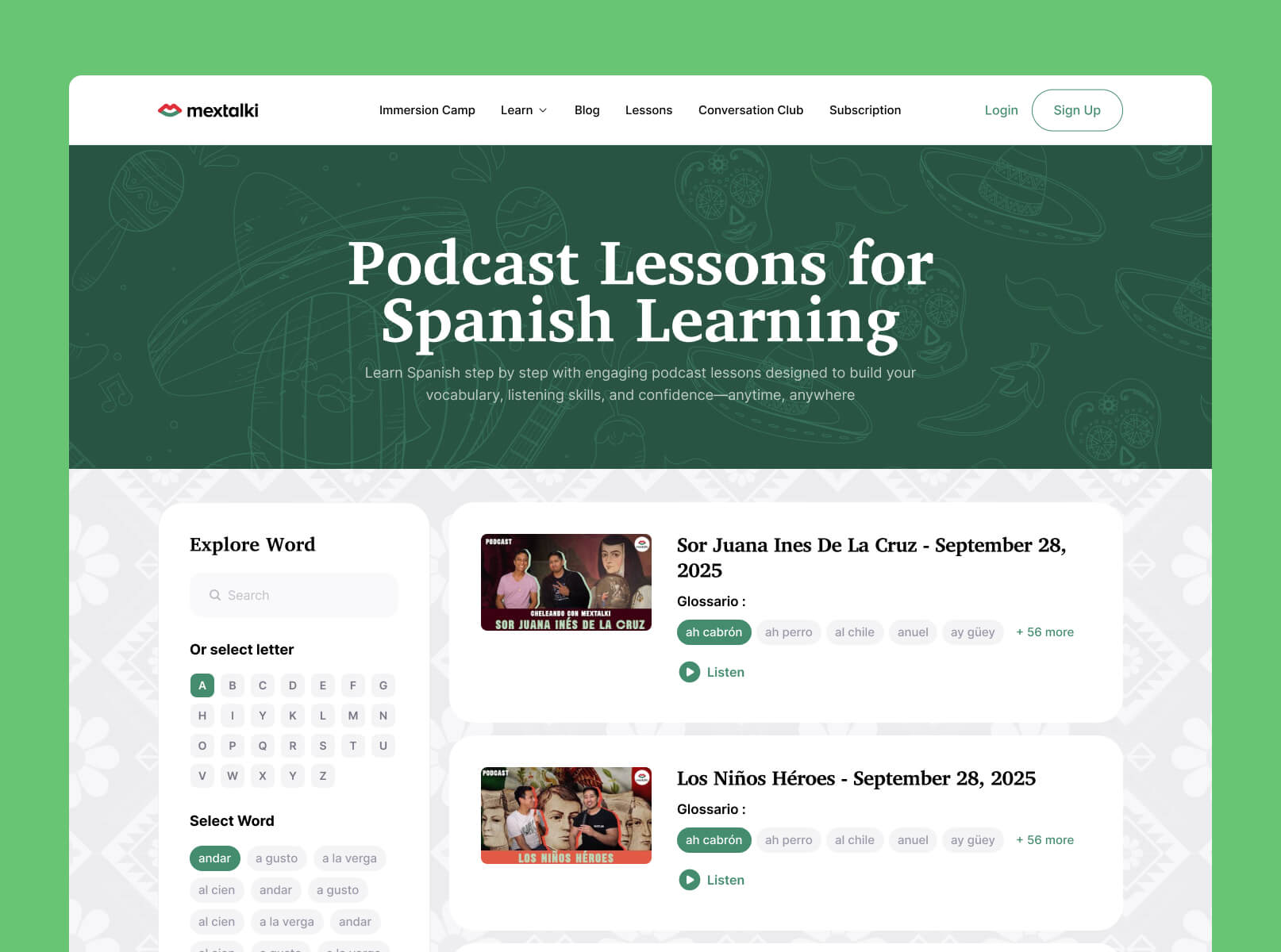
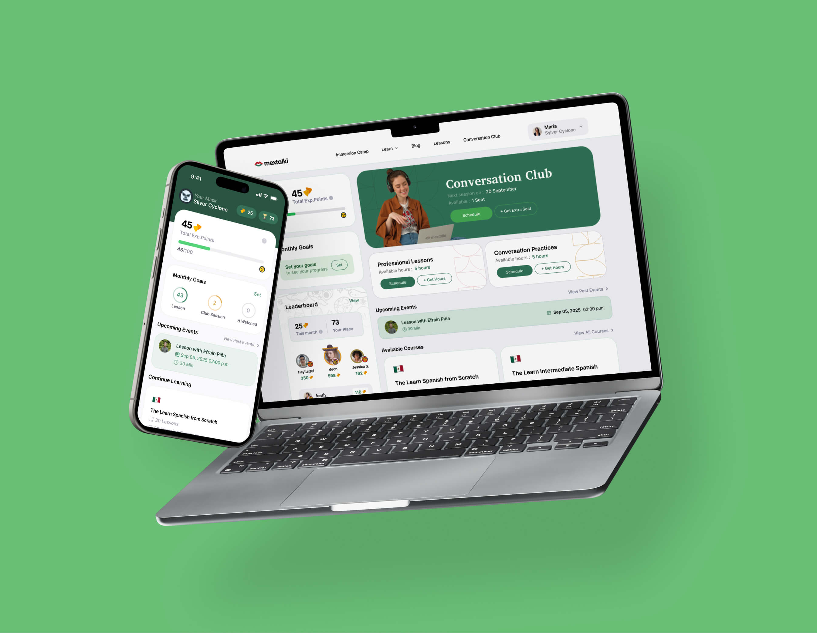
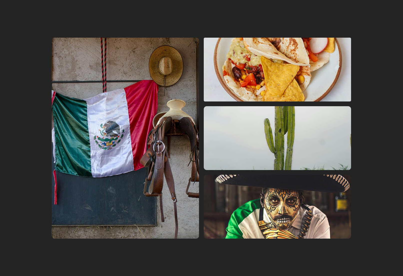
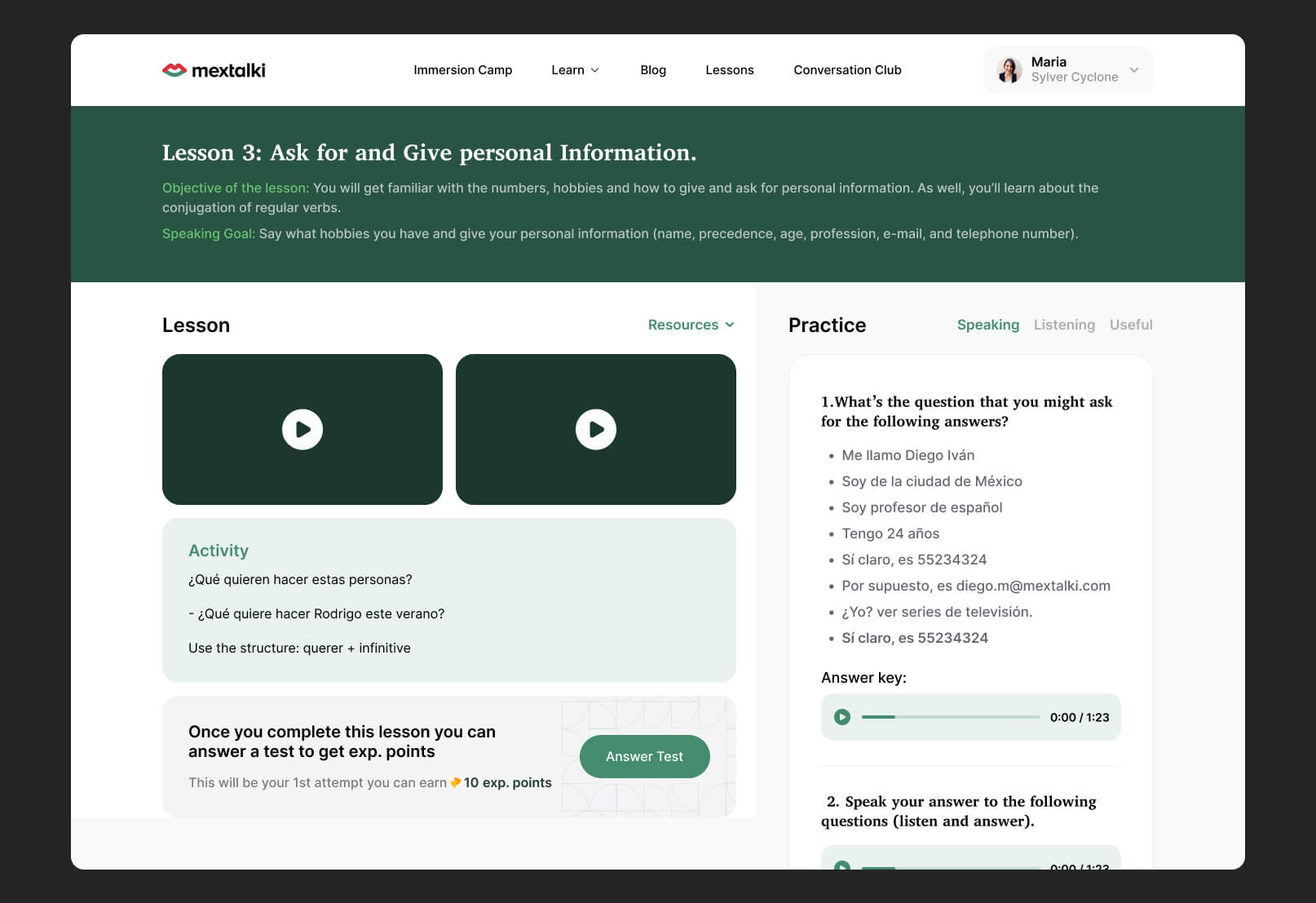
Once the structure and UX direction were finalized, I moved into the interface design phase. To create a stronger identity for the platform, I immersed myself in Mexican culture and visual aesthetics, researching ways to naturally integrate those elements into the product experience.
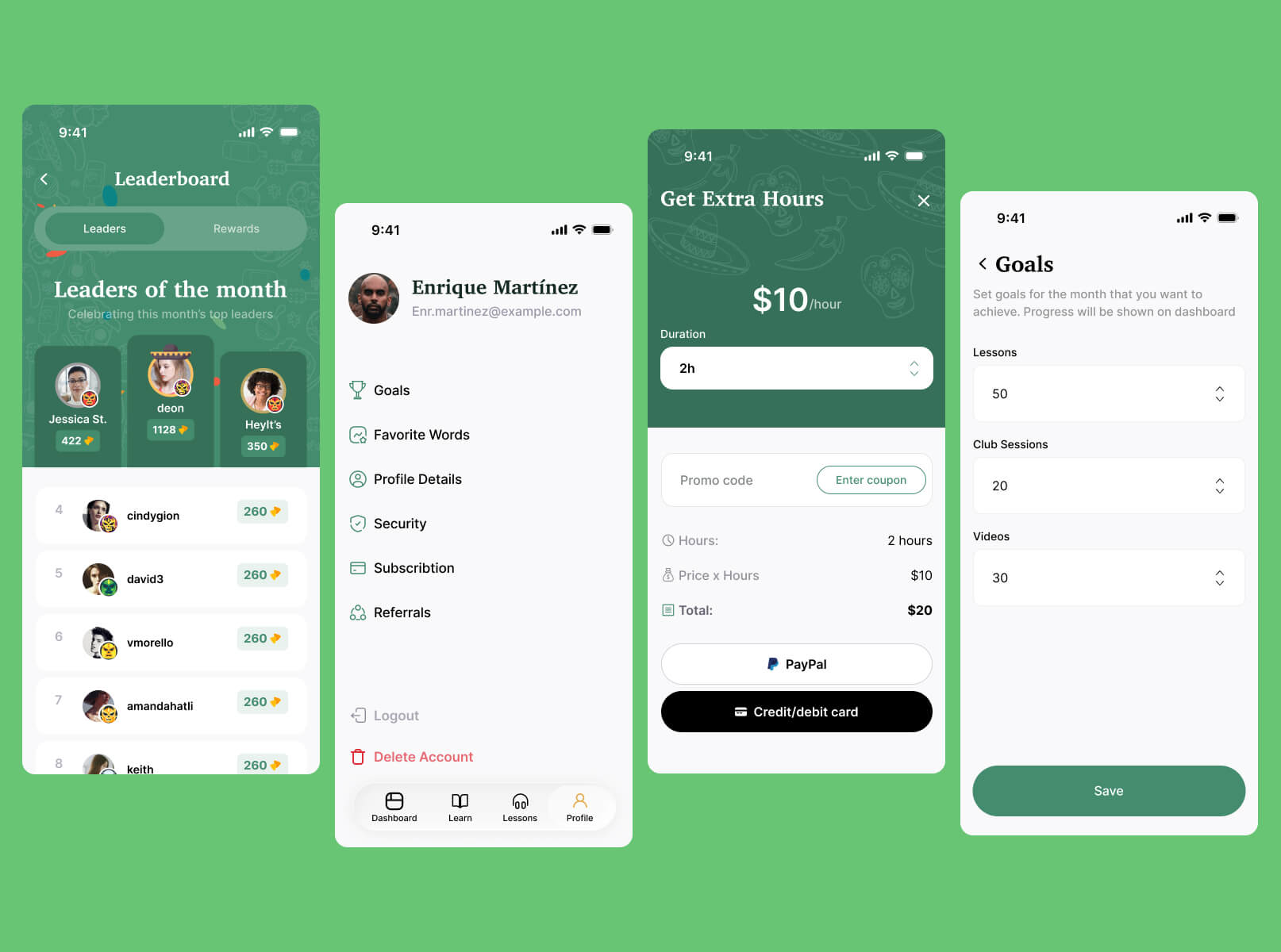
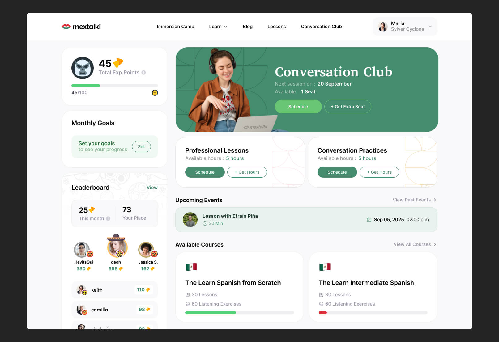
Mextalki already used green and red colors inspired by the Mexican flag, so instead of completely replacing the palette, I refined the tones to feel more vibrant and modern. One of the challenges was using red carefully, since it is commonly associated with danger or errors in digital products. Because of that, green became the primary action color throughout the interface, especially for buttons and key interactions
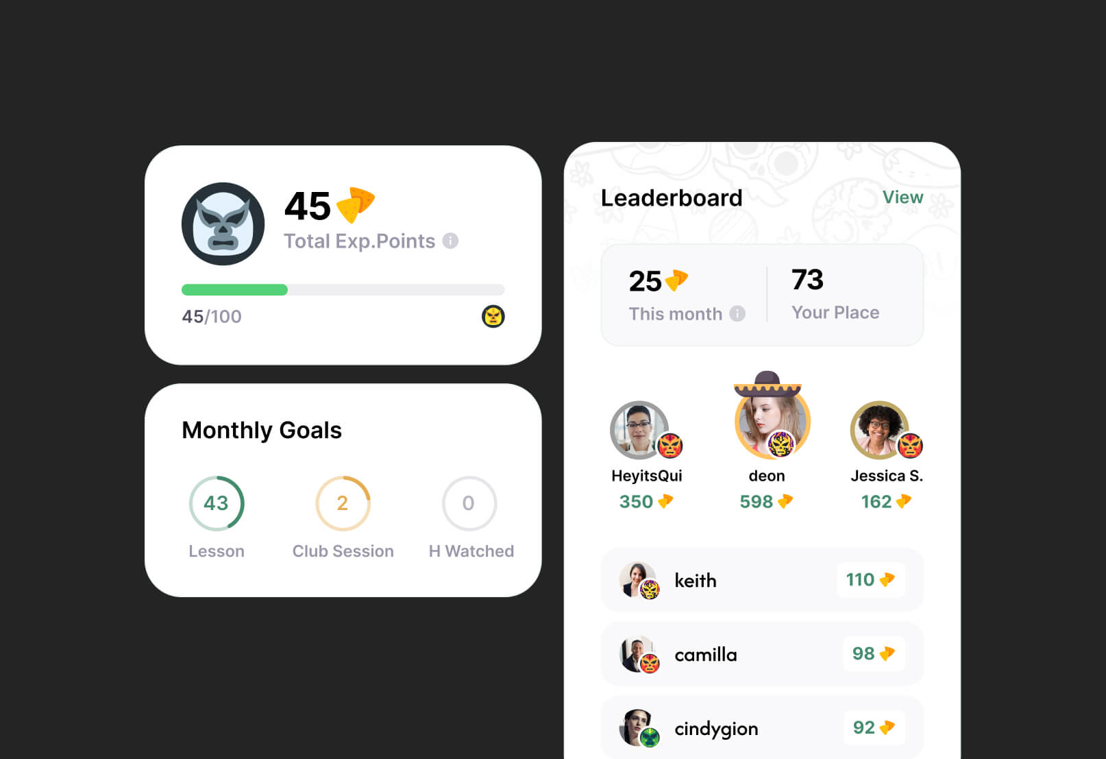
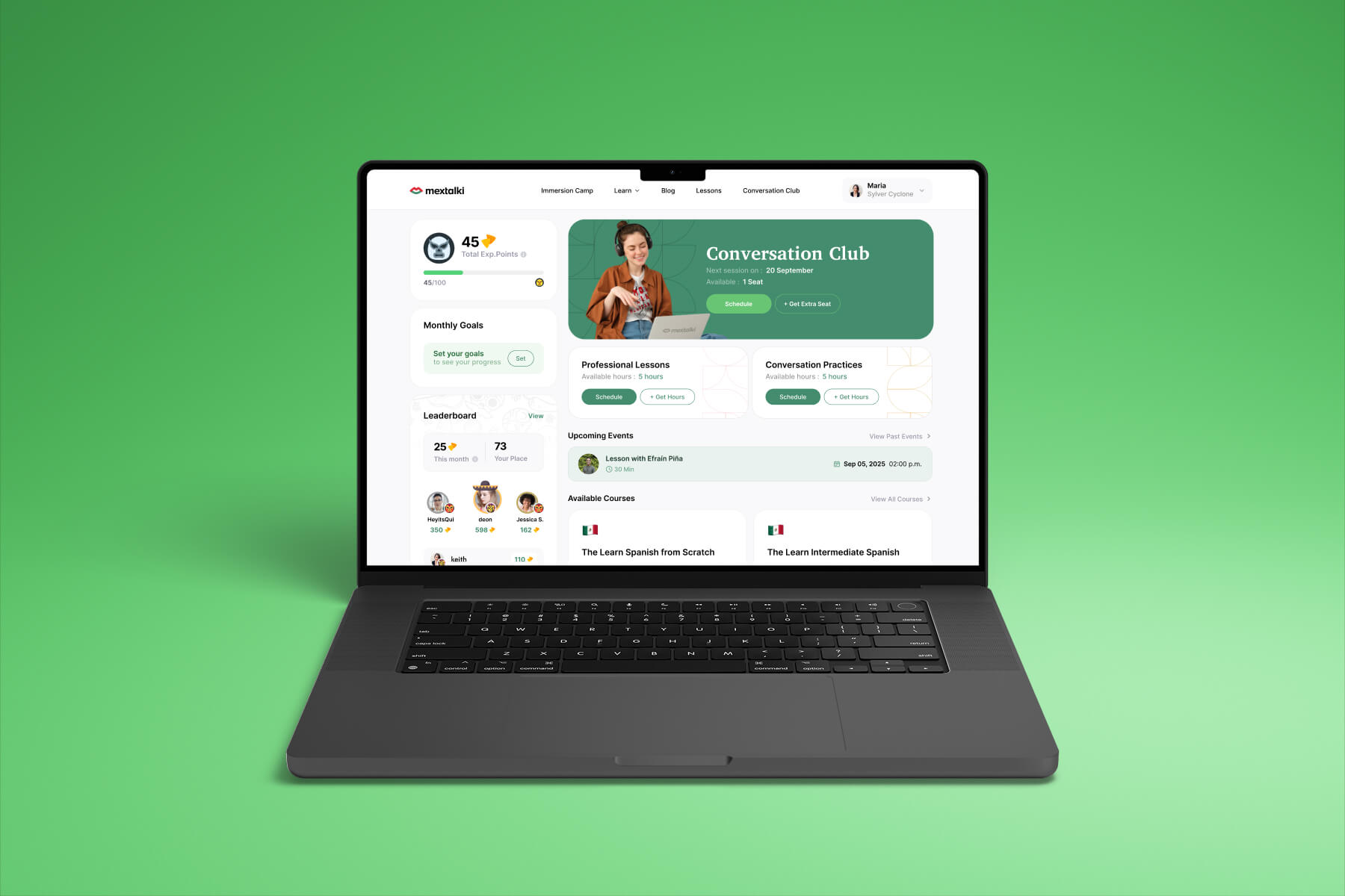
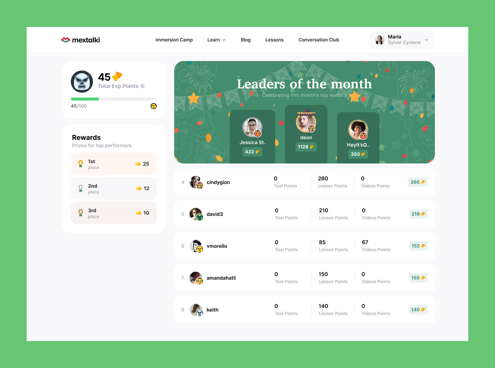
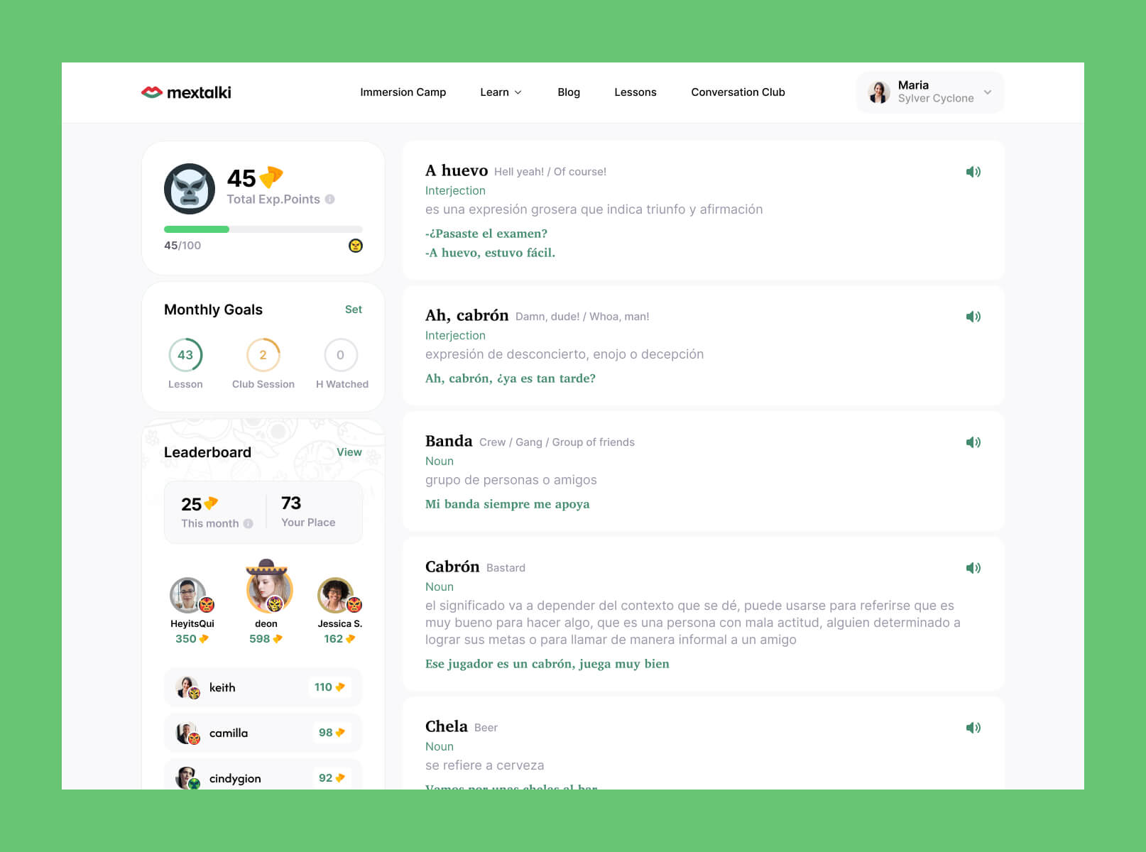
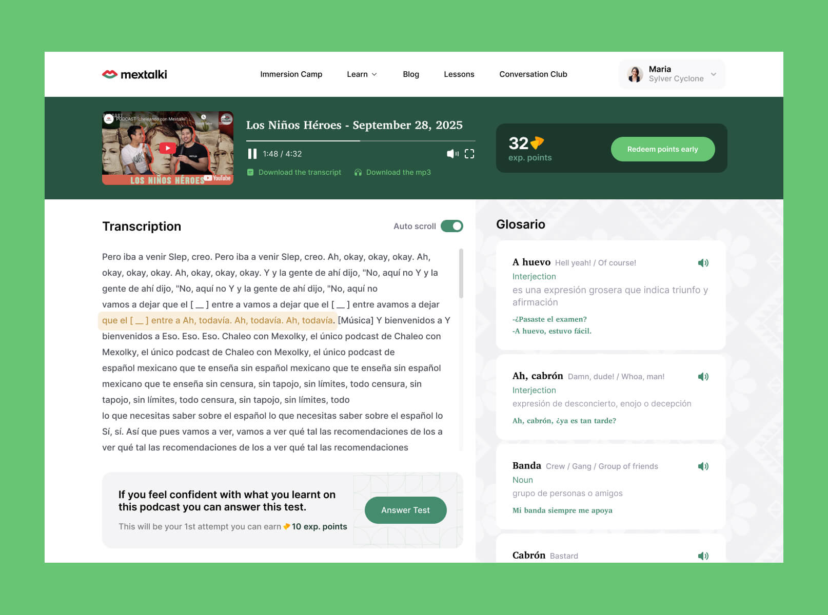
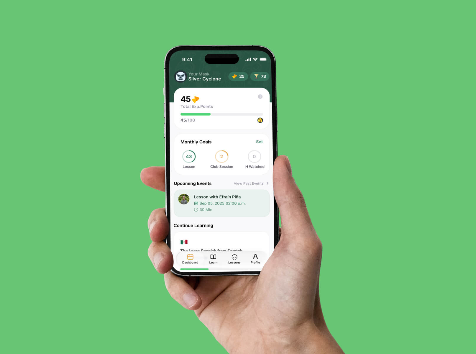
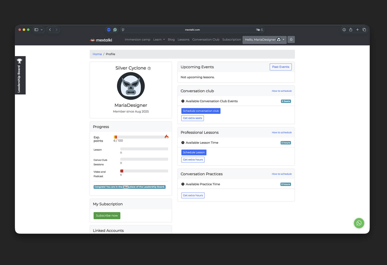
Another surprisingly long design challenge was finding the right visual metaphor for the platform’s points system. Early concepts included peppers, tequila, and cactuses, but visually they did not communicate the idea of a “coin” or reward in an intuitive way. Eventually, I decided to use nachos as the points icon. While not a traditional Mexican dish, they are strongly associated with Mexican culture globally and worked much better visually within the interface.
For the leaderboard experience, top users were rewarded with sombrero icons as a playful alternative to the traditional crown metaphor commonly used in gamified systems. Different user levels were also represented through lucha libre masks — an iconic part of Mexican culture that helped make progression feel more distinctive and memorable.
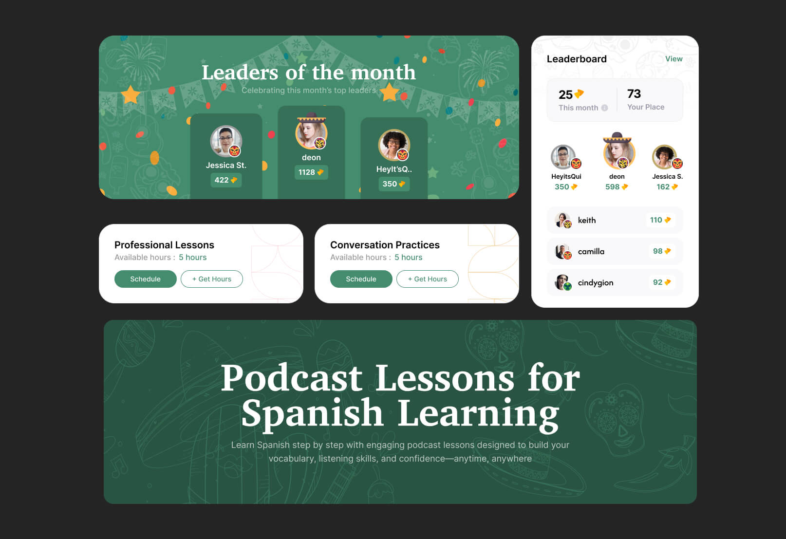
Mexican-inspired patterns were integrated across many interface elements to reinforce the platform’s personality without overwhelming usability. These details helped create a more immersive atmosphere while still keeping the interface clean, modern, and functional.
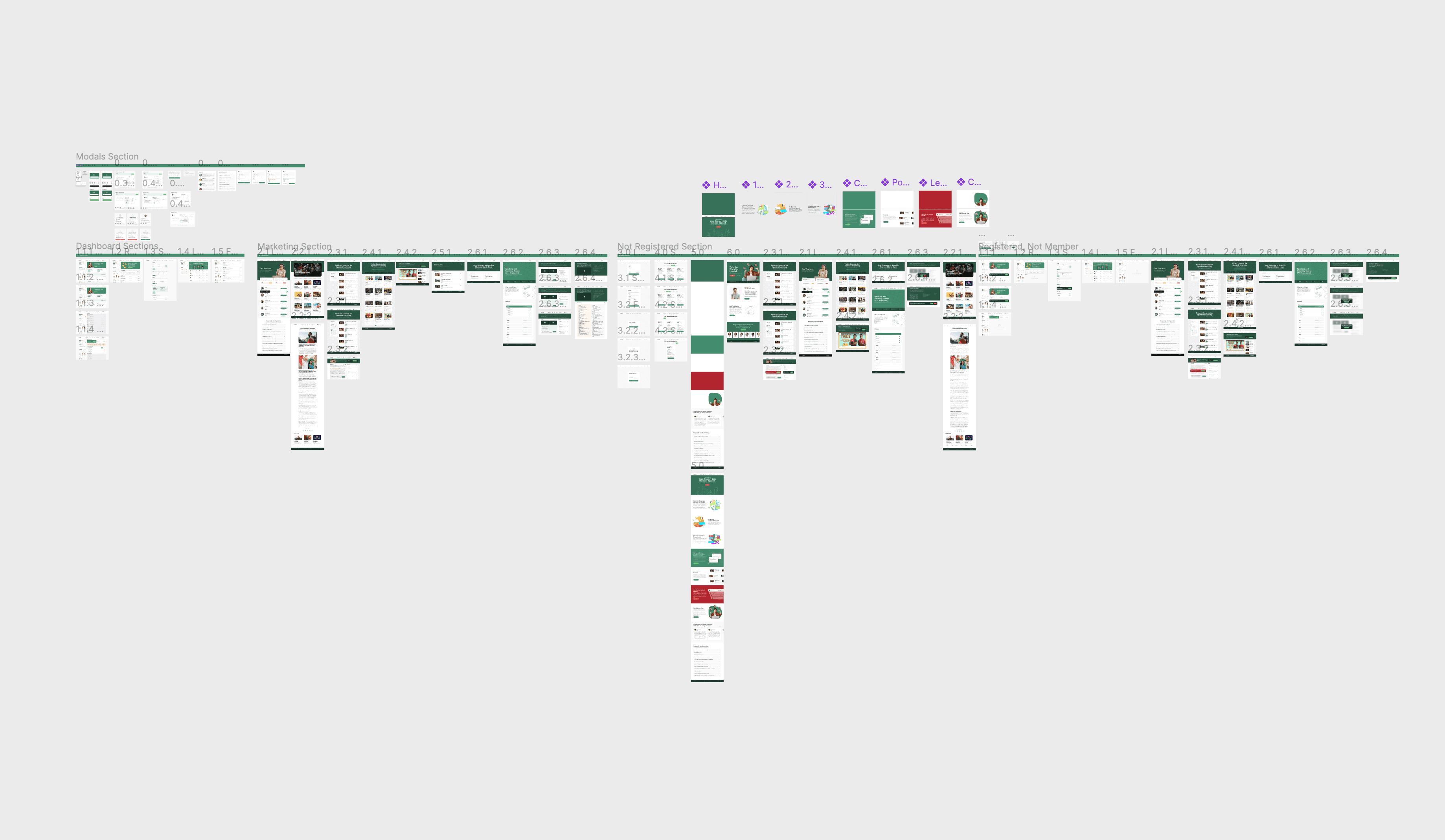
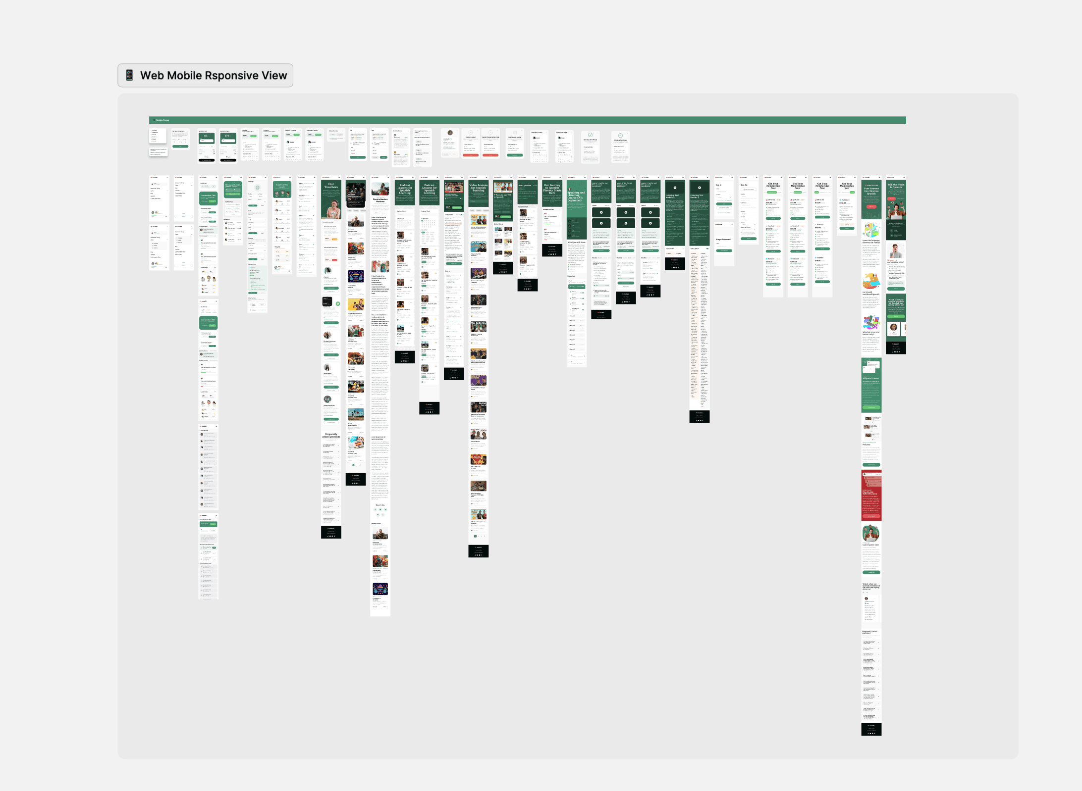
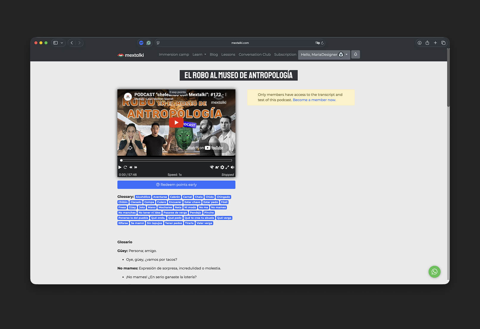
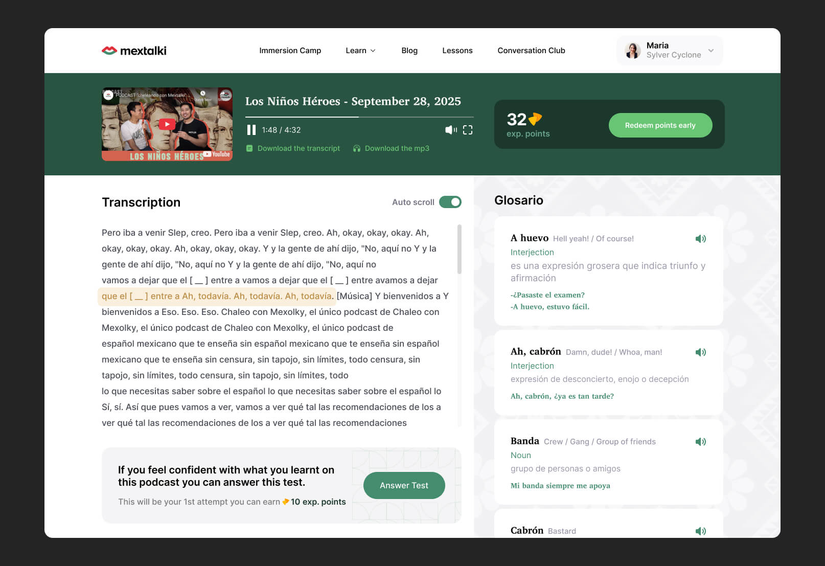
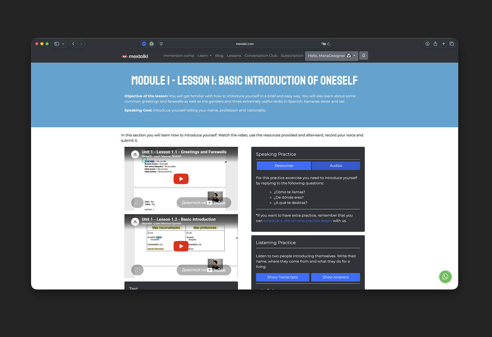
In the end, a complete design system was created for the entire platform, including fully designed interfaces for every page and user flow. Responsive versions were developed for different screen sizes to ensure a consistent experience across desktop, tablet, and mobile devices.
To support scalability and future development, a comprehensive design kit was also created, containing reusable components, typography styles, color systems, spacing rules, and UI guidelines. This helped establish visual consistency across the platform and simplified the transition into development and future product updates.
mobile app
Since the research, UX structure, and UI system for the web platform had already been established, the next step was translating the experience into a mobile application while adapting it to mobile interaction patterns and usability standards.
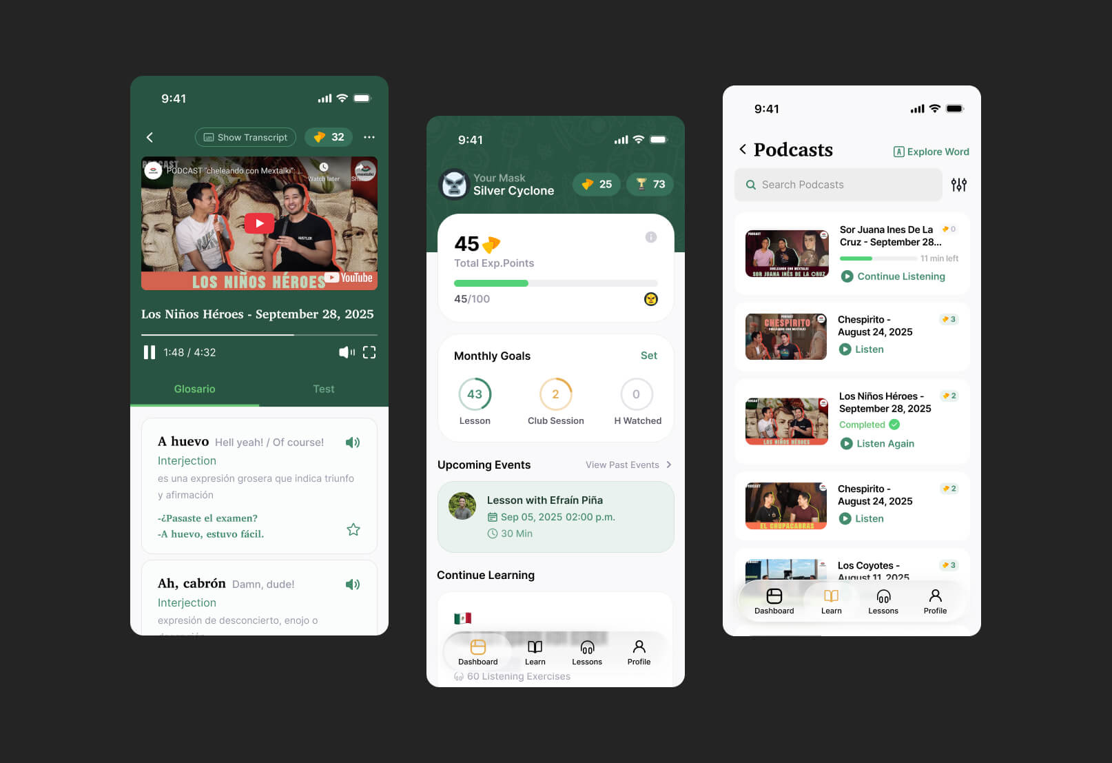
The mobile app included the same core features and learning ecosystem as the web platform, ensuring consistency across both experiences. One of the main challenges was redesigning the navigation system to work naturally within a mobile interface while still keeping access to all major learning tools clear and intuitive.
By preserving the established visual identity and adapting layouts specifically for smaller screens, I was able to create a mobile experience that felt native, clean, and easy to navigate without losing the personality or structure of the original platform. Interface elements were carefully adjusted to better fit mobile interaction behaviors while maintaining consistency with the overall product ecosystem.
outcomes and comparsion
In the end, the result was a clean and cohesive platform experience that feels intuitive for users and consistent across both web and mobile interfaces. Users are actively engaged in the learning process, earning points, tracking their progress, and competing in leaderboards, which helps make the experience more motivating and interactive.
The Figma project itself was also carefully structured using components, variables, variants, and clear layer naming conventions. This significantly simplified the handoff and development process, making the system easier to maintain and scale in the future.
Below you can see comparisons of the platform before and after the redesign.
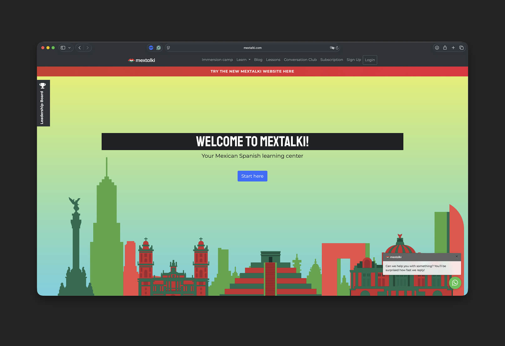
Before
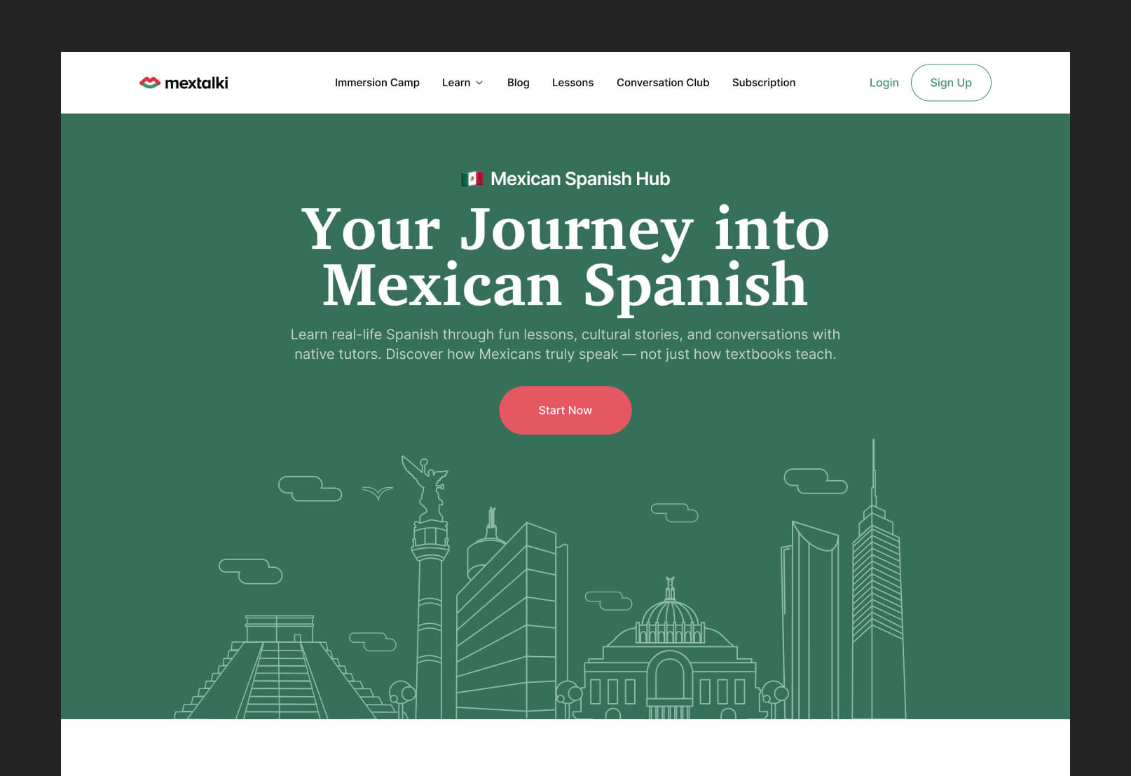
After
Before
After
Before
After
Before
After
project gallery